IE Brand works with charity, health and education clients up and down the UK, as well as internationally. Sometimes we work for large charities and universities that are household names, and sometimes we help small health and social care providers, colleges, or charity startups with big ambitions. If you’re a values-driven organisation with a challenge, then we’d love to add you to our list of clients!
- Home
- Brand Clients
Brand Clients

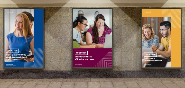
AHECS is the voice of higher education careers and employability professionals across Ireland. They exist to celebrate, support and equip careers professionals across 27 Irish universities, Institutes of Technology and HE providers.
IE Brand created a new brand and website to build a stronger membership community and establish AHECS as the go-to body for HE career development and employability in Ireland.
Close"Professional", "bold", "eye-catching", "fresh" and " professional" are just a few words I've heard used by members of the Association of Higher Education Careers Services in Ireland (AHECS) in response to a new brand and visual identity created by IE Brand and IE Digital. What's even more impressive is the level of positive feedback received when we have yet to formally launch the new brand and website!!
Dr David Foster
As a professional association, the Executive Committee was aware of a need to transform how the association presented itself to and engaged with its members, employers of graduates and the faculty and staff with whom we work in our Universities, Institutes and Colleges across the Island. IE have to be commended for engaging with AHECS and presenting potential solutions to the Executive Committee and the Heads of Careers Services in a consultative manner with a genuine desire to listen evident. From the outset, qualities such as integrity, friendliness, customer focus and professionalism shone through all the staff at IE the Executive Committee came into contact with. These qualities over all else gave AHECS Executive the confidence to partner with IE to complete what turned out to be a virtual project given COVID-19. As a member of the AHECS Executive Committee and lead on the IE developments, I have enjoyed working with Ollie and his team immensely. If you are an organisation looking to have a critical conversation with experts around your brand and digital services, I recommend engaging with Ollie and his team.
Director of the Association of Higher Education Careers Services
 Get in touch


Keech supports adults and children across Bedfordshire, Hertfordshire, and Milton Keynes with life-limiting conditions — and their loved ones — delivering care at home, in hospice, or wherever they’re needed.
Keech commissioned IE Brand & Digital to lead a full brand repositioning exercise, followed by the design and build of a new website. The project was awarded following a competitive pitch process, and focused on brand first, with digital transformation to follow.
Close"...It’s important that our branding reflects the organisation we are today, who we’re here for and the breadth of services we provide. Our new visual identity is designed to best communicate that information to the diverse community we serve and highlight that we are accessible for everyone when they need us most. The re-fresh will also unify our services under a single, strong identity – both celebrating our heritage and preparing us for the future."
Liz Searle
CEO
 Get in touch


We worked with Vita Health Group to deliver campaign creative for their free, NHS-funded access to mental health support during the 2020 Coronavirus pandemic.
Close
 Get in touch


The Orders of St John Care Trust (OSJCT) is a not-for-profit organisation that provides person-centred care for older people across 70 care homes, 14 extra care housing schemes and in the community. They support over 3,500 residents to make the best choices for their future home, care and support.
IE Brand is currently embarking on a new project for OSJCT.
Close
 Get in touch

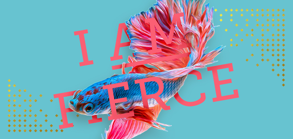
Plymouth Marjon University needed a recognisable and consistent visual signature across all its employability comms – whether they come from the careers service, or from
Academic departments. The Futures brand needed to conform to the spirit of the University's brand guidelines, while allowing for the fact that the guidelines allow for a degree of innovation, where appropriate and impactful.Futures offers a personalised, student-centred approach to employability, tailor-made to each student. In common with other University Careers Services, Futures places a healthy focus on employability, and offers support and guidance to everyone that comes through its doors (and even those that don’t). But there’s one crucial belief that shines through: They believe that life’s an adventure, and that the key to happiness is finding a career that you love.
The brand's tone is conversational, informal and quirky. The visual identity is distinctive and eye catching – with messages that follow suit. Sometimes be seen as ‘the underdog’, beneath the surface Marjon is bold and confident – encapsulated in the Futures messaging: ‘I Am Marjon’. Marjon students are determined to succeed, and the Futures team helps to make that happen.
Explore IE's other rebranding work with university careers services.
Close
 Get in touch


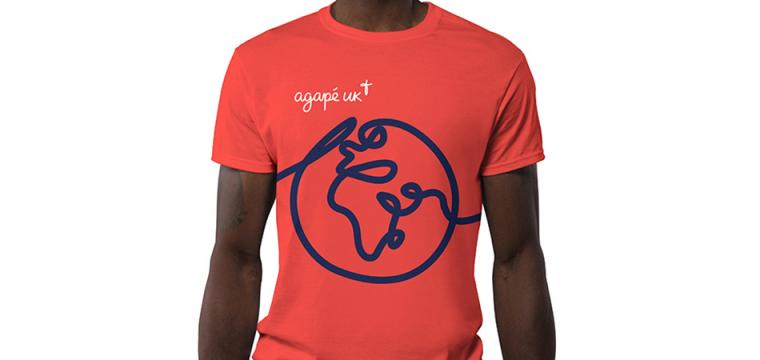
For over 50 years, Agapé UK has been inspiring people to discover Jesus together, at home, at work, at university, and abroad. As the UK arm of an international Christian charity, active in over 190 countries, they're bringing people together and transforming lives.
IE originally worked with Agapé back in the 90s, when we were first founded. We're delighted to have rekindled that relationship to rebrand the charity and create a modern new website.
CloseWe knew that IE would bring expertise, insight, and creativity to our branding challenge. What we didn’t expect was how excellent the team would be at helping us to see where we could improve our practices across the whole of Agapé UK – they really listened well to us and our stakeholders, and were sensitive to our needs as an organisation.
Lesley Cheesman
Our new branding is excellent, and it has been a breath of fresh air for me personally and our staff as a whole. It’s such an encouragement to be able to describe what we do so clearly, and to know that our brand identity reflects who we are as an organisation: discovering Jesus together, at home, at work, at university, and abroad. I am so thankful to have worked with IE – they were the right people at the right time.
National Director, Agapé UK
 Get in touch


Aston Careers + Placements service offers students careers advice and placement opportunities to help them best prepare for life after university.
Aston Careers, Placements and Employability (as it was then known) was already a sector-leading, highly successful service, but they recognised that they were suffering from poor brand recognition and inconsistent campaigns. IE Brand was tasked with creating a distinctive brand identity.
We developed an urban, edgy visual style and arresting statements to engage students at a highly emotive level. The work drove an 84.5% increase in attendance at The Placements Fair and was Highly Commended for Best Use of a Visual Property at the Transform Awards Europe 2015.
We've also worked closely with Aston as part of our work on the Goldman Sachs 10,000 Small Businesses programme.
Read more about Aston's Careers + Placements brand or explore IE's other rebranding work with university careers services.
CloseIE Brand interpreted our brief into a captivating and edgy identity. They listened to our feedback, incorporated our Aston University guidelines, and absorbed our team culture, producing a brand that not only reflects who we are but is really distinctive in our market place. We are delighted with our new look and even more so with the overwhelming demand for our services so soon after its launch.
Angie Robinson
Employer Engagement & Marketing Manager, Aston University Careers + Placements
 Get in touch


The University of Liverpool is a Russell Group university, ranked in the top 1% for research worldwide. The university’s aim is to support students to become highly employable, creative, and culturally rich graduates and enable them to become agents for change.
The University of Liverpool Careers & Employability plays a key role in this, but were finding it a challenge to engage undergraduates, postgraduate students and internal university colleagues. With the service also set to relocate on campus, the time was right to signal change, increase visibility and promote involvement.
Following an initial brand audit, IE Brand created a new brand messaging and a visual identity that conveys the personalised, student-centred service on offer and captures the Liverpool students’ unique personality.
Close
 Get in touch


We're working with Maynooth University to create a compelling brand for their careers service.
Close
 Get in touch


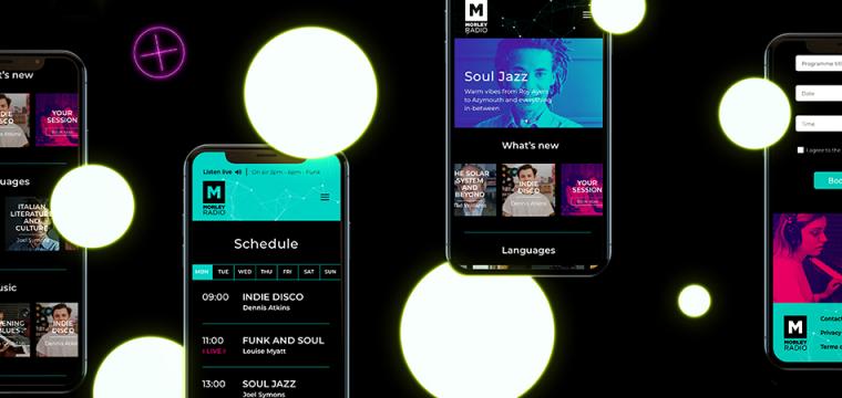
Morley Radio is the community radio station for Morley College London. It is central to the College’s vision of inspiring ambitions and creating outstanding learning opportunities.
Following a 'light touch' UX exercise to understand who the site's users would be, IE Digital created a visual design theme for the new website, inspired by the College's parent brand and current design trends, including a new logo for Morley Radio.
We then built a rich, modern and highly polished WordPress template and incorporated programme listings, podcasts and the all-important audio player – to allow users to live stream an eclectic selection of music, talk and drama, all created by students, staff and visitors in the College's state-of-the-art radio studios.
Close
 Get in touch


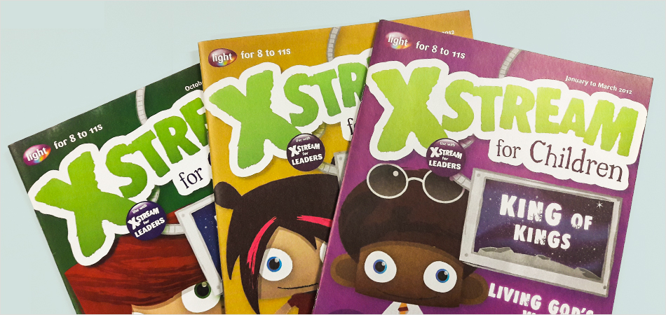
Scripture Union is a global charity working in over 140 countries. Light is SU’s market leading range of resources for children and youth, consisting of 5 kids’ and 4 leaders’ magazines, distributed throughout the English-speaking world.
Scripture Union wanted to re-establish themselves as market leaders, so they came to IE Brand to rename and rebrand the product range. We created brand communication guidelines for the magazines, plus new age-specific sub brands for each of the 5 children’s magazines.
We provided the in-house design and web teams with new templates, style guidelines and graphical assets with which to manage the identity.
CloseWithout a doubt, IE Brand’s clean, fresh and contemporary design and web solutions have given us the best possible start in maintaining our position as market leader in our field. IE have always listened carefully to our needs and suggestions then, time after time, have far exceeded our expectations.
Terry Clutterham
Head of Resource Development, Scripture Union
 Get in touch


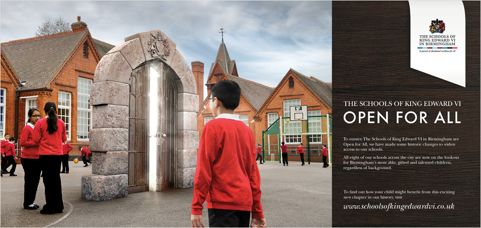
The charity, The Schools of King Edward VI in Birmingham, is involved in education through two independent schools, five free grammar schools and a sponsored academy, via the management of historic land assets which were passed on to it from as long ago as 1552.
Keen to take a lead on new inclusion legislation, the charity commissioned IE Brand to create an advertising campaign and collateral to encourage parents and children from underprivileged backgrounds to consider applying for a place in one of the Foundation's eight schools. Using beautiful location photography and cutting edge CGI, IE created the 'Opening Doors' campaign where a historic school doorway appears to 'land' in familiar playgrounds and high streets, inviting local communities to enter a brighter future.
Close
 Get in touch


Sport England advises, invests in and promotes community sport to create an active nation. As part of the build up to the London 2012 Olympic and Paralympic Games, they wanted to get two million people more active in sport.
Sport England was specifically struggling to deliver £15 million worth of grants into the hands of their ‘hard to reach’ target groups: disabled people, lower socioeconomic groups, young people and black and ethnic minority groups. Research showed that the application process was complex and inaccessible to all but educated, proficient form fillers.
IE created a workshop style, facilitated process where sports groups were led through the application process by a community leader, helping with everything from opening a bank account to progress checklists and scoring systems for self evaluation. As a result, Sport England saw a significant improvement in the diversity of applicants, and their success rates improved too.
CloseIE’s Resource Pack is perfect for the ‘Awards for All’ programme. A plain English, no nonsense, tick-box approach with engaging photography and lighthearted cartoons has substantially diversified the profile of successful applicants.
Katharine Gray
National Development Manager, Sport England
 Get in touch


Having become no.2 in the floorcare category Vax recognised that the brand lacked a consistently managed, recognisable image. They had gained their position through an appeal to consumers on the basis of no nonsense value.
IE Brand repositioned the Vax brand, retaining the value aspect and complementing it with additional values such as expertise, technical innovation and care. We commissioned lifestyle photography and created a new set of brand guidelines to police and protect the new brand. We also revamped their packaging, catalogue layouts for Argos and Next, and designed and built new ecommerce websites – both B2C and B2B, in multiple languages.
Online sales more than tripled and Vax overtook Dyson in terms of unit sales and became the number 1 UK floorcare specialist.
CloseCongratulations on winning the pitch. It was a pleasure to see design with such clear strategic thinking. IE Brand was by far the best. I look forward to working with you in the near future.
Naomi Brennan
Marketing Communications Manager, VAX
 Get in touch


Sons & Friends of the Clergy is a charity whose roots can be traced as far back as Oliver Cromwell's time in the 1600s. The charity supports the Anglican clergy and their dependants in time of crisis or need, and they are now broadening their remit to incorporate general ‘clergy wellbeing’ including physical and mental health.
Close
 Get in touch


WRAP (The Waste and Resources Action Programme) works in the space between governments, businesses, communities, thinkers and individuals – forging powerful partnerships and delivering ground-breaking initiatives to support more sustainable economies and society.
Explore our rebranding work for WRAP with Love Your Clothes and Love Food Hate Waste.
CloseIE Brand has done an exceptional job of understanding the Love Your Clothes brand and re-invigorating our visual identity. Everybody loves the thinking, design, look and feel.
Jamie Perry
Creating a stand-out brand to appeal to our many disparate audiences is no mean feat, but IE has more than delivered to our challenging brief. What’s more, they have worked hard and been extremely responsive in the face of tight deadlines.
Mouth wateringly effective design delivered with polish and panache – highly recommended.
Campaign Manager, WRAP
 Get in touch

