Family Action
Family Action is a UK charity that provides practical, emotional, and financial support to families in need. Founded in 1869, they help families facing issues around domestic abuse, mental health problems, learning disabilities, and financial hardship.
Last year, they supported 60,000 families and helped 350,000 children to eat a healthy breakfast.
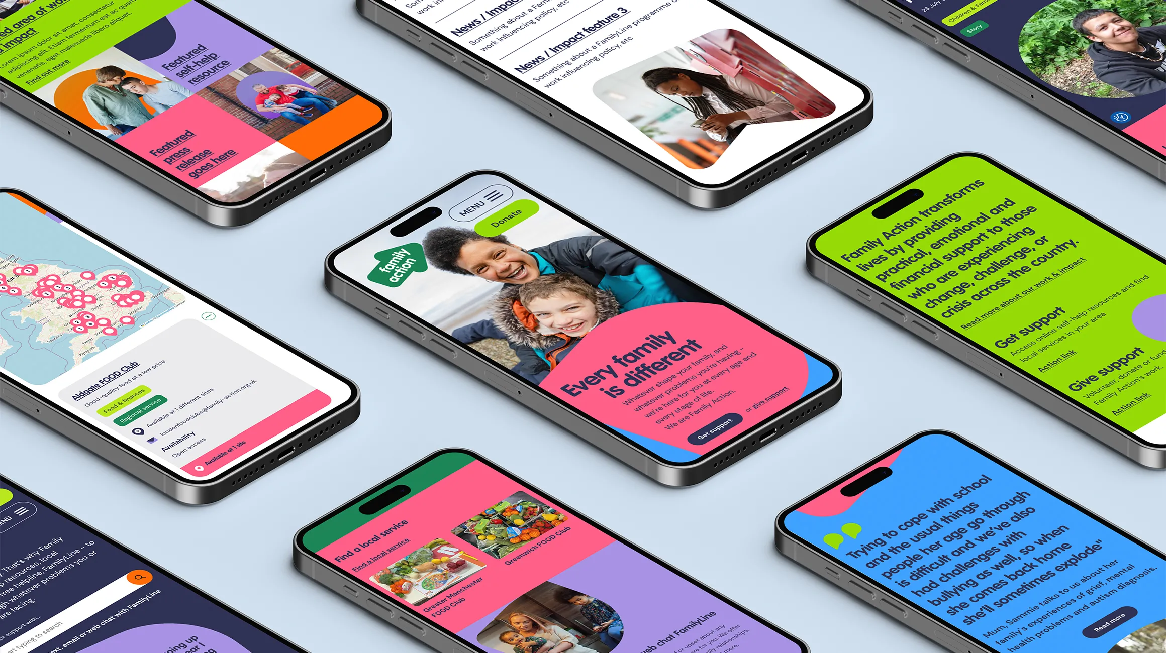
Family Action asked IE to refresh their brand and build them a new user-centred website.
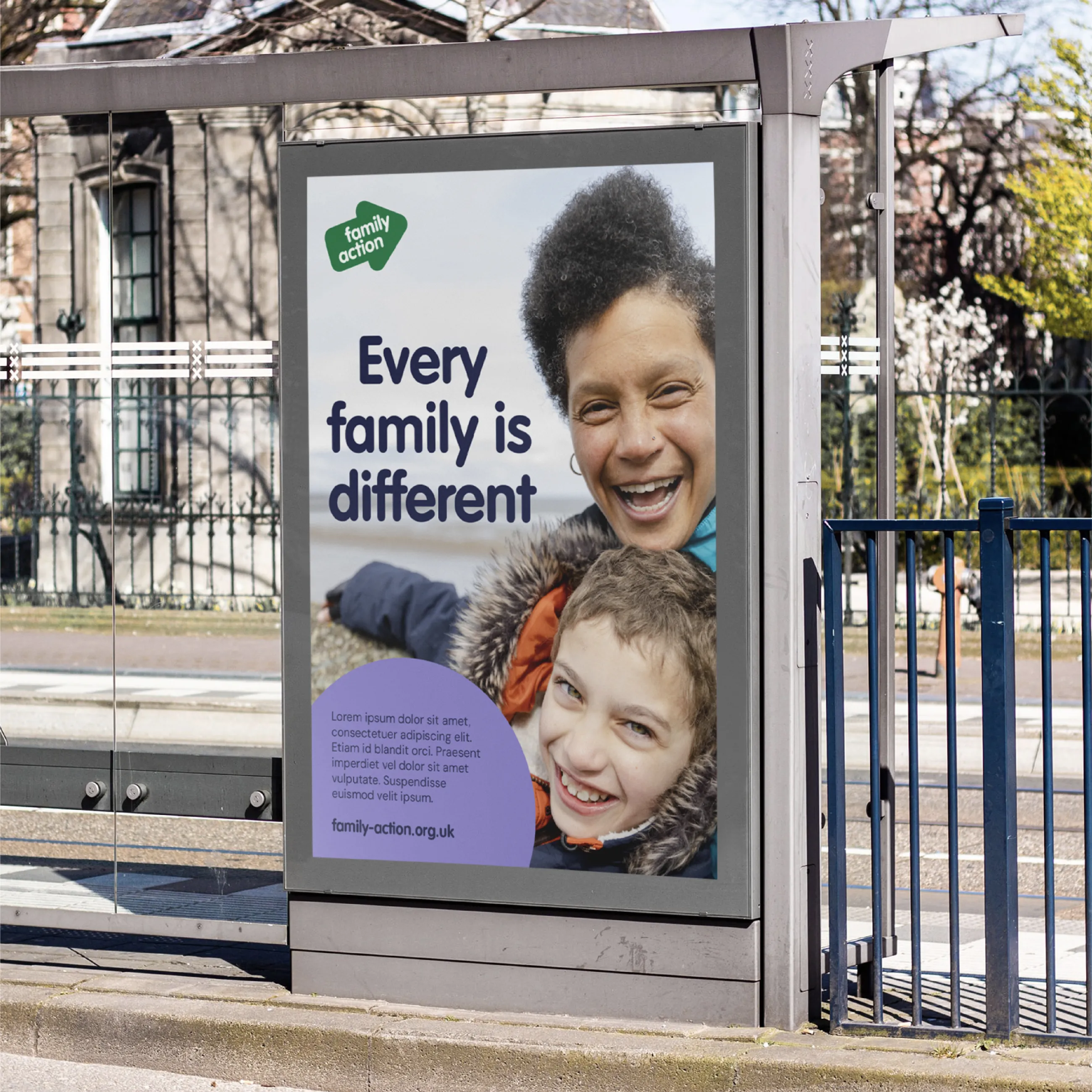
Family Action first reached out to IE to build their new website and IE quickly developed a clear plan to revolutionise their digital footprint.
But before we could transform Family Action online, it became clear a brand overhaul was required to modernise the charity’s identity and increase awareness of their incredible work.
Time was against us because the charity was about to sign up to some co-branding partnerships which would preclude them from making any significant changes to the logo or core identity for at least 12 months. Plus, the new identity needed to be in place before UX and UI work could begin on the new website. So we proposed a rapid plan to refresh the Family Action brand in less than six weeks.
Most of IE’s brand projects begin with a comprehensive listening exercise, where we speak to internal and external audiences to see what they think and feel about a brand. But on this occasion, Family Action already had a lot of existing research for us to call upon – with more already planned while the project was underway – so we were able to piggyback off what had come before and supplement it with internal workshops and briefing meetings.
Family Action were also rightly keen that we took internal audiences with us on the journey and that their internal teams were able to collaborate on the project at every turn. And this co-creation approach is exactly how we love to work.

Before we began work on visual design, we needed to better understand Family Action’s brand architecture which included dozens of partnerships, sub-brands and branded programmes. IE was tasked with mapping the existing architecture and devising a new set of rules that would allow Family Action – and its partners – to know when, where and how to apply the brand.
This complex architecture represented services that were branded as...
- Family Action
- A named service with the Family Action logo
- A branded service alongside the Family Action logo
- A branded service alongside the name Family Action
- An independent sub-brand
IE advised that the way the architecture was currently visually represented was confusing, because it was impossible for people to tell – at a glance – which services, programmes or entities were wholly owned / delivered by Family Action and which weren’t. And we were concerned the core Family Action brand could be missing out on vital brand equity.
IE created a new brand architecture map to simplify the brand family and record a consistent set of rules around how it should be used. This allowed us to proceed to the design phase, confident in the knowledge that we had a robust system to fall back on.
Right from the off, Family Action knew that while they were looking for a bold leap forwards in terms of visual design, they also wanted the new identity to echo its predecessor. In the initial brief they told us that:
‘We have a visual system that is currently under-utilised and which we think can be pushed / evolved to help us create a distinctive online presence.’
That meant using the existing identity as a starting point and deciding which elements to keep – and which to lose – according to a simple philosophy: no change for change’s sake.
Each and every IE brand identity project begins with a clear set of pre agreed success criteria. Our list for Family Action included the need to:
- Contain a recognisable evolution of the current Family Action logo
- Differ sufficiently from the existing visual identity to signal change
- Reflect the charity’s new ‘power of family’ narrative
- Demonstrate the scale and scope of the charity
- Reflect a new sense of organisational confidence
- Contribute to growing positive awareness of Family Action
- Appeal across Family Action’s core target audiences
- Reflect the desired personality of the brand
- Inspire proud ownership
- Help to tell Family Action’s story
- Help to simplify Family Action’s work
We began by tweaking the existing logo to make it more digital-friendly. This included tweaking the colour to pass accessibility checks and rotating the angle of the arrow to make it easier to read. We also restored dots on the i’s to aid legibility.
But Family Action’s wider visual identity received a much more comprehensive redesign, retaining a rounded typeface (though adopting a new font) while creating everything else from scratch.
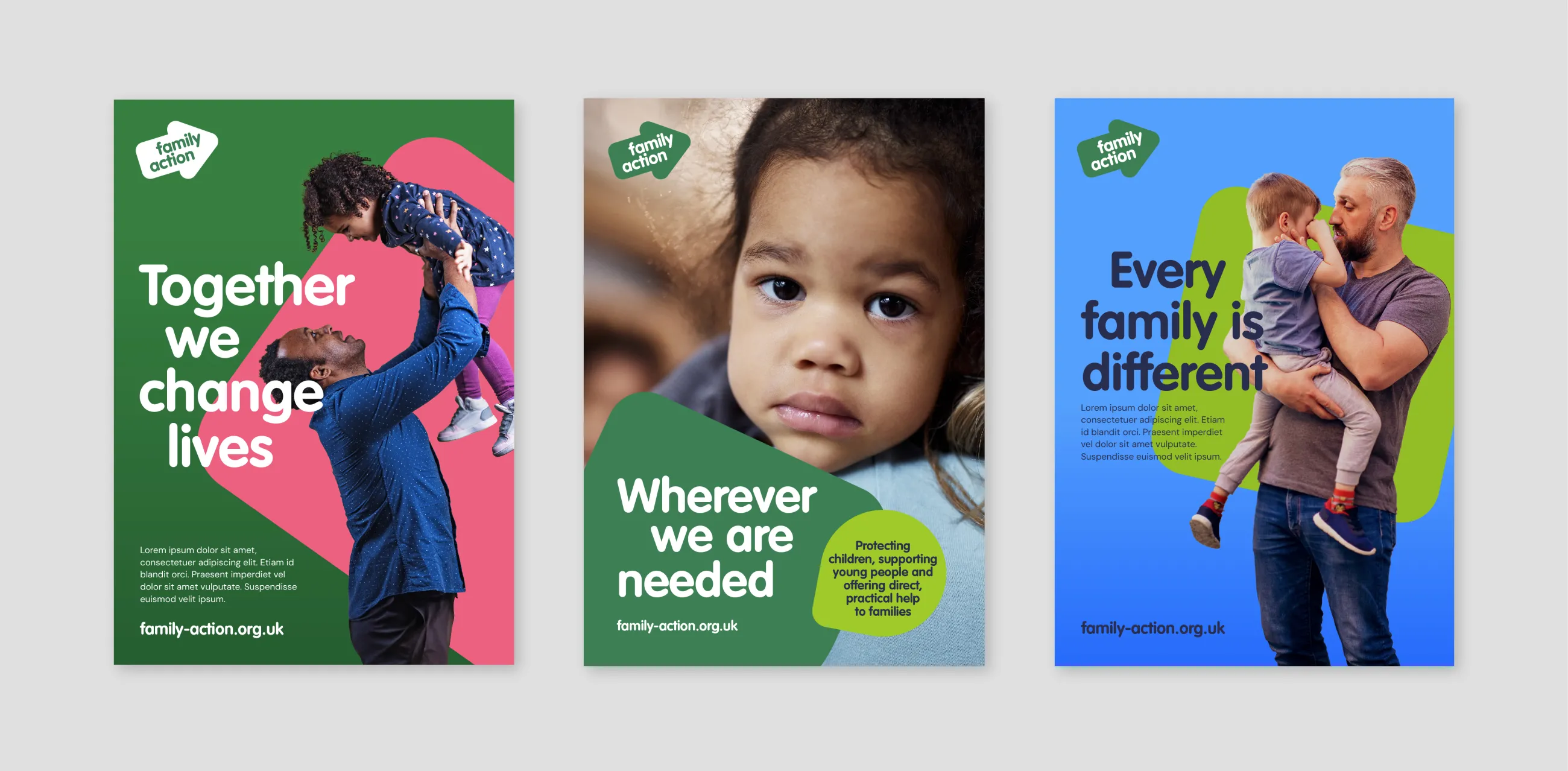
The new identity includes:
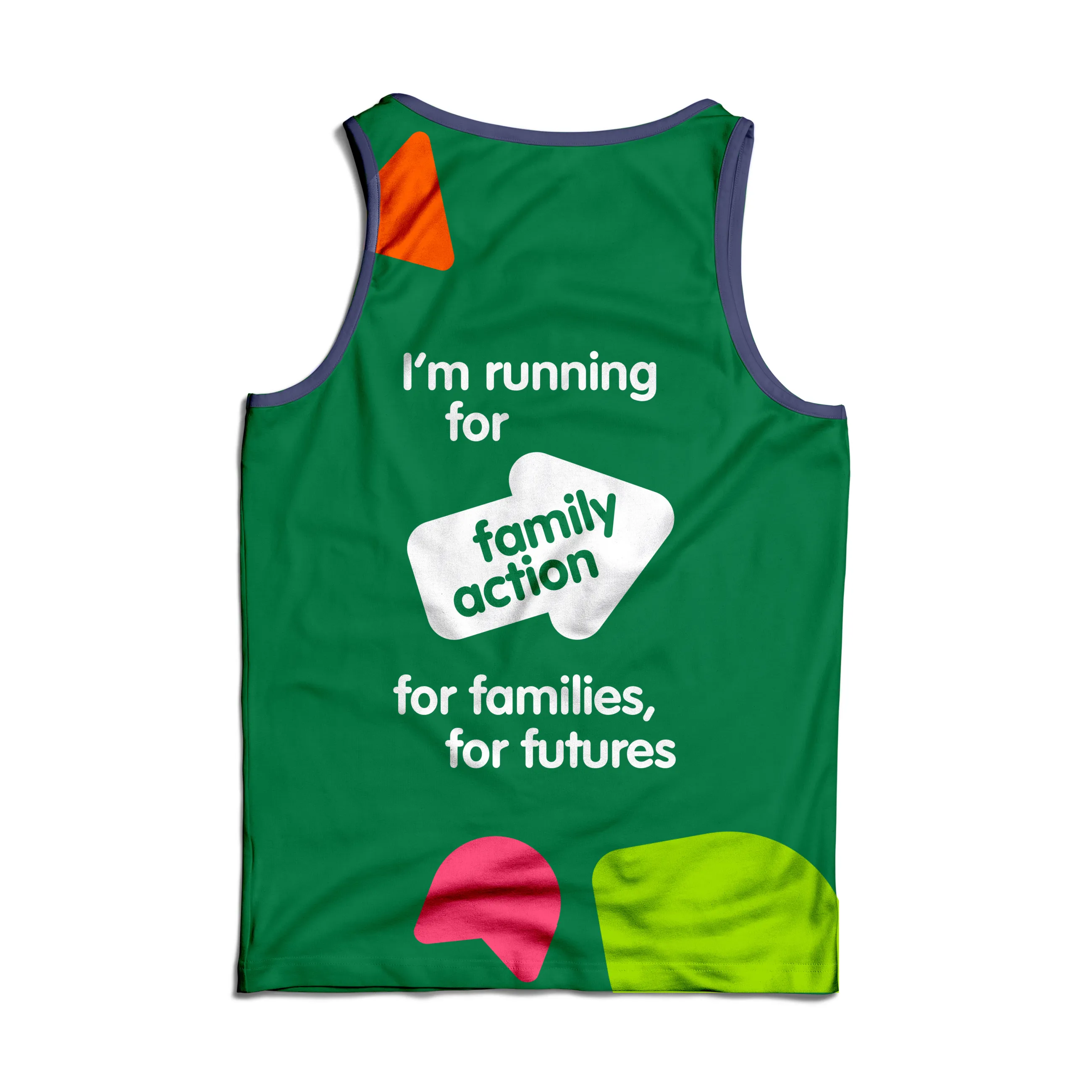
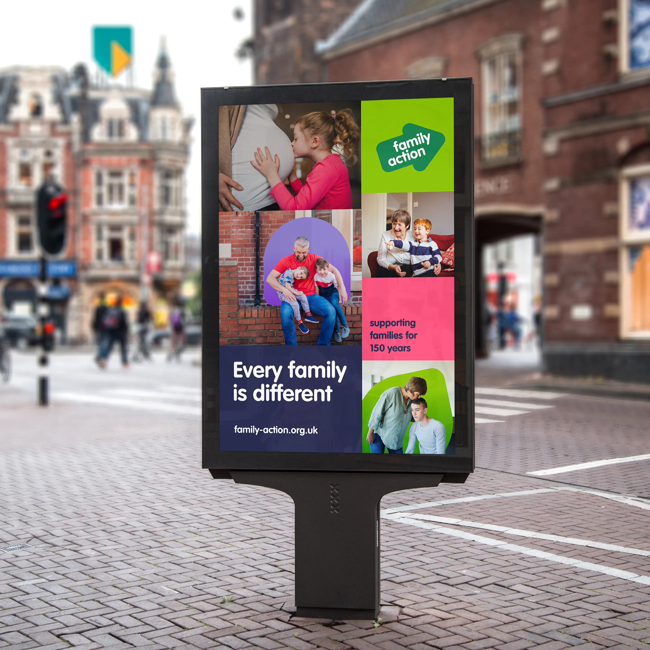
- A bold and vibrant colour palette full of energy
- A series of distinctive shapes that can be used as backgrounds, frames and image enclosures
- Gradients to add warmth and dynamism
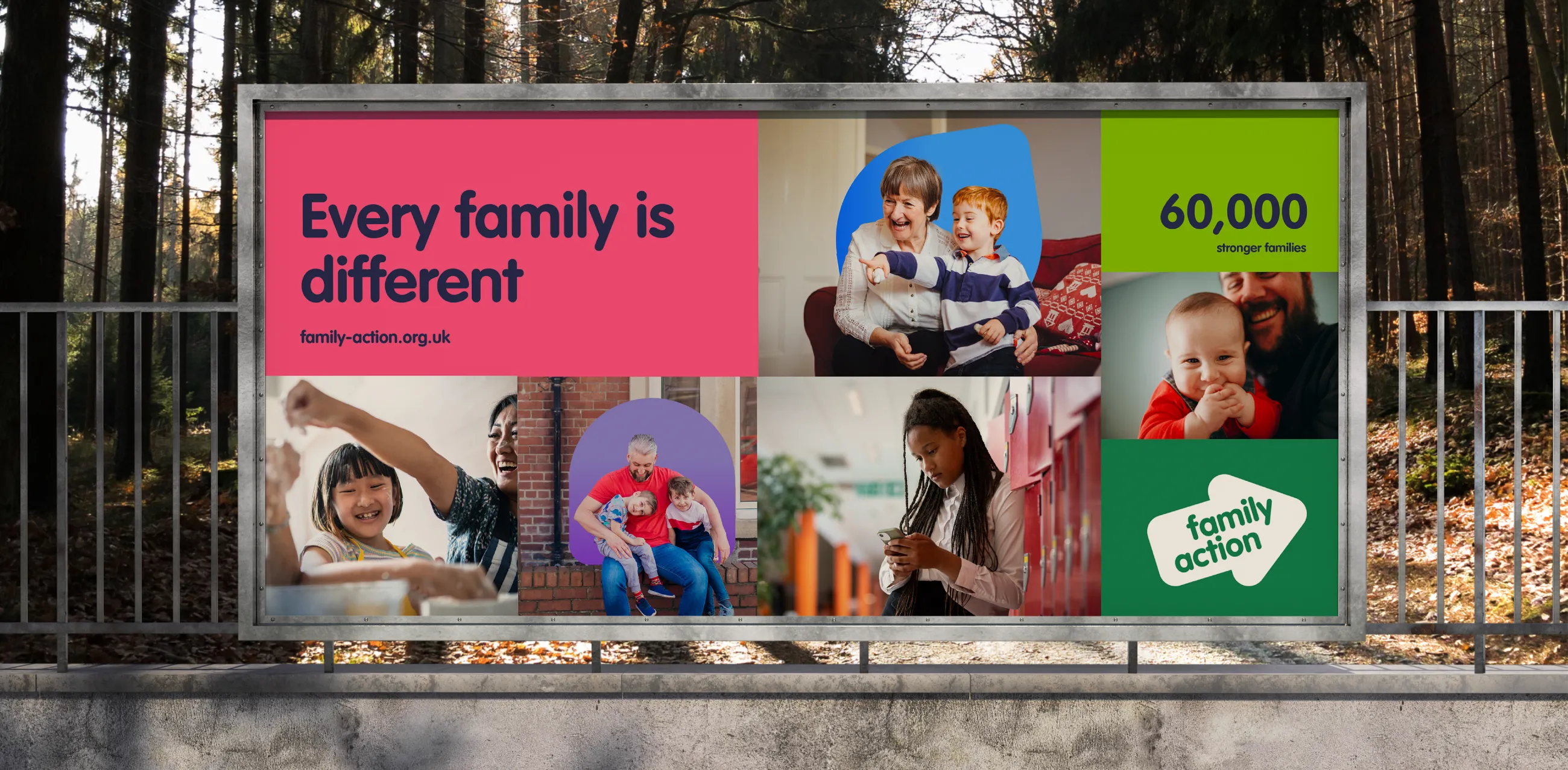
- Reportage-style photography showing a diverse range of families
- Icons for every occasion
- Image cutouts to bring compositions to life
- A versatile grid that allows engaging on brand comms to be designed with ease
- A motion-first approach that lends itself well to animation
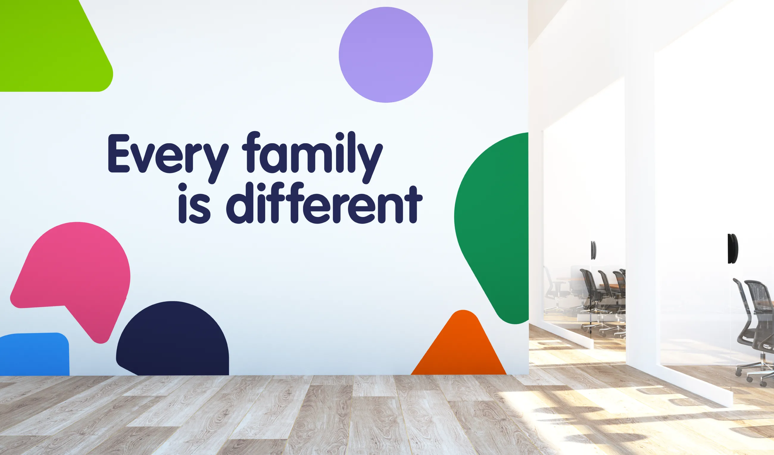
The new identity revolves around an overall brand theme: every family is different. That means that every single element from the new identity can be used in myriad ways so that just like families – no two designs look the same.
The visual identity was incredibly well received by everyone at Family Action who helped us to fine tune the identity, and stress test it across every possible application on and offline.
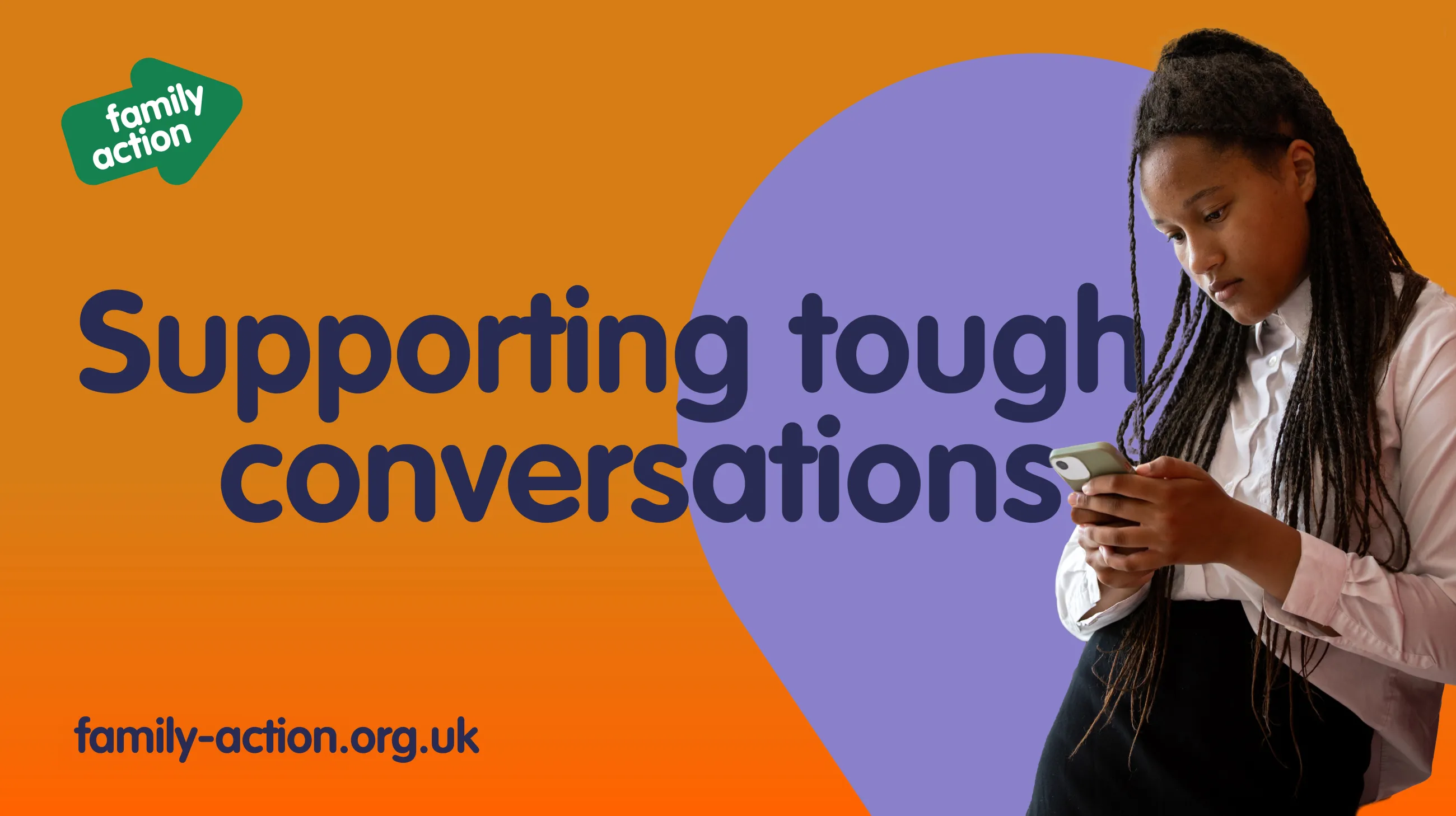
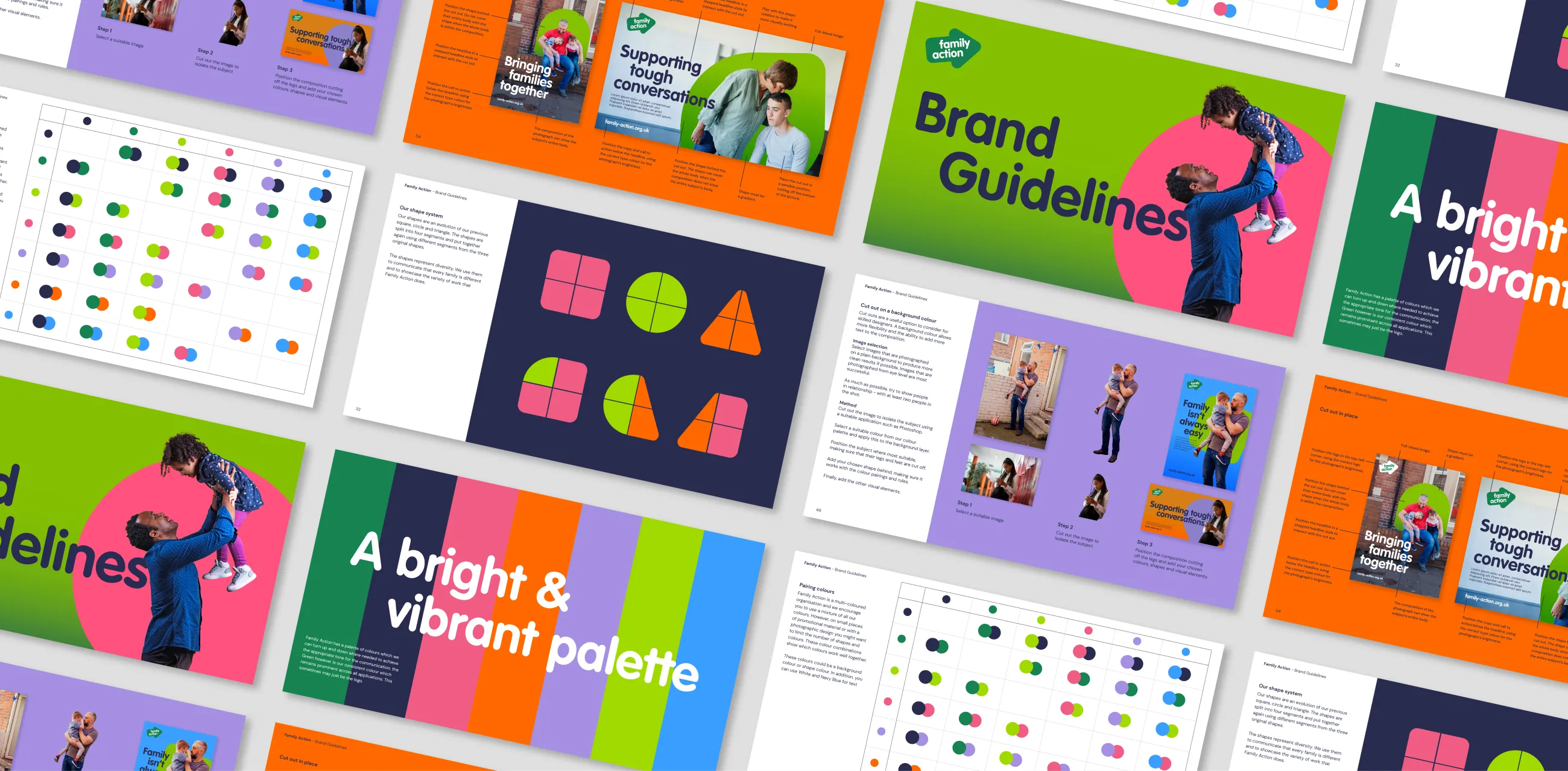
With visual identity signed off, we created an 80 page brand guidelines document for Family Action with detailed rules around co-partnership branding, accessibility and all the usual guidance around things like fonts, colours and photography.
We also created a suite of easy-to-edit templates in Canva to allow anyone at Family Action to create comms with no design experience necessary.
IE then began work on a new user-centred website for the charity. Before IE Digital arrived, the old Family Action website was really beginning to creak after 10 years of organic growth. There were no focused user journeys and a wealth of uncatalogued inaccessible content. The new website has been designed to make it easier for people to engage with the charity, whether they’re looking for support or want to make a donation.
