University Hospitals Sussex
Image

Client
University Hospitals Sussex NHS Foundation Trust
Services
Stakeholder engagement
Brand positioning & messaging
Visual identity
Brand guidelines & templates
Marketing collateral
Industry
Health charities
Health
NHS
The new University Hospitals Sussex NHS Foundation Trust needed a new brand and visual identity.
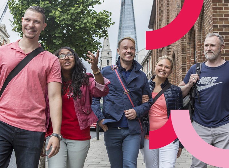
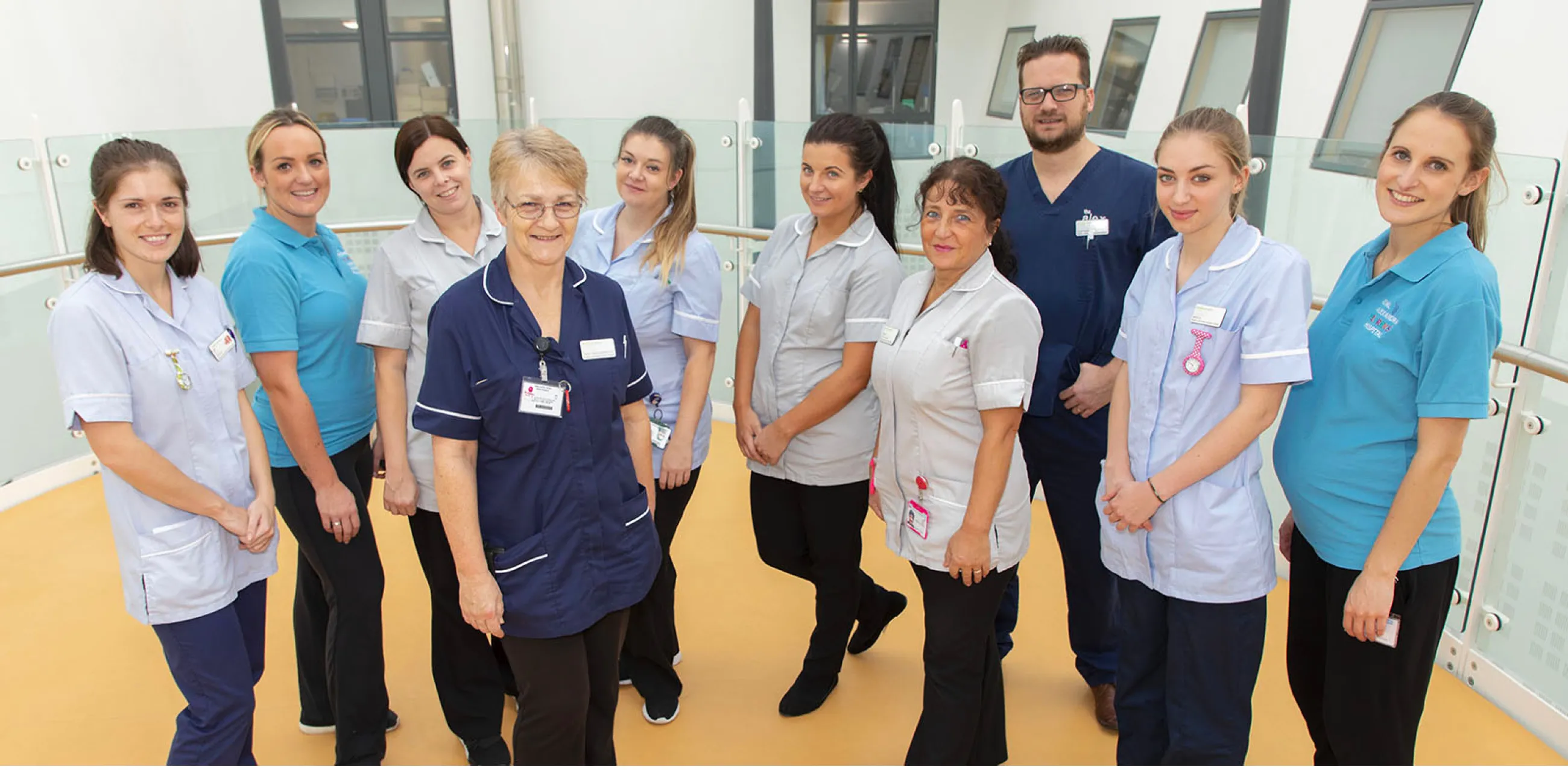
Formed from the merger of two neighbouring NHS hospital trusts, the brand needed to bring together two very different cultures in order to become one of the biggest trusts in England. The newly merged University Hospitals Sussex became one of the biggest trusts in England. It runs seven hospital sites, employs around 20,000 staff, and cares for 1.8 million people across Sussex.
From kick-off and stakeholder research through to messaging, visual identity and launch, the branding project was completed in just nine weeks.
Image
Image
Image
Listen
Merging two distinct NHS organisations
Two NHS hospital trusts had agreed to merge officially in April 2021. The new Trust needed a brand to bring these two disparate organisations together.
Two NHS hospital trusts had agreed to merge officially in April 2021. The new Trust needed a brand to bring these two disparate organisations together.
The existing trusts were ‘Western Sussex Hospitals NHS Foundation Trust (WSHT)’ and ‘Brighton and Sussex University Hospitals Trust (BSUH)’. They had worked in partnership for nearly four years, and already shared a leadership team.
With a few months to go, the Trust approached IE Brand to deliver a new brand and visual identity in double-quick time.
A cultural merger
The brand messaging needed to convey that the merger would be a union of equals. These were two distinct trusts, with different attributes, strengths, and personalities. And they were coming together to become stronger – for the benefit of patients and staff.
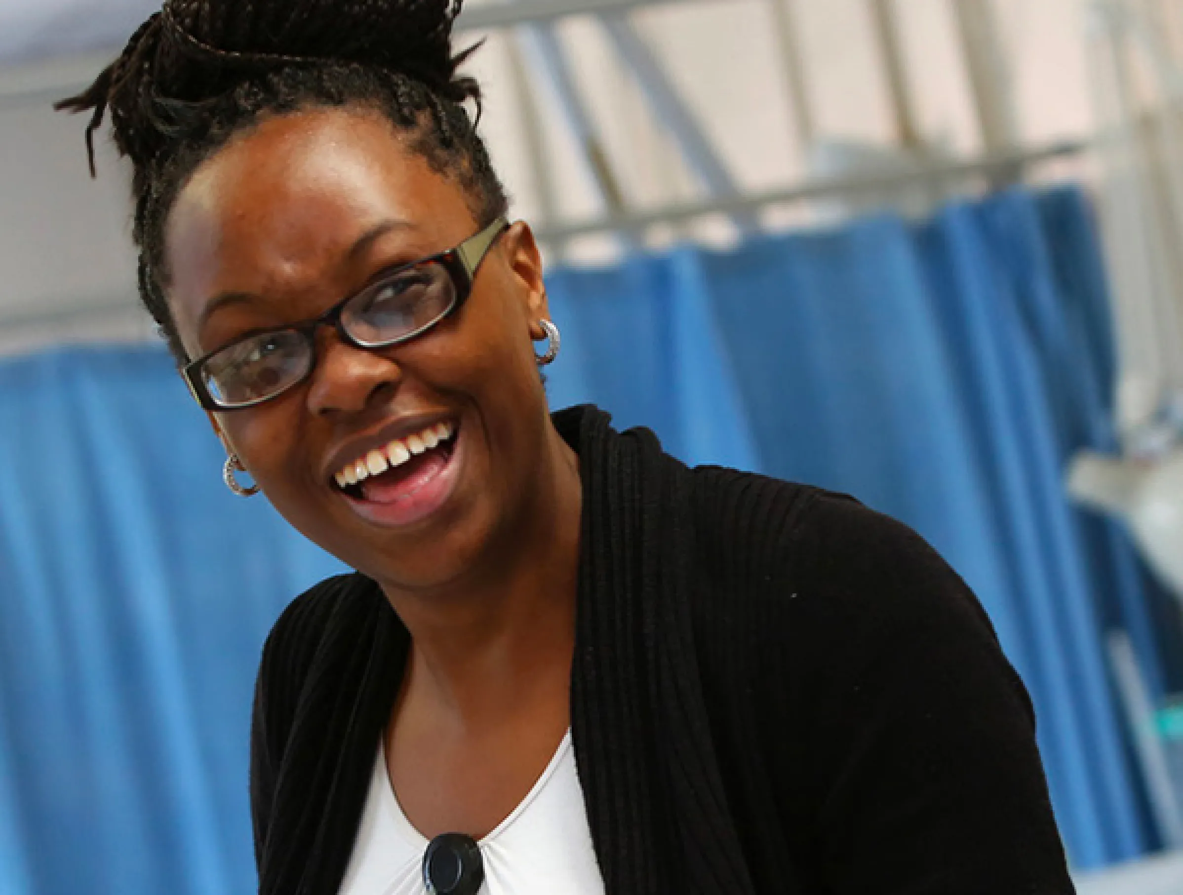
This was very much a merger of two cultures and, as with any merger, deep understanding of and close engagement with stakeholders from both trusts was critical. It was important that everyone felt a part of the process and could unite behind the new brand.
Immersion in the brand
With the clock ticking, IE's consultants began by immersing themselves in the organisation. We quickly got up to speed through desk research, digesting the client’s brief, analysis of existing research and the business case for the merger.
We also led immersion workshops and in-depth telephone interviews with internal stakeholders to capture perceptions from across the organisation.
The Trust praised IE’s ‘astounding level of understanding’ of the organisation in such a short period. They said we’d captured the essence of the two merging organisations superbly. We showed we really understood the implementation challenges they faced.
Image
Image
"We were very impressed by the speed at which IE Brand was able to gain an insightful understanding of the distinct cultures of the two merging Trusts, and delighted by the strength and clarity of their recommendations. Their team worked at extraordinary pace to meet our tight deadlines, whilst always taking great care to listen, explain their thinking, and ensure they took us with them along the journey."
Jonathan Keeble - Director of Communications and Engagement, UHSussex
Image
Advise
Becoming one NHS Foundation Trust
IE Brand distilled an intense period of research into a few honest truths.
Building community cohesion
We scrutinised the separate identities of the existing trusts. One very efficient and high performing, but less warm by personality. The other needing to improve performance, but culturally more diverse and with a stronger sense of identity.
The main thing the two trusts had in common was a natural cynicism towards the merger. The rationale for the merger was “Better for staff. Better for patients. Better for Sussex”, but these claims needed backing up. People on the front line needed convincing of the benefits. Most importantly, we needed to break down old barriers and build community cohesion from the ground up.
Banishing old boundaries
We presented our findings and ten core recommendations to the Trust leadership team.
The new Trust needed to reflect the NHS parent brand but create a personality of its own. We had to banish old boundaries, while celebrating the hospitals, clinics, services and individuals that form the team.
We advised the Trust to drop all existing internal borders and move to “we are University Hospitals Sussex” as quickly as possible.
Then we wrestled with the Trust’s brand architecture. We needed to bring order across the seven hospitals and their various departments, satellite locations, and sub-brands.
Image
Image
Deliver
An NHS brand to unite behind
Finding common ground
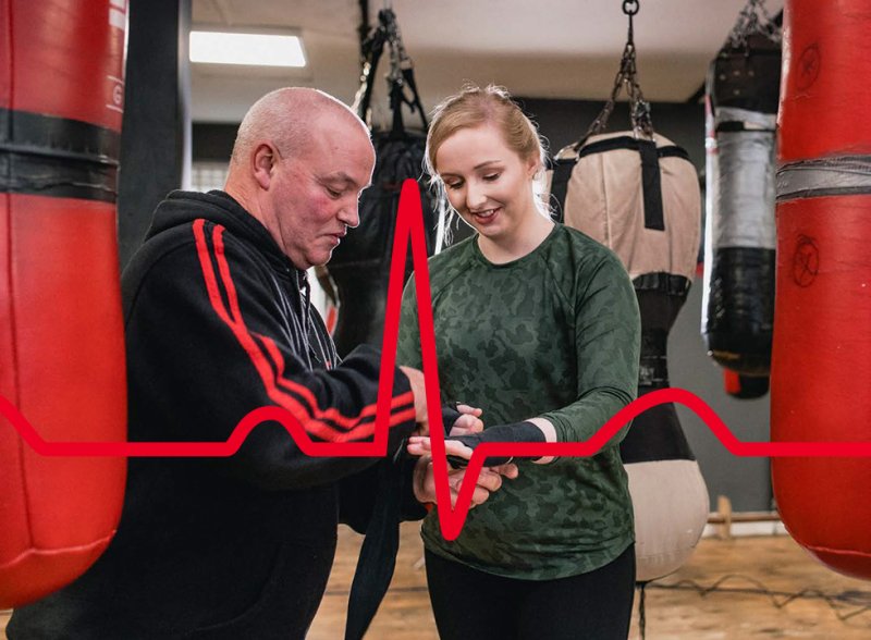
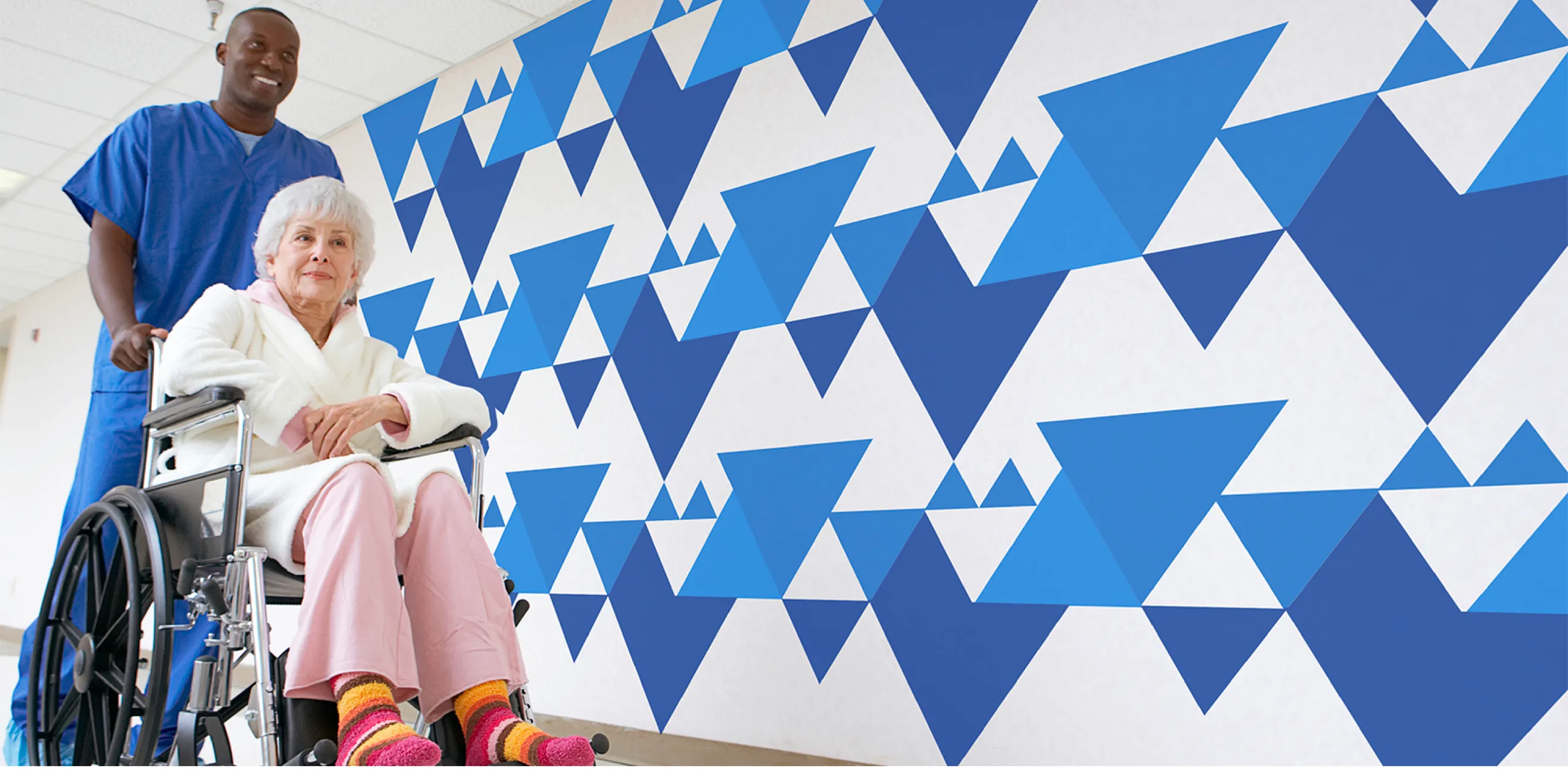
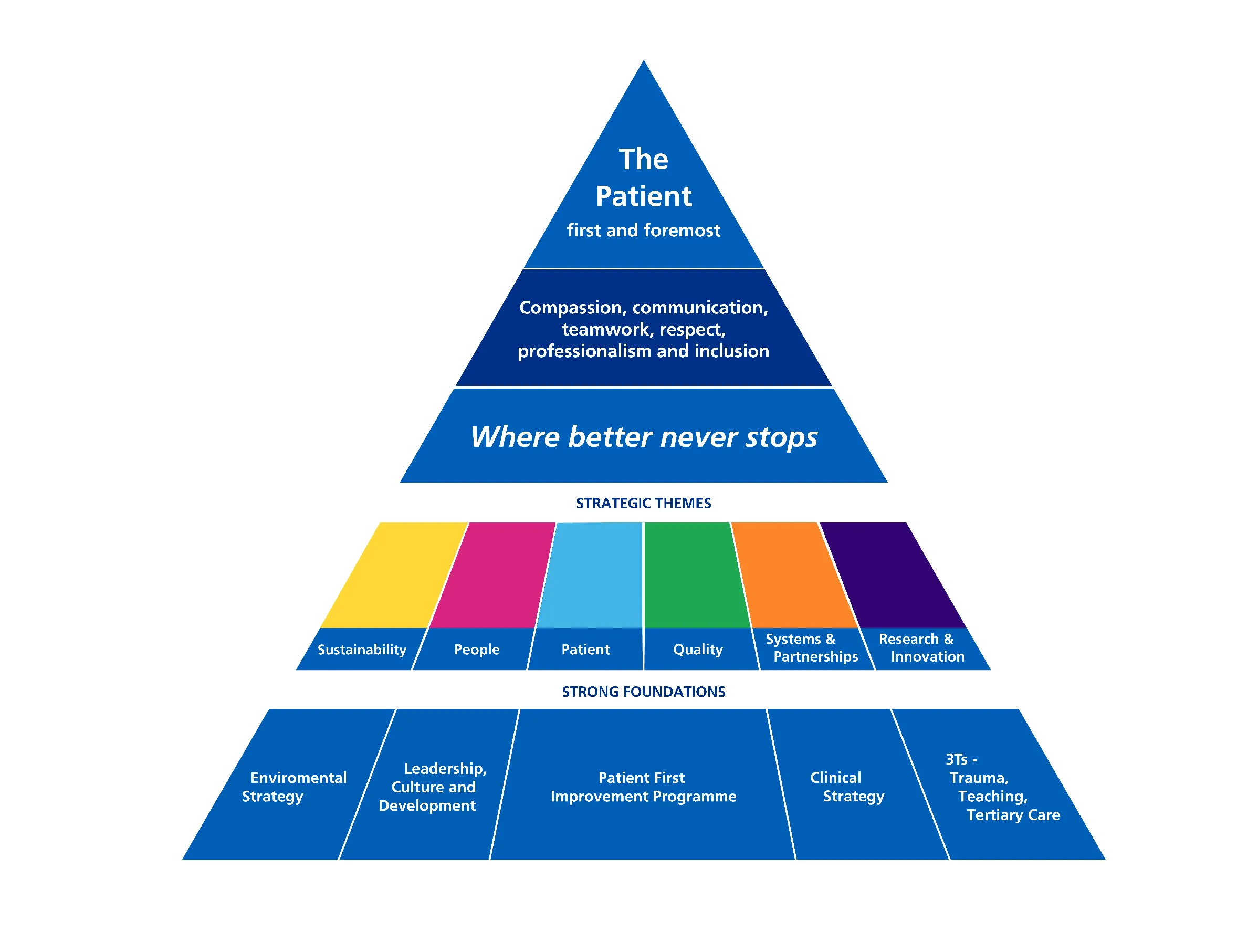
Beneath the overarching NHS visual identity, neither of the trusts had a strong visual identity of their own. But what they already shared was their Patient First Triangle. This key asset is at the heart of the Trust’s philosophy to transform the patient experience and quality of care.
The triangle was recognised within both trusts. For some, it represented what was special about the organisation. It had enormous potential to stand out and lead the field in a rather bland sector.
The Patient First Triangle had not yet been fully embedded. IE recommended the Trust reboot the triangle and put it at the heart of the new brand. This would give it a new lease of life and signal the Trust’s ownership of the philosophy.
Brand personality and tone of voice
With the Patient First Triangle at its heart, the Trust’s personality started to emerge. Based on our stakeholder research, the Trust is:
- Down to earth and approachable
Serious when needed but happy to lighten the mood when appropriate. - Decisive and driven
They never stop pushing themselves to be the best they can be. - Energetic and trail blazing
Resilient in the face of challenge. Always contributing to the changing face of UK health and social care.
For the next few years at least, the merger is key to the brand’s story. How two distinct Trusts came together for the benefit of patients and staff.
BSUH and WSHT have been relegated to history, but the Trust still celebrates its many different hospitals, clinics, and their individual voices. The Trust is not the sum total of its buildings, but all its people working together towards a common goal.
The strapline for University Hospitals Sussex became: Where better never stops.
And we prepared a series of campaign messages for a range of audiences including:
- Patients and Public
- Staff and Volunteers
- Prospective Staff
- Partners
- Government and Media
- Regulators and Unions
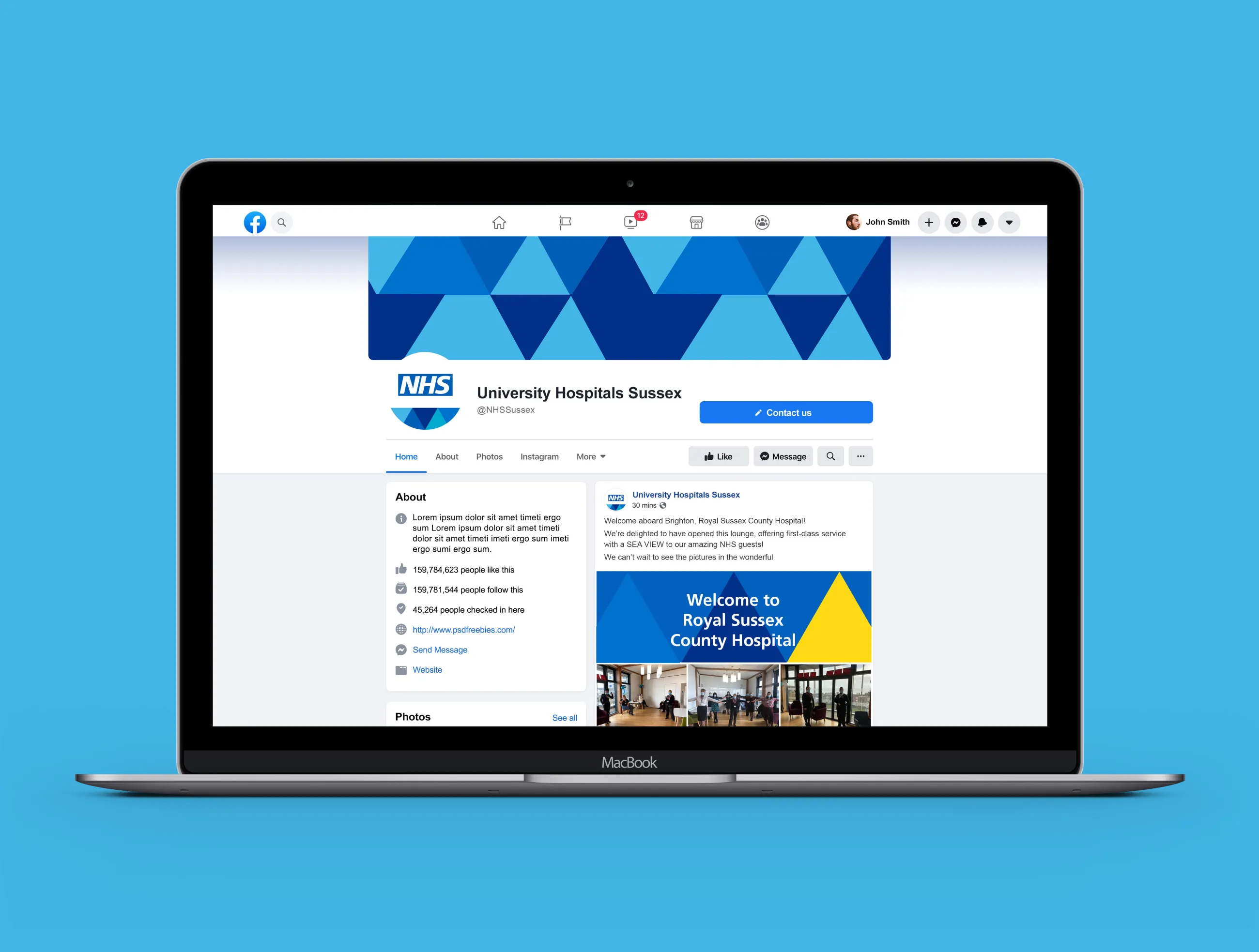
A bold, engaging visual identity
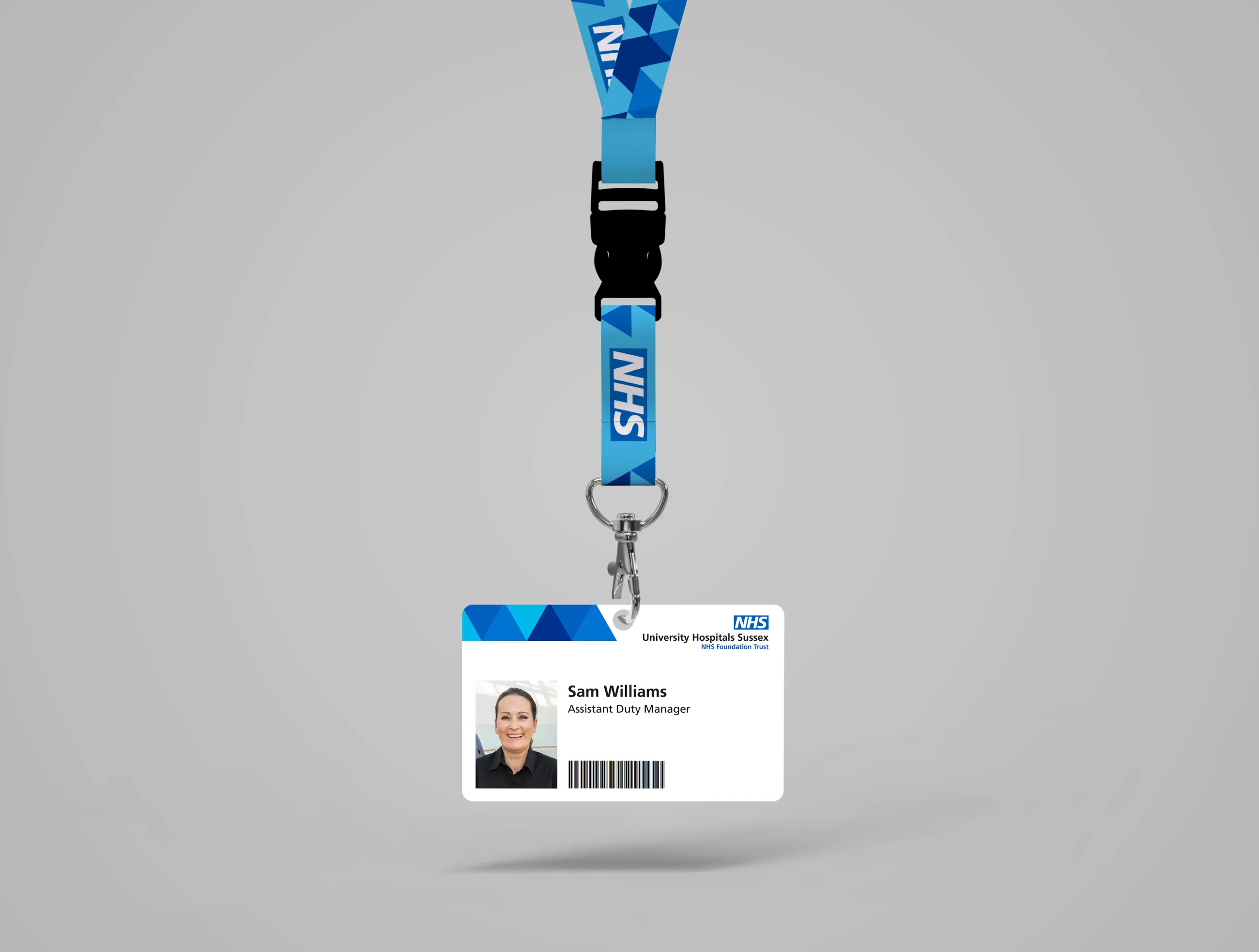
To signal the Trust’s ownership of ‘Patient First’, we placed an equilateral triangle at the forefront of its visual identity. This immediately struck a chord with stakeholders.
The triangle creates a flexible, distinctive visual identity, with bold, dynamic diagonals. It also forms patterns symbolising the NHS's network of organisations and the relationships within them.
The triangle also inspired the Trust’s choice of accent colours, taken from the NHS brand palette. These appear alongside the signature blues that dominate the NHS brand.
Image
Image
"A standout moment for me was the presentation of visual identity and messaging... IE's 'single solution' approach was both distinctive and scary in equal measure, so we approached the presentation with trepidation. As the slides unfolded we were struck by how the solution had clearly arisen from a deep understanding of the Trusts and what binds us together. It felt instantly authentic – a bolder, cleaner, more confident version of us."
Julia Knight - Content and Communications Officer, UHSussex
Image

Support
Supporting the launch
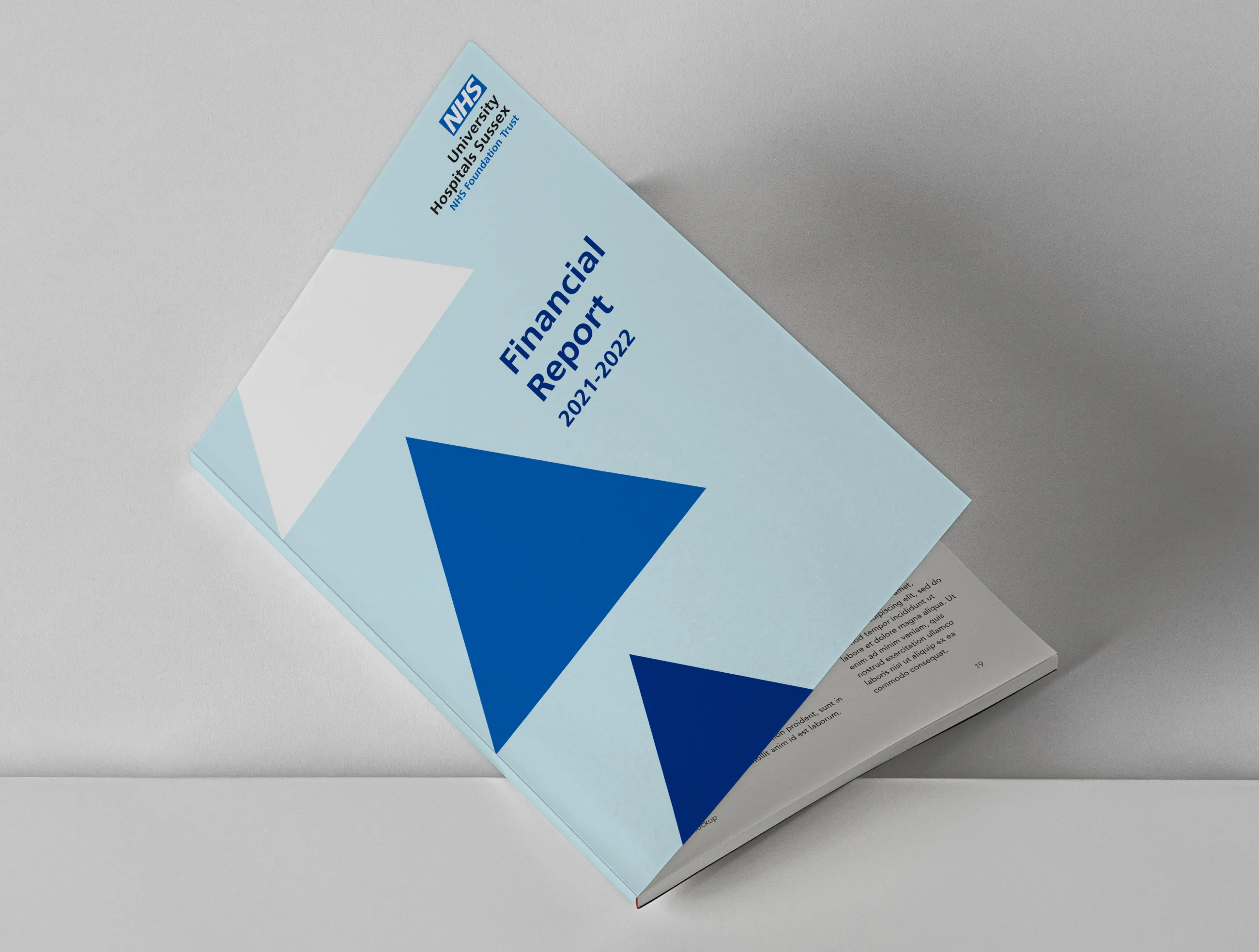
The rebrand took just nine weeks, from project kick-off to the Trust’s official launch in April.
This included the brand tone of voice and messaging matrix, visual identity guidelines and core collateral.
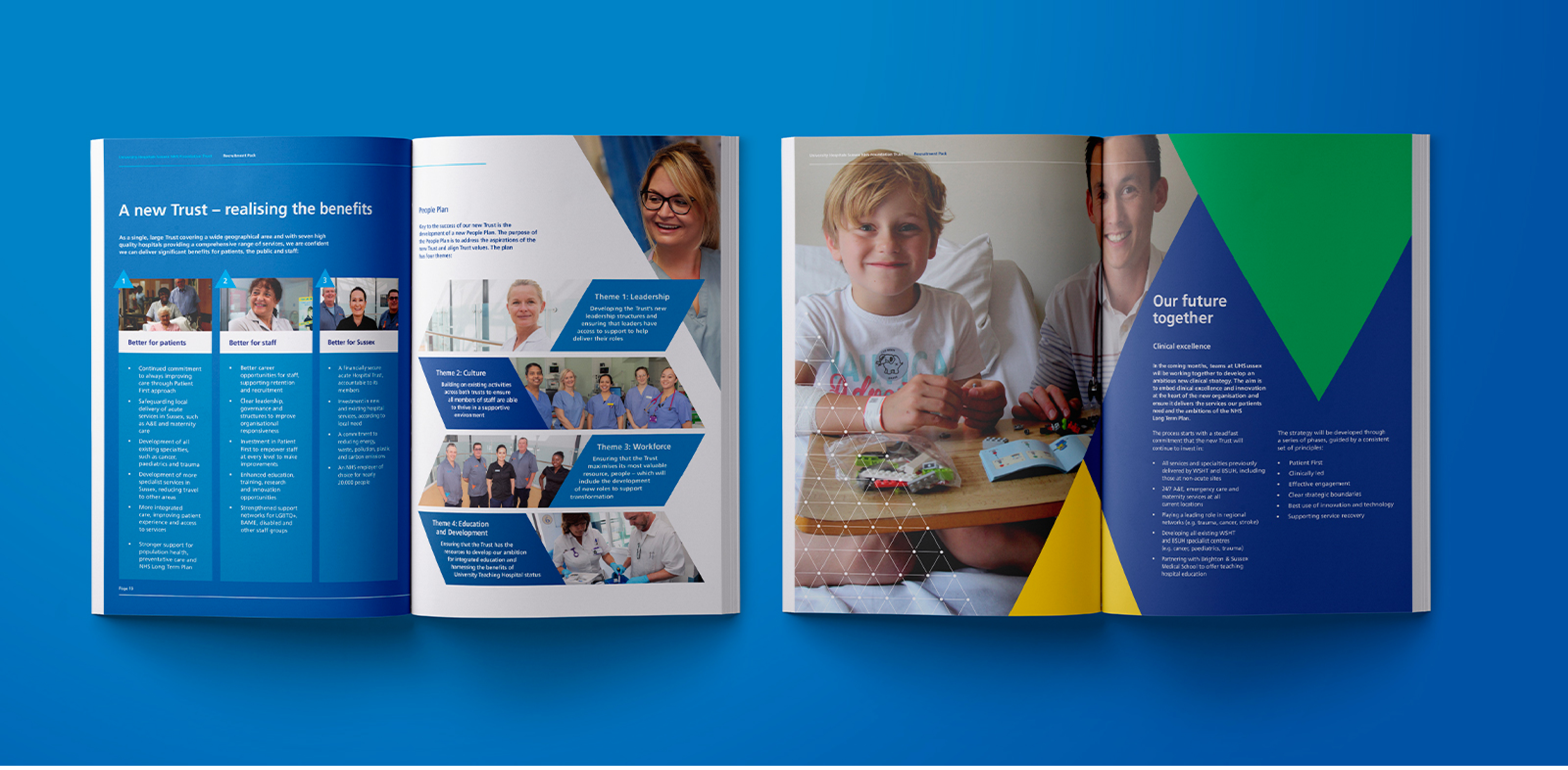
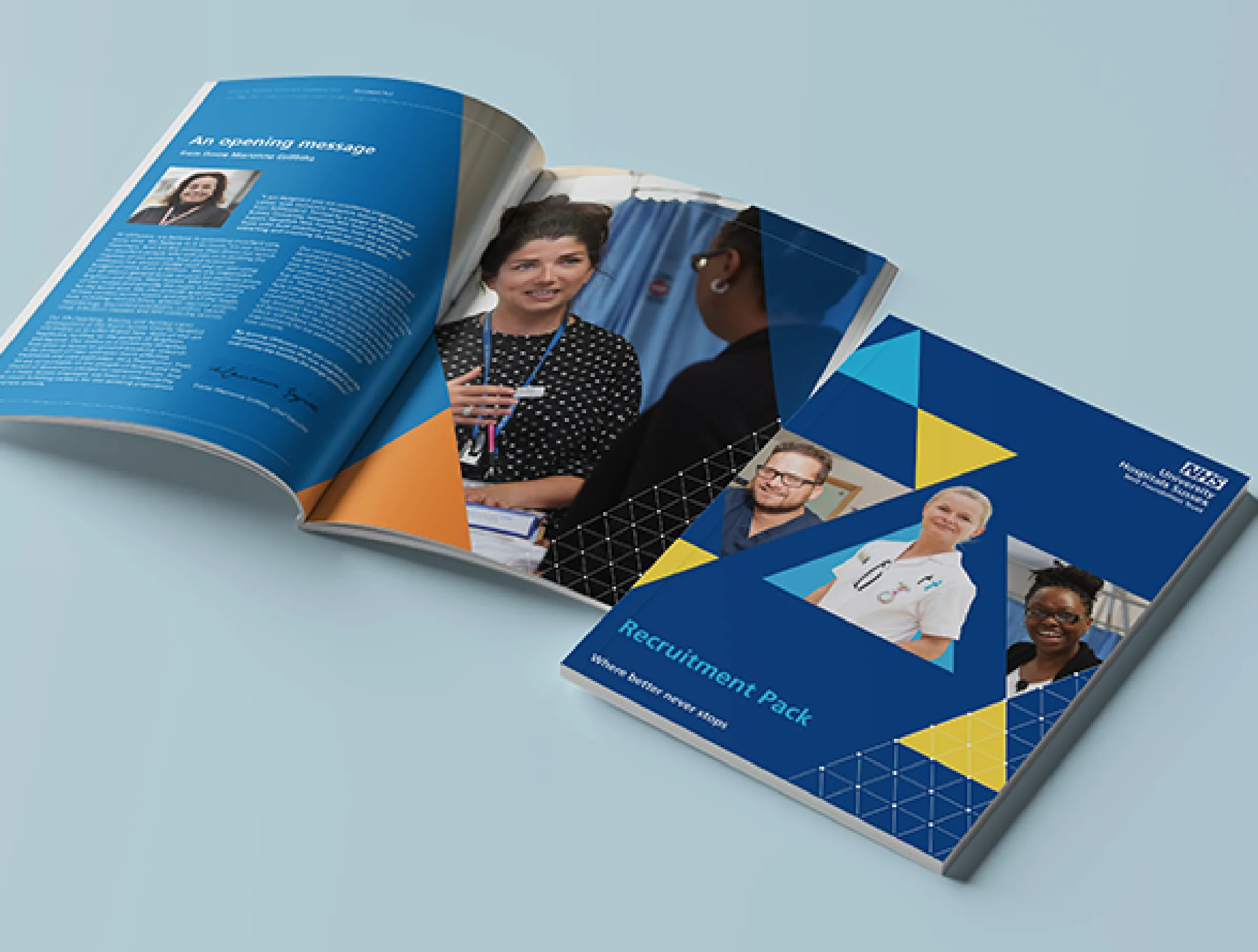
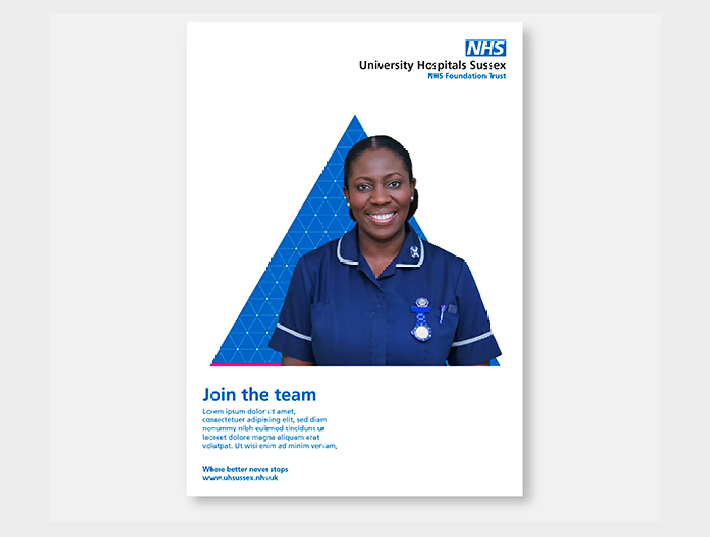
One flagship document was the Trust’s new recruitment pack. This was an important one to get right at a crucial time for attracting and retaining NHS staff. IE designed the pack and provide a template for the in-house team to create future branded documents.
Deliverables for the project included:
- A redrawn Patient First Triangle
- Brand guidelines and brand messaging
- Leaflet and poster templates
- Pull up banners
- PowerPoint, Word and email templates
- Social media and intranet assets
- Teams backgrounds and screensavers
Image
9 weeks to rebrand from kick-off to launch
1.8 million people across Sussex cared for by the new NHS Trust
20,000 staff employed across University Hospitals Sussex