
Bank Workers Charity

Bank Workers Charity offers a safety net to people that have worked in banks, along with their families. They help people to overcome challenges from their finances, relationships, mental or physical health, or career.

Before we landed
Bank Workers Charity wanted to reinforce its position as the leading support charity for people who’ve ever worked for a bank. They were also considering a name change – some people thought ‘bank’ too restrictive, and ‘charity’ carried a stigma.
The challenge we were set
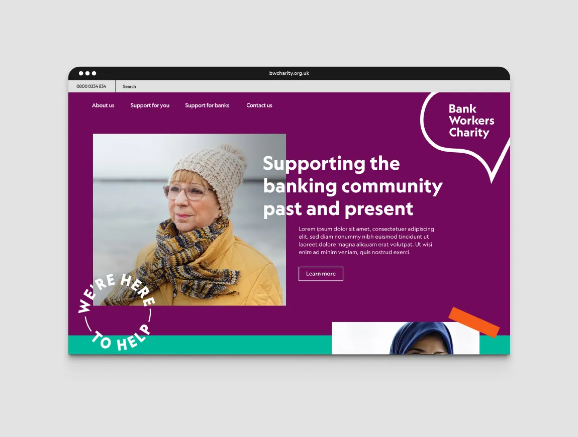
IE Brand conducted research with internal and external stakeholders. We concluded that there was no compelling case to change the name, instead they should embrace it. A name change carried too much risk, for limited reward. Instead, we introduced a strapline to clarify their work: Supporting the banking community past and present.
Our stakeholder listening showed that the charity had an excellent reputation, with people happy to recommend their services. The charity is warm and welcoming in phone conversations, but the brand identity didn’t reflect that warmth. We needed to close that gap and improve awareness, so we refreshed the brand messaging and visual identity.
The difference we made
IE Brand helped Bank Workers Charity to look and sound the part. We put people at the heart of the brand, using real stories to encourage people to start a conversation.
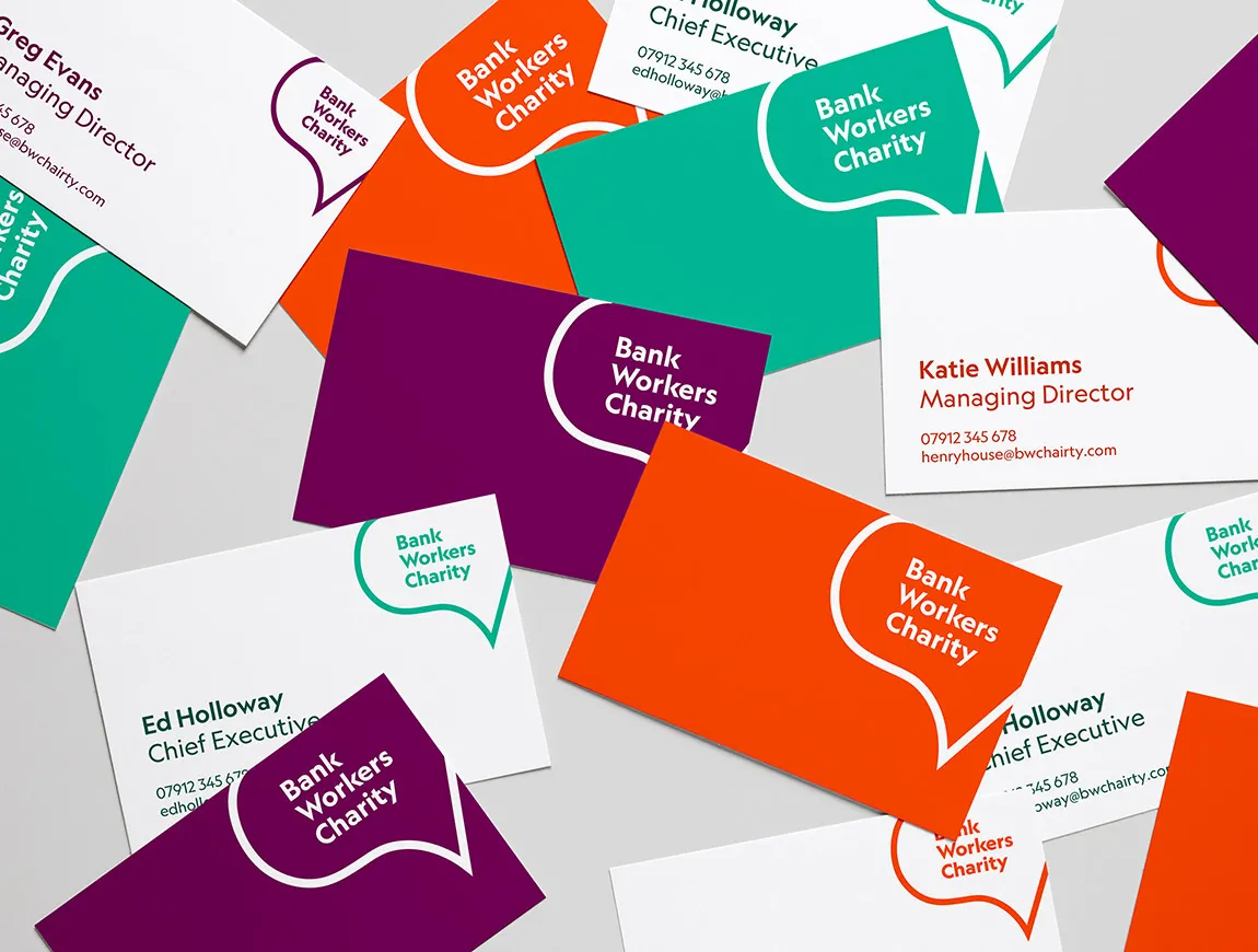
This focus on conversation translates into the new logo, turning a pound sign into a speech mark. We also dropped the initials BWC, instead proudly showing off the charity’s full name.
We commissioned a suite of simple, branded illustrations to convey the different services on offer. These combine with other elements in lots of ways: stamps, mathematical symbols, and photography. Comms are brought to life in bold, bright shades of mint, tangerine and plum.
The new tone of voice is more personable, warmer, and richer. It’s caring, non-judgmental and reassuring.
The rebrand allows Bank Workers Charity to adopt a louder voice on the national stage, acting as a thought leader, and advocating for the wellbeing of people in the banking community.