Royal Academy of Engineering
A project to craft impactful brand messaging for the Royal Academy of Engineering to ensure their new five year strategic vision is accessible. And then an ambitious new visual identity to communicate the Academy’s credibility and experience, while promoting it as a leading voice in engineering and technology.
The Royal Academy of Engineering harnesses the power of engineering to build a sustainable society and an inclusive economy that works for everyone. Together, they’re working to solve the greatest challenges of our age. To become a Fellow of the Royal Academy of Engineering is to be recognised as one of the UK’s best engineers, and these Fellows give their time to support these wider goals.
The distinctive new logo and visual identity epitomise an organisation that is creative, intelligent, inspirational and prestigious.
Impressed by our work on an earlier project to create its EngineeringX sub-brand, the Royal Academy of Engineering invited IE Brand to review their core brand messaging.
The Academy had developed a new five-year strategic plan, and it was IE’s job to articulate this strategy for external audiences across five segments:
- Fellows of the Royal Academy of Engineering
- Engineers in industry and academia
- The general public
- Policymakers
- Companies & partners.
The new strategy emphasises the role of the Academy and its 1,600 Fellows – who give their time voluntarily – in advancing and promoting excellence in engineering for the benefit of society. They influence policy, grow talent, build global partnerships and drive innovation.
Audience testing for brand messaging
IE mapped out the drivers, calls to action and marketing messages as appropriate for each of these audiences and tested the messaging in a series of workshops and – due to the COVID-19 lockdown – telephone interviews.


Our draft tone of voice tested positively overall, and the research helped our copywriters to tease out the main language hooks that resonated with the Academy’s audiences. Certain key words came through loud and clear like credible, expert, and ambitious.
Incorporating audience feedback
Our test audiences were also keen to see an emphasis on simplicity and accessibility for top-level communications – but never at the expense of credibility. It’s important that the Academy keep things simple and concise for its introductory comms. But once they have established a relationship with the reader, they are free to share content that’s authoritative, technical, and detailed.
Testing also showed that the Academy should highlight its role in bringing people together. They assemble leading engineers in business and academia alongside policymakers and educators to advance engineering’s contribution to society. And they act as a catalyst for finding creative solutions to some of the world’s greatest challenges.
Messaging matrix and strapline
Following our research, IE Brand honed the final messaging matrix to incorporate these insights and reflect the confidence and ambition of the new five-year plan.
Our new brand messaging captures the essence of the Academy’s mission and runs across all of their comms, including campaign materials and published research.
With the final brand messaging approved, the Academy needed a new visual identity to take it into the next five years and beyond. They needed a modern, progressive brand to show the Academy as a leading voice in engineering and technology.
Having already been impressed by IE's messaging work, the Academy appointed IE Brand to develop the brand’s look and feel too. Our design team created a bold, colourful and exciting visual identity, with a new logo at its centre.
Re-imagining the logo
The Academy’s previous icon was inspired by a Stone Age flint, one of humanity’s first engineering triumphs. The new marque is an evolution of the flint, making it sharper and more precise. It has a three-dimensional, geometric feel and suggests engineering systems and processes. It’s intriguing, open to interpretation, and lends itself well to animation.
Bespoke font, vibrant colours and geometric shapes
We created a distinctive custom font – Montserrat Engineered – to be used sparingly in campaigns and on covers for maximum impact and differentiation. This sits alongside the brand’s core sans serif font.
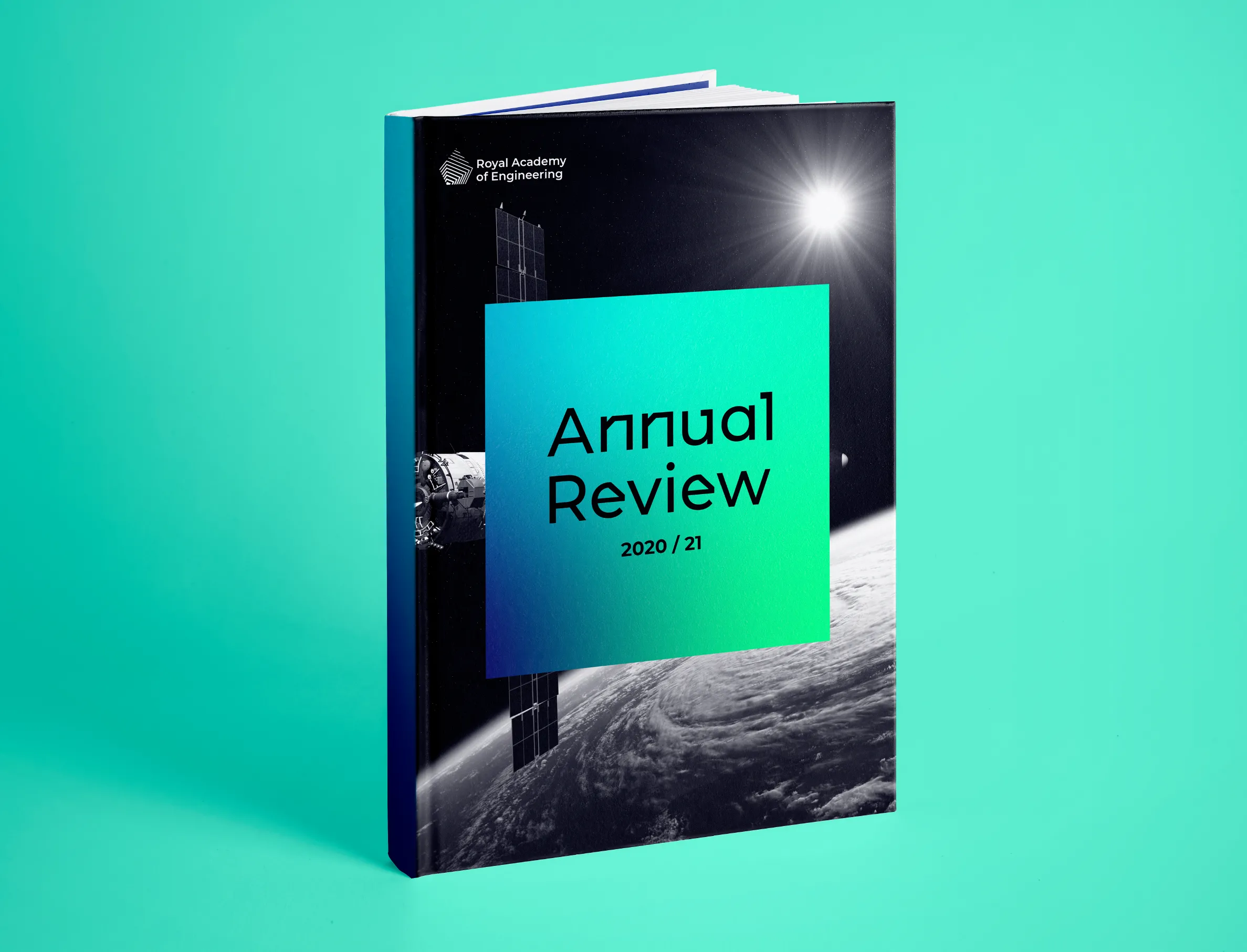
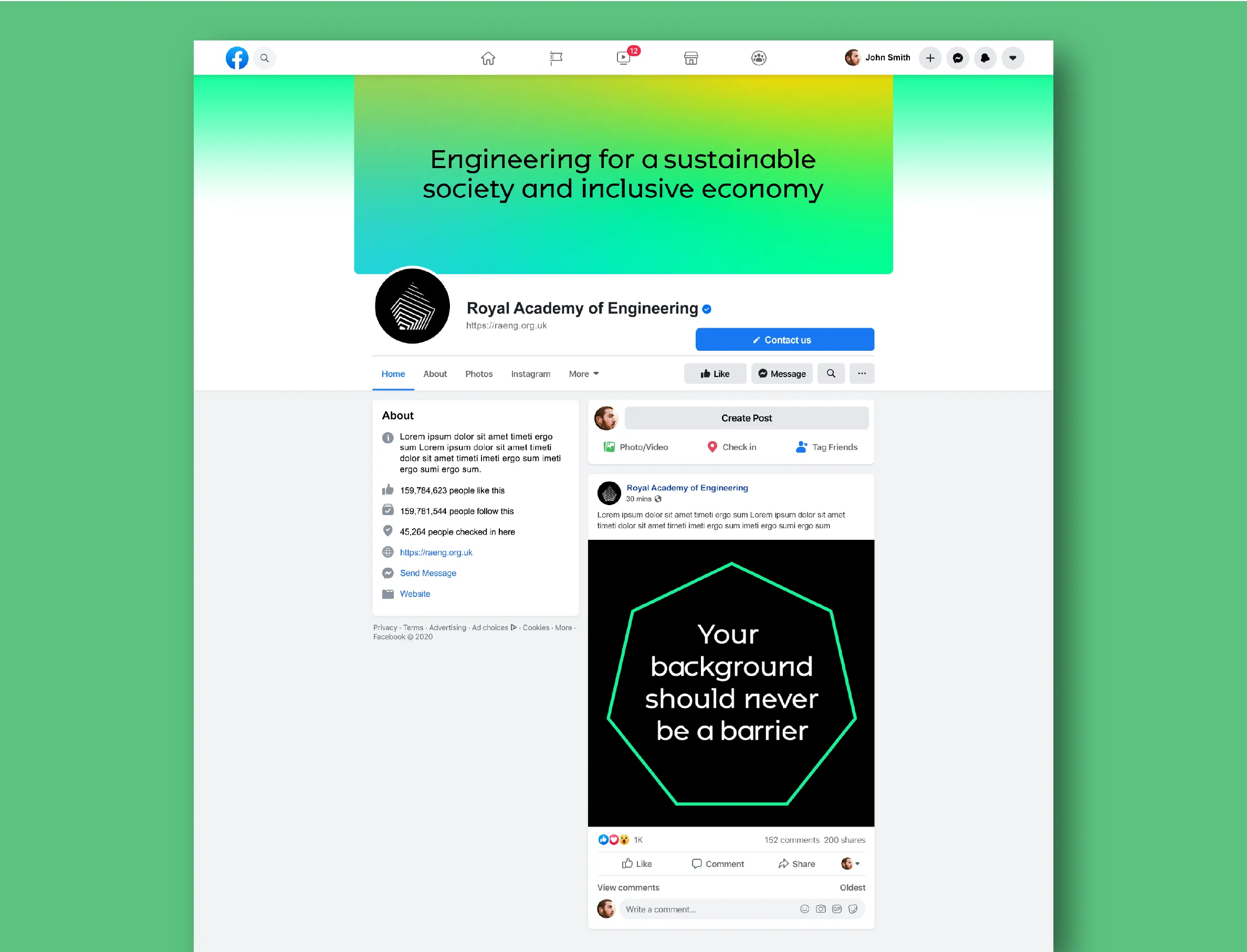
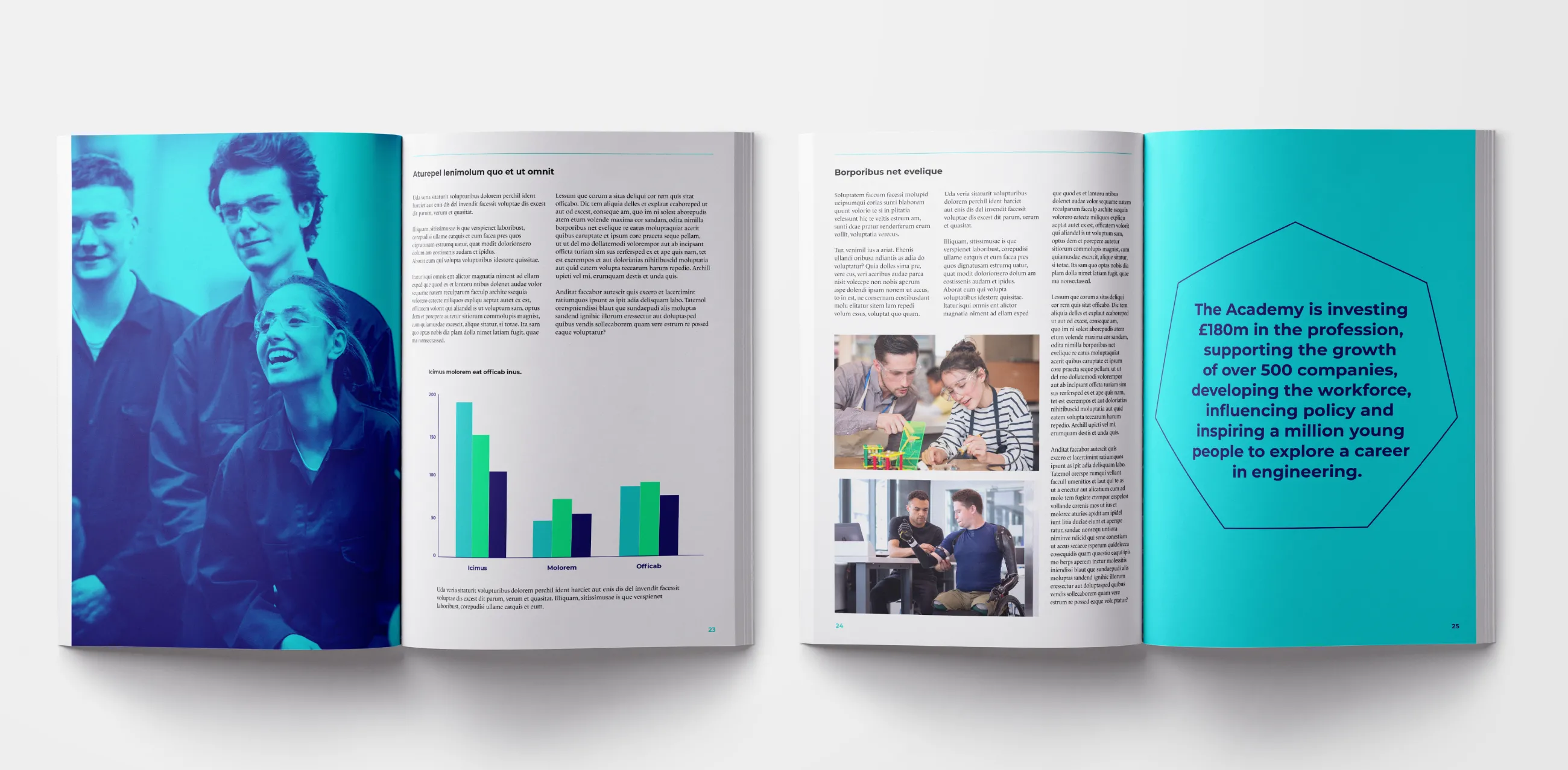
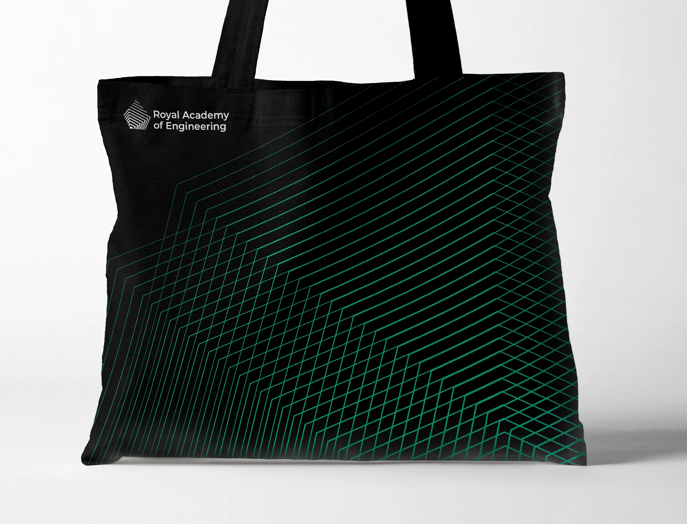
The brand uses high-impact monochrome visuals, complemented with a vivid palette of arresting colour gradients. A set of geometric shapes inspired by the logo is used across comms to contain dynamic photography, quotes and statistics. Finally, we created a set of bespoke geometric patterns that can be used alone or together to bring collateral to life.
The new visual identity can flex between being public-facing – such as a campaign to promote careers in engineering – and appealing to engineering professionals and Fellows in prestigious reports. It epitomises an organisation that is creative, energetic, intelligent, and inspirational – while exuding the prestige and credibility of a Royal Academy.

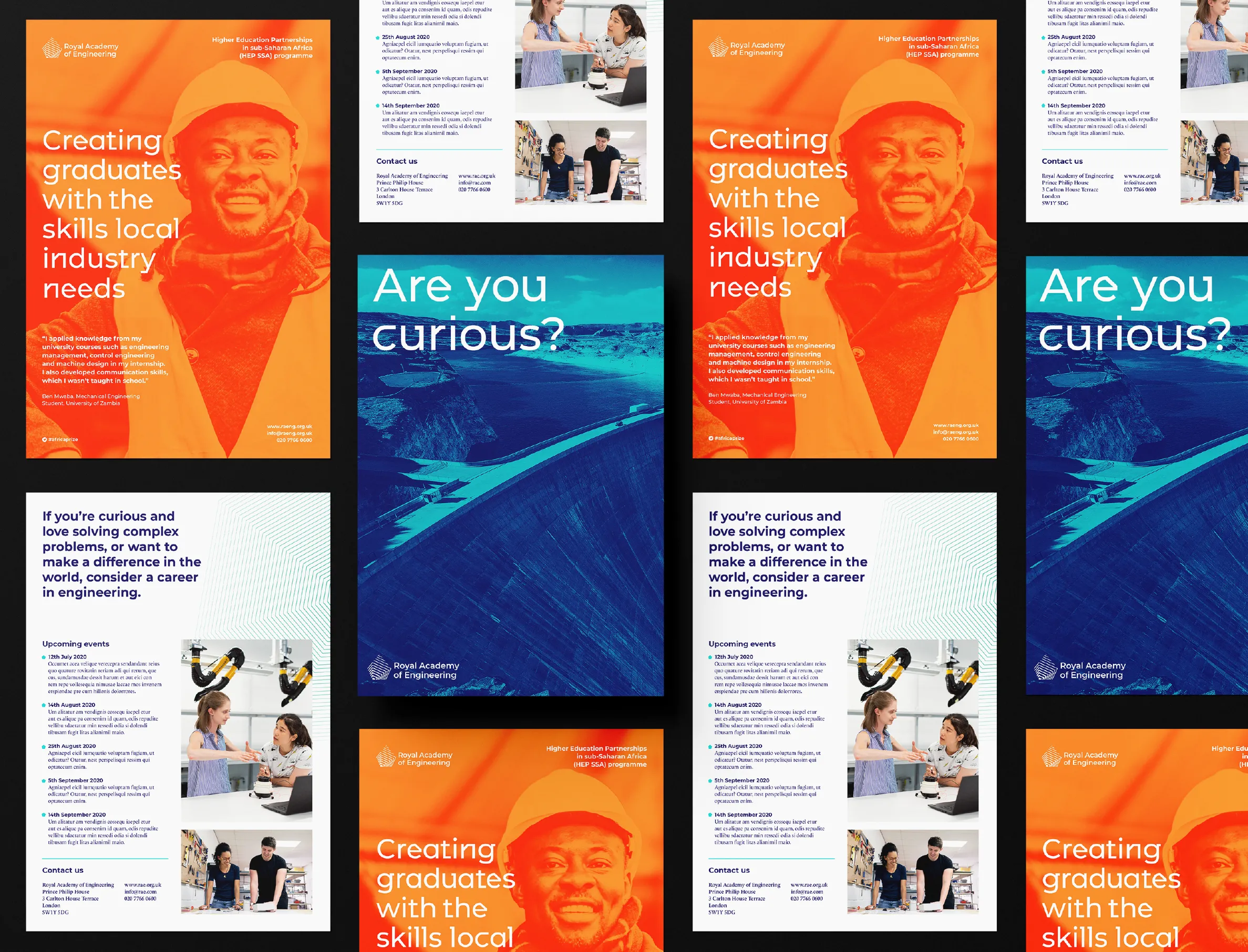
Finally, IE Brand created detailed brand guidelines for the Academy. Along with a set of key templates, these allow the Academy to roll out the new brand easily and consistently.
The brand book shows the visual identity in a wide range of applications – from STEM resources aimed at secondary school pupils, through to prestige publications for formal landmark events, and everything in between. It also demonstrates how the new brand works alongside partners and existing subsidiary brands.
Meanwhile, the messaging matrix is a practical tool, supporting the Academy to write and re-write on and offline comms in the new tone of voice and hit the right calls to action.
Later, IE Digital designed a modern, user-centred and flexible new website for the Royal Academy of Engineering, to bring the new brand and visual identity to life. The new site strengthens the Academy’s position as a leading voice in engineering and technology, and celebrates what they do in a more dynamic and engaging way. Read the website case study.


