IE Brand works with charity, health and education clients up and down the UK, as well as internationally. Sometimes we work for large charities and universities that are household names, and sometimes we help small health and social care providers, colleges, or charity startups with big ambitions. If you’re a values-driven organisation with a challenge, then we’d love to add you to our list of clients!
- Home
- Brand Clients
Brand Clients


WDP is a charity providing drug and alcohol treatment and recovery services in London, the South East and the East of England.
CloseIE Brand demonstrated an impressive level of insight in supporting WDP through a significant rebranding exercise. Quickly managing to grasp our vision and our values, IE delivered a fantastic new brand and style that we are sure will serve WDP well for many years to come.
Sue Clements
Chief Executive, WDP
 Get in touch


Following a substantial restructure and investment programme the University of Birmingham’s Careers & Employability Centre recognised that a rebrand – including a new name – was going to be vital in helping them communicate organisational change.
They wanted to raise awareness and engagement levels and achieve ambitious targets for student satisfaction, employer ranking and national awards. Immersing ourselves in the university's audience research and value proposition work, IE Brand identified the brand's essence – connectivity, which led to a new name – Careers Network – and audience-specific straplines for students, staff and employers.
We then created a distinctive visual identity using 3D, photographic typography and a rich set of graphical assets to embody the ‘real voices’ of students. Student engagement increased by 289% and the work won two European Transform Awards.
Read more about Birmingham's Careers Network brand or explore IE's other rebranding work with university careers services.
CloseIE Brand really understood what we needed to achieve. We are delighted with the brand, design and messaging and – more importantly – our stakeholders have really taken to it and we are enjoying much higher levels of brand recognition.
Eluned Jones
Director of Student Employability, University of Birmingham Careers Network
 Get in touch

Anawim helps women in and around Birmingham. Their Women’s Centre is a safe space for those struggling with trauma, the criminal justice system, domestic abuse, addiction, mental health, sexual exploitation – any woman who needs their help. Their wrap-around services and specialised caseworkers can transform women’s lives.
Read our full case studies on how we rebranded the charity, and how we designed and built their new website.
CloseWorking with IE has been transformative for Anawim. The level of research undertaken with such a broad range of Anawim’s women, staff, volunteers and supporters has enabled us to really delve into what makes Anawim unique and enabled us to work together to realise who we are and what we stand for. We have no doubt that our new brand will not only enable Anawim to reach more women who need support, but will also encourage more people to engage with, fund and learn more about Anawim and its values.
Emily Johnson
Fundraising and Communications Manager
 Get in touch


Branding and website design for a new NHS campaign brand. Time to Talk comes from NHS West Sussex Talking Therapies, part of Sussex Community NHS Foundation Trust.Time to Talk offers a free, confidential service for adults in West Sussex. It's the only NHS Talking Therapies provider in West Sussex, and one of the leading services in the country. They provide a range of talking therapies and other treatments for adults with mild to moderate anxiety and depression, and other mental health conditions.
Close
 Get in touch

A new brand, visual identity and logo for Highlands School, a high-performing, mixed comprehensive school serving the west side of Enfield. The new look debuted in September 2022 for the new academic year.
Close
 Get in touch


IE created a new education brand and website for the AgriFood industry. As a collaboration between six UK universities – Reading, Nottingham, Aberystwyth, Harper Adams, Cranfield and Bangor – the AFTP is the bridge between industry and academia. Their postgraduate-level courses translate cutting edge academic research into applied industry expertise, helping the industry’s best talent to deepen their knowledge, advance their skills, and progress their careers.
The AFTP brand is defined by its close relationship to industry, so the new visual identity is firmly rooted in the world of AgriFood, not the classroom, to celebrate the best the industry has to offer.
CloseFrom the moment we first walked into the studio I was instantly impressed with IE’s warmth, professionalism and passion for brand and marketing that I was looking for to transform three existing brands into a single exciting new one.
Deborah Kendale
I believe that all our team, across six universities have been delighted with the results of the project and we are now working together to develop the ideas and messaging our brand now represents. IE took time to painstakingly tease out the issues at the heart of our market and understand both what makes us tick as organisations and what our market demands; to give us the credibility and edge that we were looking for in a new brand and image.
For us, a project of this scale was daunting but with IE’s creativity combined with strong project management skills, I believe we have produced an excellent start to the project that will help us attract the participants we need to make the AFTP a success.
Business Development and Marketing Manager, University of Nottingham / AFTP
 Get in touch


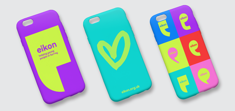
Eikon is a charity helping young people in Surrey to feel safe, heard and supported. They wanted their brand to better resonate with children and young people, and they also needed it to work harder to support fundraising.
IE Brand created a vibrant new visual identity for Eikon, including a new logo and strapline, and updated brand messaging, to reflects the charity’s fun, active and engaging approach to its work, while protecting Eikon’s credibility with commissioners, schools and partner organisations.
Close
 Get in touch

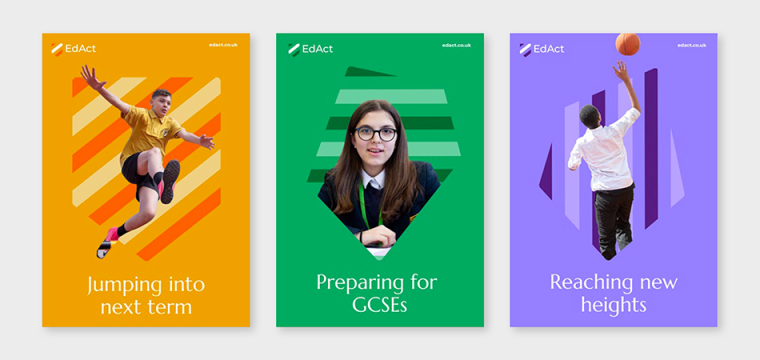
EdAct is an established Multi-Academy Trust with five locations across North London, proudly working together to provide an exceptional education for the local community.
Close
 Get in touch

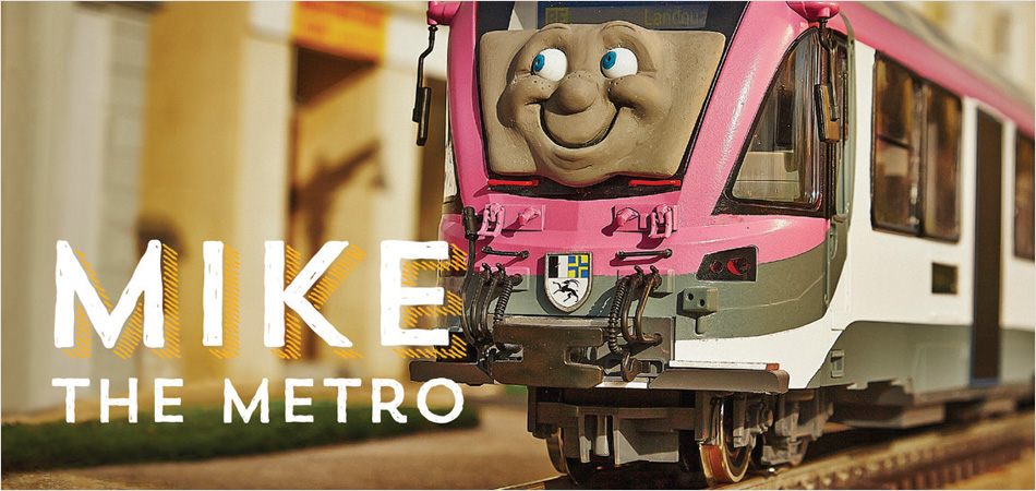
Network West Midlands works with public transport operators to improve the regional transport structure.
Explore how we created the Commuterland films for Network West Midlands.
Close
 Get in touch


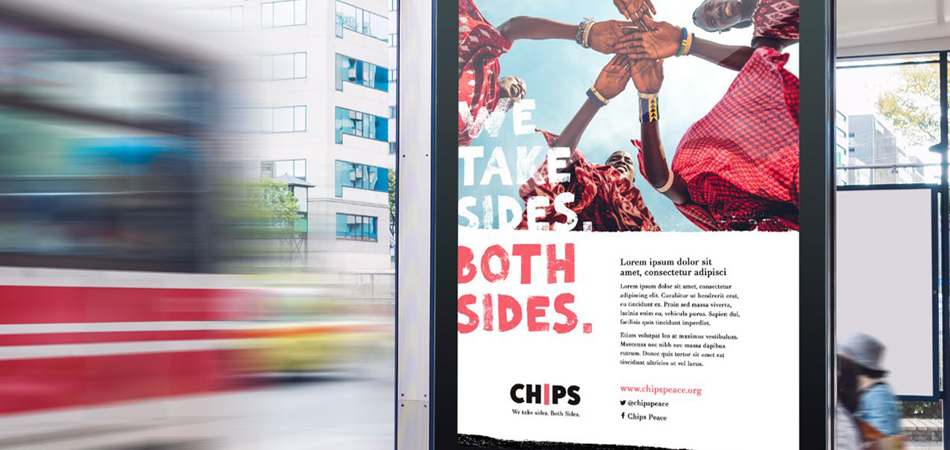
CHIPS (Christian International Peace Service) is a charity that joins with communities from both sides of a conflict – from Brixton to Ghana – to help build sustainable futures free from violence and division.
CloseOur brand and identity are the key to communicating our personality, and if truth be told, were in dire need of a spruce-up. We ran the risk of being overlooked as out-of-touch and irrelevant, even as the work we do – with real people, in real communities – becomes even more needed.
Paul Maxwell-Rose
We chose IE Brand for their branding expertise and thorough, considered approach to the process. They were excellent at guiding our team, and challenging us where we needed to be challenged. We felt in very safe hands and thoroughly enjoyed working with their team and seeing the new brand and design emerge. IE Brand's wise, high-quality work to rebrand CHIPS will lead to a step-change for the charity. We’ll now be able to shout louder with less effort. It’s a great investment in the future. Awesome work!
Director
 Get in touch

A rename and rebrand for a leading training provider for science and technology apprenticeships.
Over the past decade Youthforce had grown significantly. They had changed, and so had the world. Apprentices can be any age, and the name was causing confusion, so IE Brand renamed them Tiro – a Latin word meaning novice, recruit, apprentice, beginner and soldier.
The brand's new brand messaging, visual identity and re-skinned website reflect the challenging, authentic and excitable business Tiro is now.
Close
 Get in touch



University of Bristol is one of the most popular and successful universities in the UK and was ranked within the top 50 universities in the world in the QS World University rankings 2016.
Ahead of a larger university-wide brand review, Bristol engaged IE Brand to carry out a piece of brand architecture work to look at how various areas of the university and its sub-brands fit together. We went on to deliver research and consultancy for three of its internal university services: Careers, Sport and Catering.
For each one we developed new brand messaging and visual identities, to be applied to everything from food packaging and sports kits to social media and building signage. We also devised launch campaigns for the catering brand, Source, and the relaunched Careers service.
Read more about Bristol's new sub-brands or explore IE's other rebranding work with university careers services.
Close
 Get in touch

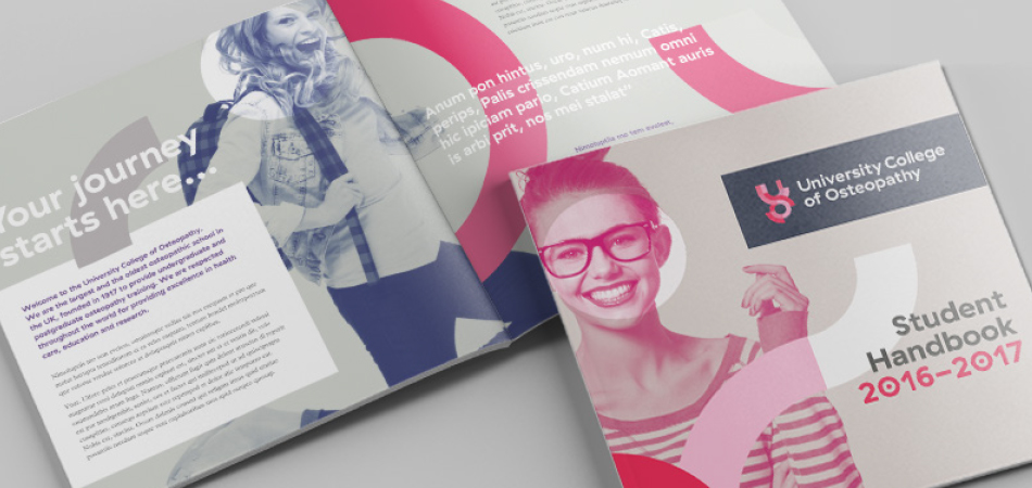
When the British School of Osteopathy was granted University College status, they became the first degree-awarding, specialist osteopathic institution in the world. To make the most of this unique status, they needed to review their name and their brand. With IE's help they've become the University College of Osteopathy (UCO).
IE Digital developed two new websites for the University College and its clinic. Early in the consultancy it became obvious that the clinic needed a separate website to address the specific needs of its user base, so the two sites have been designed and developed in parallel to accommodate the differing user journeys, while maintaining close links and a consistent look and feel.
CloseIE has led us expertly through a significant rebranding project, engaging with key stakeholders and ensuring buy-in at every stage. We’re delighted with our new visual identity and how IE has brought it to life online.
Charles Hunt
Principal and Chief Executive, University College of Osteopathy
 Get in touch

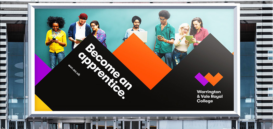
Warrington & Vale Royal College was created from the merger of two post-16 Further Education colleges – Warrington Collegiate (ranked 8th in the country) and Mid Cheshire College. The college needed a new brand identity to signal change for the new college and its sixth form.
Explore how we created the new Warrington & Vale Royal College brand.
Close
 Get in touch


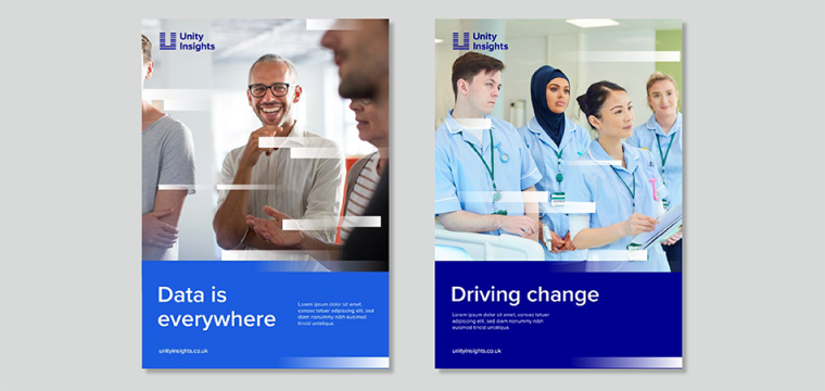
Unity Insights offer bespoke analytics and evaluation services to the NHS, academia, innovators, and industry.
Close
 Get in touch


