IE Brand works with charity, health and education clients up and down the UK, as well as internationally. Sometimes we work for large charities and universities that are household names, and sometimes we help small health and social care providers, colleges, or charity startups with big ambitions. If you’re a values-driven organisation with a challenge, then we’d love to add you to our list of clients!
- Home
- Brand Clients
Brand Clients


The University of York is a top 20 UK university with a strong record of employability – it comes top of all the Russell Group universities for the proportion of graduates in work or further study three years after leaving.
In spite – or perhaps because – of that success, the Careers brand had been neglected and no longer represented the services on offer. They needed to increase visibility and drive engagement with a compelling strategy, simplified brand architecture, clear and concise messaging and an arresting visual identity.
IE Brand helped UoY to achieve just that, creating a more mature brand for Careers with strong calls to action and a more challenging tone. The new brand sets expectations higher and emphasises a less passive, partnership approach between students and the careers team to maximise their prospects.
Read more about York's careers brand or explore IE's other rebranding work with university careers services.
Close"IE Brand's sector expertise, combined with their collaborative, co-creation approach, has enabled us to introduce a university wide employability brand that all key stakeholders are really pleased with. Since being unveiled, the high quality, impactful visuals have been championed by central Marketing and adopted by key employability providers to deliver consistent and engaging messaging to our students."
Louise Thurston
Strategic Project Manager: Communications and Engagement (Careers and Placements, Student and Academic Services)
 Get in touch


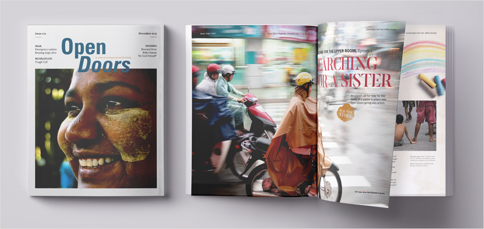
Open Doors International (ODI) serves persecuted Christians worldwide through bible delivery, bible training, practical support, advocacy and prayer.
IE has worked with ODI on projects as varied as a supporter magazine toolkit, a gamified interactive learning resource, a 60th anniversary logo and digital consultancy around customer journeys through ODI's suite of international websites.
We were also commissioned to undertake a comprehensive brand audit to inform the future development of the Open Doors brand.
Close
 Get in touch


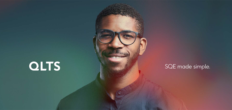
A rebrand for specialist training company QLTS. QLTS have been helping aspiring solicitors in England and Wales to pass the Solicitors Qualifying Examination (SQE) and its predecessor, QLTS, for more than 10 years.
Following immersion in the organisation and its sector, customers, and competitors, IE Brand identified their strengths, weaknesses, and the challenges they faced. We conducted a survey of stakeholders and produced a series of recommendations based on the results. We then developed tone of voice guidelines and a new visual identity with clear guidelines, templates, and assets. We also offered advice on brand architecture and a design for the new website.
CloseThe IE Brand team quickly grasped our industry, the market we operate in, our customer profile, and our competitors. They identified our strengths, weaknesses, and the challenges we faced, demonstrating a deep and thorough understanding of our business needs and goals. If I had to undertake a similar project in the future, I wouldn't hesitate to work with them again. Ollie and his teams are experts in their field, and you will notice it from day one.
Nir Chanoch
Managing Director, QLTS
 Get in touch

#LoveNotLandfill is a new campaign brand aimed at changing the fashion habits of young Londoners as part of ECAP – the European Clothing Action Plan.
The campaign is aimed at normalising sustainable behaviour in young people aged 16-24, to divert clothes away from incinerators and landfill. This audience buy a lot of cheap clothes and tend not to know the best way to care for them to make sure they last longer. But, they are generally open to changing their habits for the sake of the environment, as long as they can continue to dress well and look good.
The vibrant new brand supports campaign activity to encourage participation in clothes swapping events, bring banks, mend and repair workshops, and buying second hand. It's being promoted in sixth forms and universities across London, as well as at pop up shops with second-hand clothes curated by sustainable and ethical fashion bloggers.
The campaign's hard launch kicked off in September 2018, including the launch of new clothing banks around London designed by street artist Bambi and an extensive PR campaign.
Close
 Get in touch
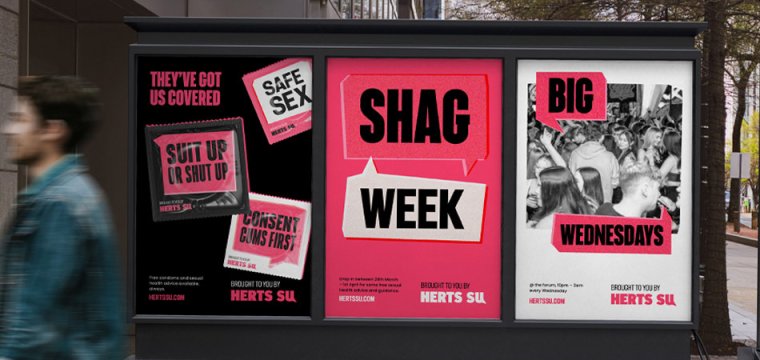
Rebrand of the University of Hertfordshire's Student Union – Herts SU. We used a striking colour palette of black, white and a vivid pink to make their comms instantly recognisable on campus.
CloseWe were looking to move away from branding that had run its course. In consultation with a number of stakeholders, there was a real demand to make sure our new visual identity was simple but striking. Safe to say IE Brand hit this brief with our bold look and feel! We’ve had an amazing reception to the new branding, from staff and students alike. Everyone has commented on how striking it is, how appropriate it is for a Students’ Union (many saying it’s what we’ve been missing) and the way in which it simplifies our complicated structure. To this day we're still obsessed with the end result and we couldn't recommend a brand agency more. Thank you ever so much!
Samantha Gibson
Acting Marketing Manager, Herts SU
 Get in touch


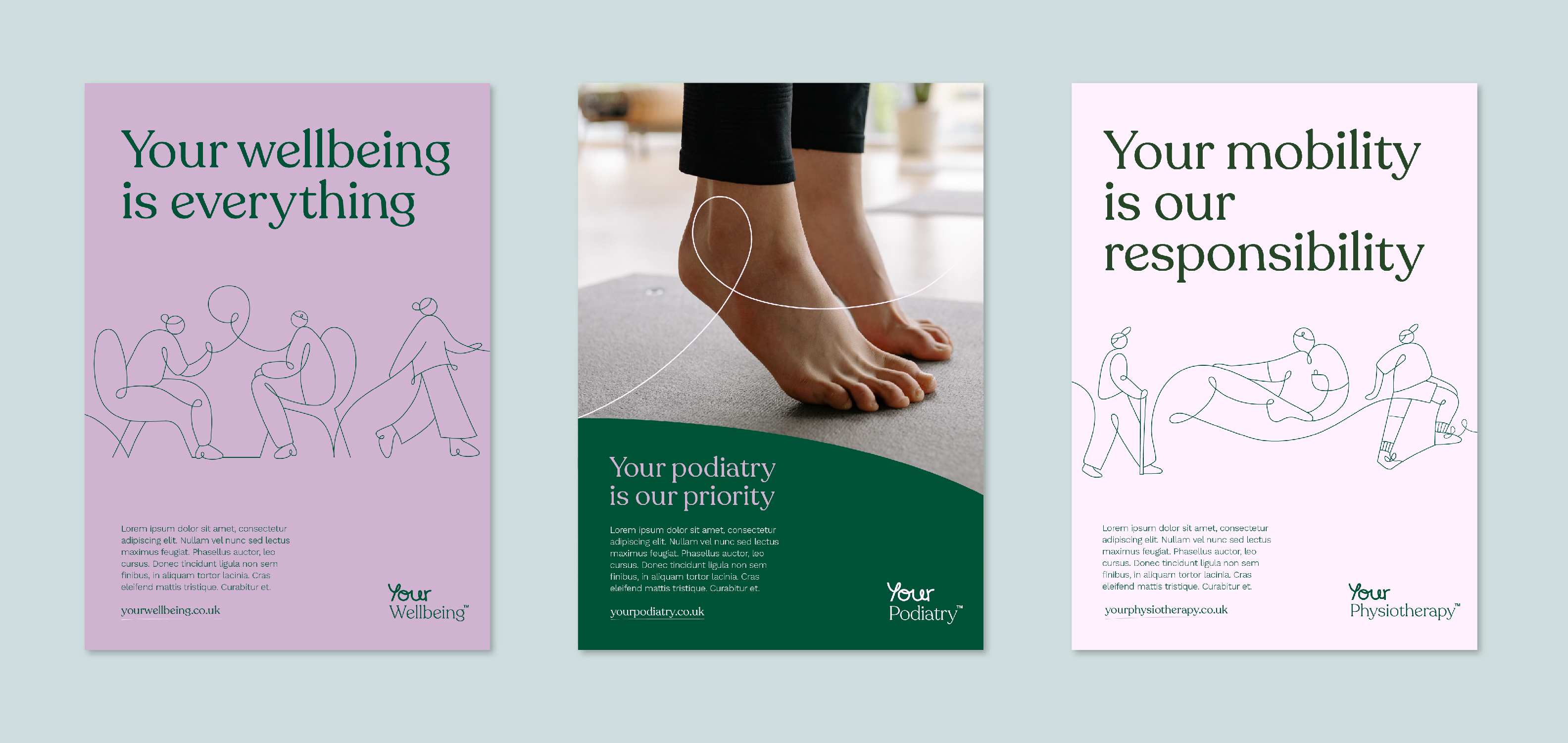
Your Podiatry, Your Physiotherapy, and Your Wellbeing are three new private healthcare brands created by Your Healthcare CIC. Your Healthcare is a public healthcare provider delivering NHS services in the boroughs of Kingston and Richmond. Any and all surplus from the private brands is reinvested into supporting public healthcare in the community: Private healthcare with a social purpose.
IE Brand created the three new sister brands including brand and campaign messaging, visual identity and websites.
Close
 Get in touch
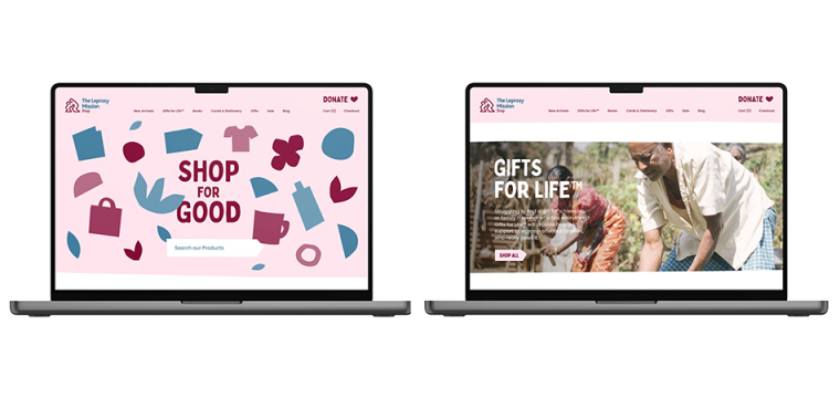
IE rebranded the Leprosy Missions Shop. The shop sells a range of unique gifts from around the world, including artisan and Fairtrade products, hand crafted by people with leprosy and other disadvantaged groups. They also sell virtual gifts – Gifts for Life™ – that directly contribute to The Leprosy Mission’s humanitarian work.
The shop raises vital funds for the Leprosy Mission, the world's oldest and largest leprosy-focused organisation, founded in 1874. The Christian charity works in more than 30 countries, working to transform the lives of the people affected and bring the world one step closer to eradicating the disease once and for all.
IE Brand transformed the charity's brand messaging and created a highly flexible visual identity for the website, merchandise, social media channels, catalogues, and other marketing comms. We combined playful cut-out Illustrations, photography, typography, and a beautiful colour palette to create an endless range of compositions. The palette also changes with the seasons. The two core colours are burgundy and lapis blue, which each dominates the brand at different times of year. There's also shades of holly green and gold to add a vibrancy for Christmas communications.
Visit theleprosymissionshop.com
Close
 Get in touch

Herefordshire Cares is a new initiative provided by Herefordshire Council and funded by the Department of Health and Social Care. Their aim is to raise the profile of those working in the adult social care sector and recruit more people into vacancies in Herefordshire.
IE Digital refreshed the brand and created a new website for Herefordshire Cares to address common questions, share case studies of existing people working in care, and display the wide range of jobs available in the sector. The site supports a wider campaign run by the council.
Close
 Get in touch
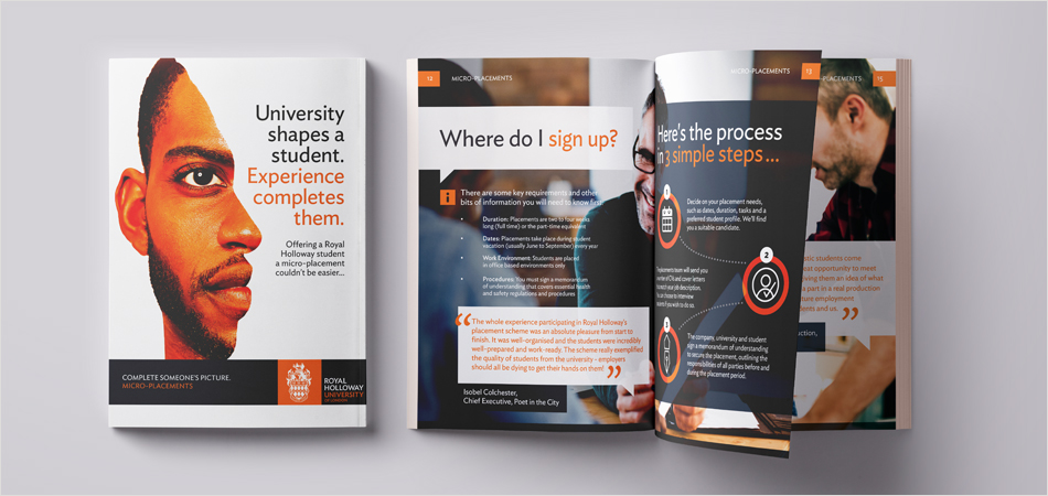
Royal Holloway, University of London (RHUL) is ranked in the top 30 of all UK universities. Founded by two social reformers who pioneered the ideal of education and knowledge for all who could benefit – their vision lives on today.
With high quality work experience becoming evermore important to winning that first graduate job, IE Brand has worked with RHUOL's Careers and Employability team on an employer facing Micro Placements Brochure – designed to drive up engagement with SMEs and larger corporates.
Close
 Get in touch

University of Aberdeen Careers Service wanted to invigorate its brand. While they had a strong foundation on which to build, they wanted to evolve the brand identity to improve awareness and engagement, on and off campus.
Following a listening exercise, IE Brand gauged key stakeholder values and provided a simple, succinct and concise report, from which Aberdeen could benchmark their performance and IE’s design team could develop the new visual identity.
IE brand then created a set of compelling visual assets and a new brand identity to improve the impact and effectiveness of the service, while honouring the university’s existing brand guidelines. The new brand features the prominent use of a chevron, a heraldic symbol lifted from the University of Aberdeen’s traditional crest, and provides clarity, consistency and flexibility across a range of collateral.
Explore IE's rebranding work with Aberdeen and other university careers services.
Close
 Get in touch


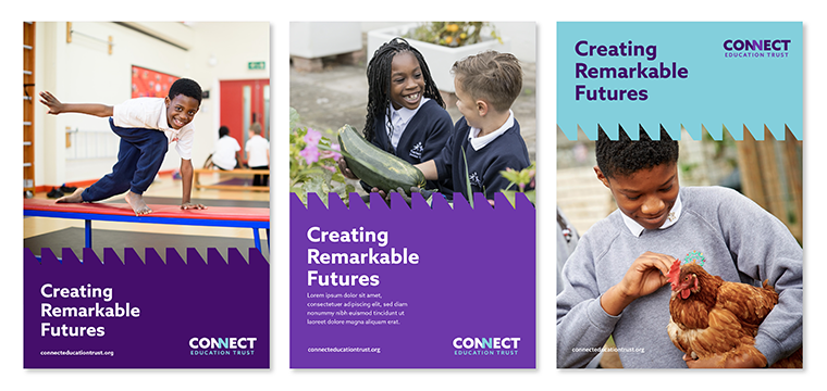
A rebrand for a Multi-Academy Trust and charitable company in Enfield, North London.
Connect is a leading Multi-Academy Trust creating remarkable futures for thousands of pupils through educational excellence. With 500 people, and over 3500 pupils under their care, Connect's 7 schools proudly make a difference to the communities they serve.
Close
 Get in touch
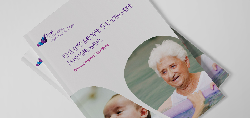
Part of the NHS family, First Community Health and Care CIC is a not-for-profit with a mission to help people to stay in their own homes for longer. IE was commissioned to craft an inspiring new brand identity and incorporate this into a responsive CMS driven website.
We conducted qualitative stakeholder interviews, audience mapping, competitor mapping and market positioning to develop a new brand proposition, key messaging and tone of voice. Combined with a new logo, visual identity, brand guidelines and collateral templates, the work brought clarity and consistency to First Community's communications with key target audiences.
We then developed a new website and social media profile to support the new brand.
CloseWe selected IE due to their evidenced based methodology. The project was fantastically managed and kept to time. IE pushed us to think outside the box, challenging our processes and setting success criteria for the project. Our relationship with IE worked so well we have continued to work with them to design our marketing collateral and website.
Liz Hobby
Communications Manager, First Community Health and Care
 Get in touch


CSH Surrey is an award winning community healthcare provider and was the first independent social enterprise to emerge from the NHS.
CloseI am delighted to inform you that Central Surrey Health has been announced as preferred bidder with a score of 86% against 63% for the other competing finalists. Thanks to you and all your team for the contributions that ensured this successful outcome.
Jon Ford
Exec Lead Business Development, CSH Surrey
 Get in touch


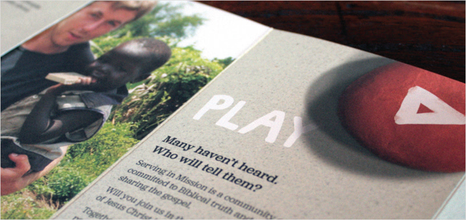
As the UK branch of SIM, Serving in Mission is an international, interdenominational Christian mission agency with more than 1,600 missionaries serving in over 60 countries.
Initially founded 100 years ago as the Sudan Interior Mission, SIM UK – as it had become known – was struggling to meaningfully engage with a younger and increasingly digital-savvy world, and brand recognition was poor.
IE Brand carried out a market positioning/competitor analysis exercise to help SIM UK work through the pros and cons of a renaming and rebranding exercise. Following stakeholder research and positioning analysis, IE renamed, rebranded and repositioned SIM as Serving in Mission. We developed a new multi-channel digital strategy focused on exposing stories of transformation with on and off line calls to action around “Go,” “Pray,” and “Give”.
CloseI have very much enjoyed working with the IE Brand team and particularly appreciated your help and support through the challenges of the project.
Allie Schwaar
Communications Manager, Serving in Mission
 Get in touch


The University of Nottingham is global university and member of the Russell Group. They are world leaders in academic research, and provide innovative and engaging education through campuses in the UK, China and Malaysia.
IE delivered digital user experience consultancy to support the in-house development team with their online recruitment of International students. This included qualitative and quantitative user needs research, to define user personas and optimise the user journey. Our team also created a suite of design assets, to meet the strict specifications of the university's CMS (content management system).
The AgriFood Training Partnership (AFTP) is a partnership between the University of Nottingham and other leading agrifood education partners. Nottingham led the development of the new AFTP brand and website, and chose IE to deliver both aspects of the project.
CloseIE led us through a clear, streamlined process to enable all stakeholders to develop and adhere to success criteria, with clear outputs to help support buy-in.
International Recruitment Team

 Get in touch
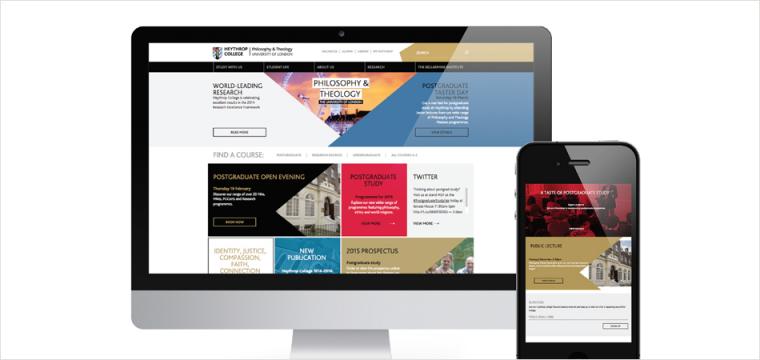
Part of the University of London, Heythrop College was established in 1612 and provides undergraduate and postgraduate degree programmes in philosophy and theology. They were re-expressing their course offerings to fit more closely with students’ needs, and wanted a new brand and website to help communicate that to potential students.
IE Brand reviewed Heythrop’s internal research to summarise the top line brand, and agreed a vision for the college’s identity. We repositioned Heythrop from a conservative Catholic college of theology and philosophy, to a vibrant college of the University of London, thus attracting and moulding students to change their world.
IE introduced new, intriguing images and messages to bring the personality of the college to life on and offline. We also evolved the school’s crest and modified the typography to align it more closely to that of University of London. The college's fresh new website had a stunning user experience to help students find the information they need.
CloseIE’s brand and digital expertise has given Heythrop a new voice, a new look, a brand new website and renewed confidence.
Amy Fenton
Marketing Manager, Heythrop College – University of London
 Get in touch

