Agape UK
Client
Agape UK
Services
Stakeholder engagement & research
Brand positioning & messaging
Brand architecture
Visual identity & logo design
WordPress website
Charity Marketing
Charity Web Design
Industry
Charity
Christian charities
Agapé invited IE Brand to develop a distinctive new brand position based on detailed stakeholder research. We simplified the charity's brand architecture, created the Discovering Jesus Together strapline and nudged the name to Agapé UK – to emphasise their part as the UK arm of an international Christian charity, active in over 190 countries.
For over 50 years, Agapé UK has been inspiring people to discover Jesus at home, at work, at university and abroad. Agapé UK is bringing people together and transforming lives.
IE Brand created a softer, more approachable visual identity and tone of voice that reflects Agapé's Christian heritage whilst also remaining accessible to those exploring faith for the first time. The new brand sees the charity begin a new chapter, with everyone proud to say they work for Agapé UK.
Image

Image
Listen
Audience research and gap analysis
Agapé (now Agapé UK) entered into the consultancy phase of work with IE Brand knowing that they needed to address some big questions.
The charity's funding model and organisational structure encourages an entrepreneurial spirit in ministry. This results in an organisation made up of of bright, independent-minded voices with very clear, and occasionally conflicting, ideas about Agapé's mission. IE Brand's challenge was to create a distinctive brand position and proposition that everyone could unite behind.
Internal stakeholder research
Following a thorough brand audit, IE Brand conducted six internal stakeholder workshops with around 25 key Agapé team members from across the central charity and its key sub-brands. This was supplemented with a quantitative e-survey to all staff.
Our research explored the internal perspective on the organisation’s purpose, reputation, strengths and weaknesses, and key challenges. We looked at what it’s like to work for Agapé – what attracted people in the first place, whether experience matched expectations, and whether they felt they had the right people in the right roles. We also workshopped ideas around how Agapé could attract more donors to support the parent charity, extending fundraising beyond the financial support of individual staff members.
External research
To sense-check internal assumptions we interviewed a sample of people from external audiences, including churchgoers and existing Agapé supporters. Then we ran a gap analysis to compare internal perceptions of the brand with the views we had heard from the outside world.
Image
Image
We knew that IE would bring expertise, insight, and creativity to our branding challenge. What we didn’t expect was how excellent the team would be at helping us to see where we could improve our practices across the whole of Agapé UK – they really listened well to us and our stakeholders, and were sensitive to our needs as an organisation.
Lesley Cheesman, National Director, Agapé UK
Image
Image
Advise
Repositioning and reuniting the charity
Having guided the Agapé team through some emotional focus groups and explored external perspectives, IE’s brand researchers and consultants presented 20 key findings and recommendations back to the brand steering group, including:
Naming: Our research showed that the name Agapé, while not without its drawbacks, wasn’t a barrier to engagement. In order to emphasise the charity’s global reach we changed the name from Agapé to Agapé UK. This celebrates their being part of a larger whole, within an international organisation that’s active in nearly 200 countries.
Brand architecture: Agapé UK had operated as a ‘family’ of brands, each with its own distinctive audiences and visual identity. We looked at each sub-brand to determine their value as separate ministries and concluded these were diluting the parent Agapé UK brand. This was making it difficult to achieve the awareness Agapé UK needed to gain traction. Instead of telling the world four vaguely interesting things, they needed to be telling them one incredible thing.
We recommended they discontinue the sub-brands and adopt a clearer message about Agapé UK as a whole life ministry.
- ‘Student Life’ became Agapé UK at university
- ‘Family Life’ became Agapé UK at home
- ‘Work Life’ became Agapé UK at work and
- ‘Global Life’ became Agapé UK abroad.
Embrace digital: Agapé UK's people were almost universally loved and admired among those who knew them, but the brand lacked awareness elsewhere. They needed to increase their presence in churches and at events, and embrace digital to connect with more people. Little-used social media channels had proliferated among the sub-brands, so we advised them to consolidate these, listen to how their audiences use social media, and build conversations.
Professionalise: Agapé UK needed a clearer strategy and improved HR and operational processes. We recommended they create an Agapé UK covenant for staff, setting clearer expectations for individual workers and ministries, while offering more formalised central support in areas such as performance management and pastoral care.
Image
Our new branding is excellent, and it has been a breath of fresh air for me personally and our staff as a whole. It’s such an encouragement to be able to describe what we do so clearly, and to know that our brand identity reflects who we are as an organisation: discovering Jesus together, at home, at work, at university, and abroad. I am so thankful to have worked with IE Brand – they were the right people at the right time.
Lesley Cheesman, National Director, Agapé UK
Image

Image
Deliver
Messaging and visual identity
Once we had simplified the brand architecture and agreed Agapé UK's positioning, it was time to bring it all to life.
IE Brand ran a messaging workshop with Agapé UK stakeholders to co-create the brand’s personality, tone of voice and messaging. From this process, a new charity strapline emerged: Discovering Jesus Together.
The old brand had often felt overwhelming for newcomers, who were put off by a vocabulary that was, at times, too theological and felt aimed at Christians. We took a more stripped back approach, to make Agapé UK more accessible to those exploring faith. The new messaging matrix includes guidance on creating more ‘introductory’ comms and avoid answering questions nobody has asked.
We also defined the messages and calls to action for the different audiences, with a conversational tone of voice.
Designing the new look for Agapé UK
IE Brand prepared a Success Criteria Design Brief, which was approved by Agapé UK, before briefing our brand design team. The new visual identity needed to appeal across Agapé UK's target audiences: active and non-active Christians, churches, supporters, partners and staff. It had to be the visual representation of a single, united charity with a renewed focus on discovery, discipleship and togetherness – and a place where staff are proud to work. It also needed the versatility to talk to university students, couples, or workers, and to ambassadors and partners on the global stage.
We also needed to reflect the charity’s desired brand personality:
- evangelistic and creative
- genuine, caring and loving
- approachable and inclusive
- passionate and enthusiastic
- bold and curious
- faithful and committed
- well-connected and international.
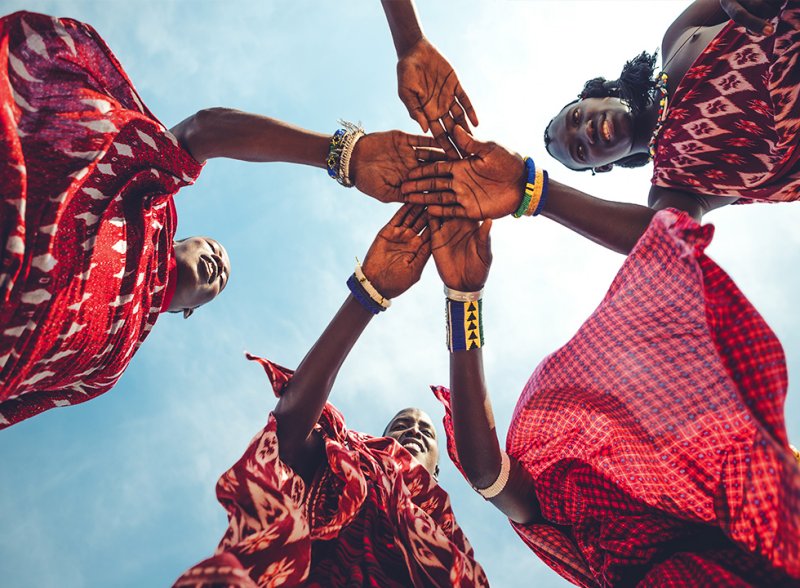
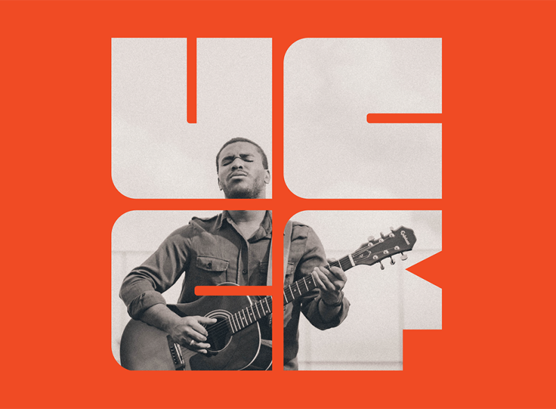
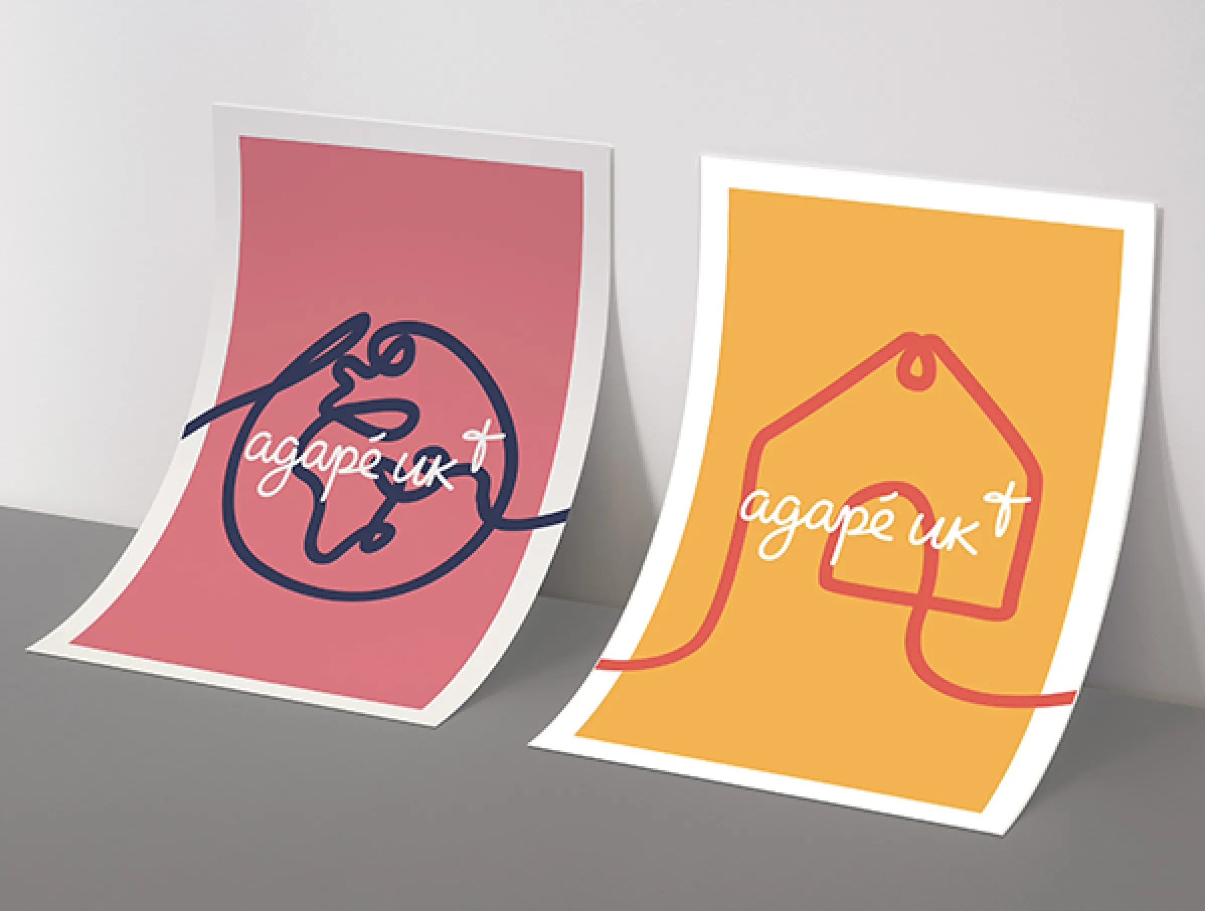
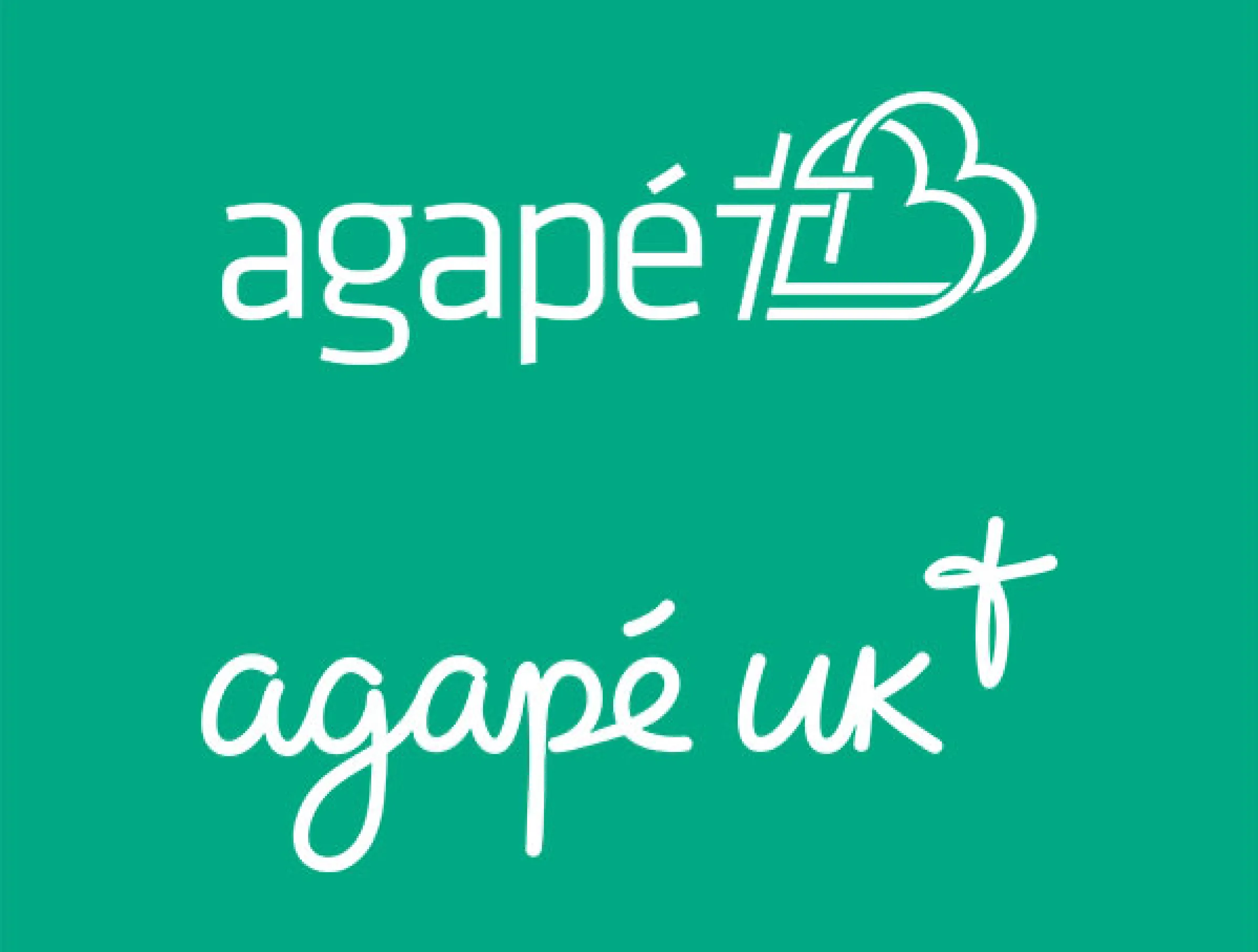
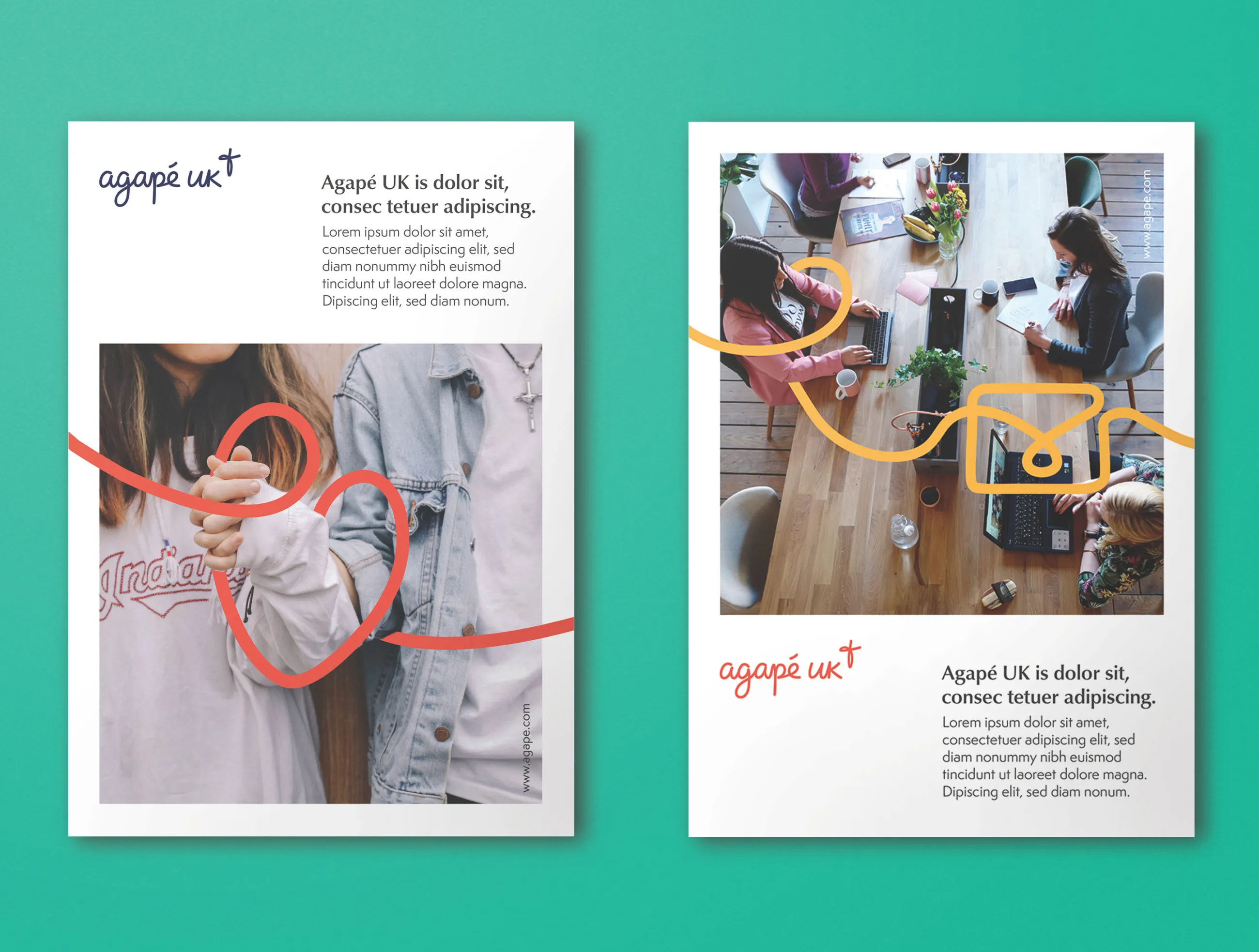
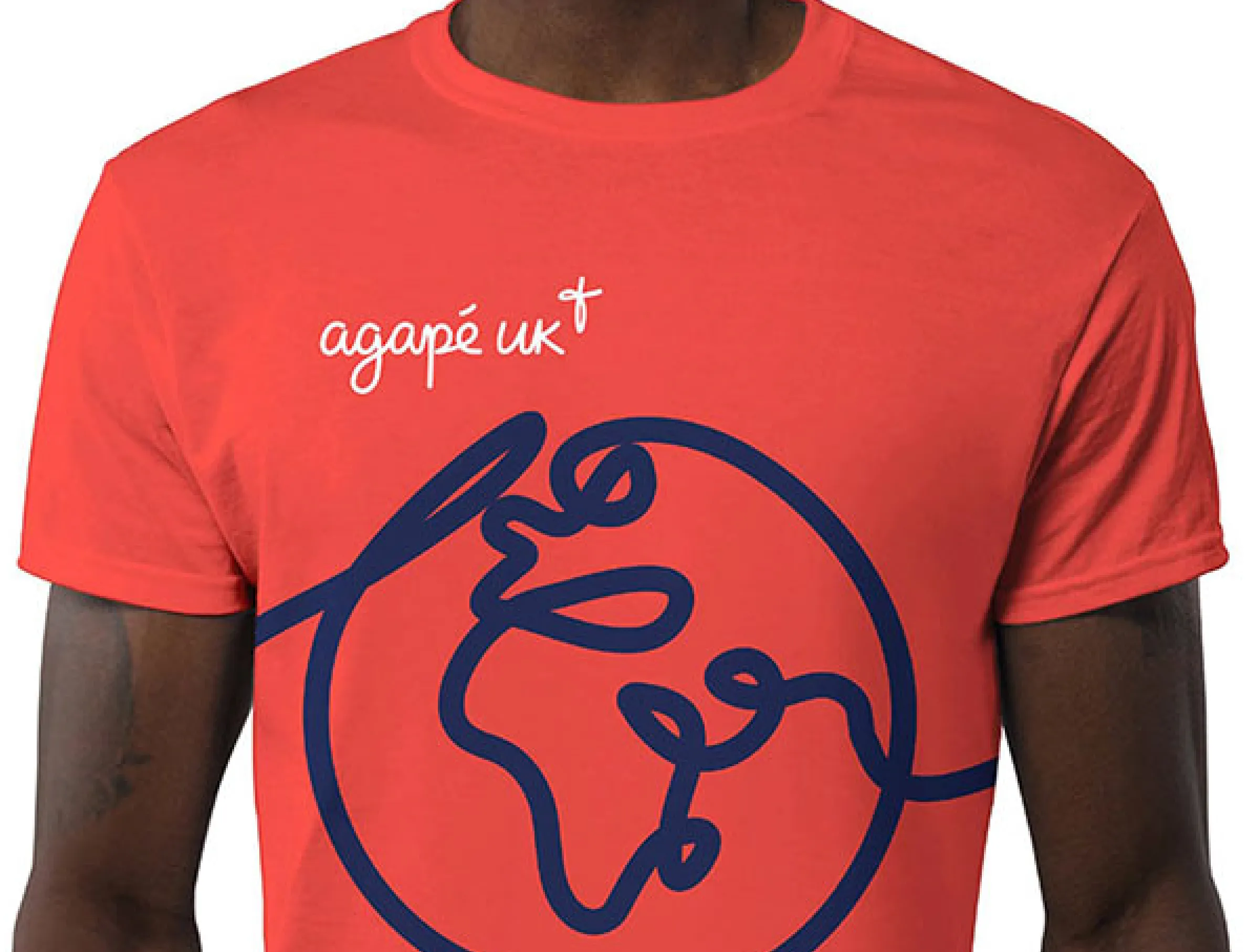
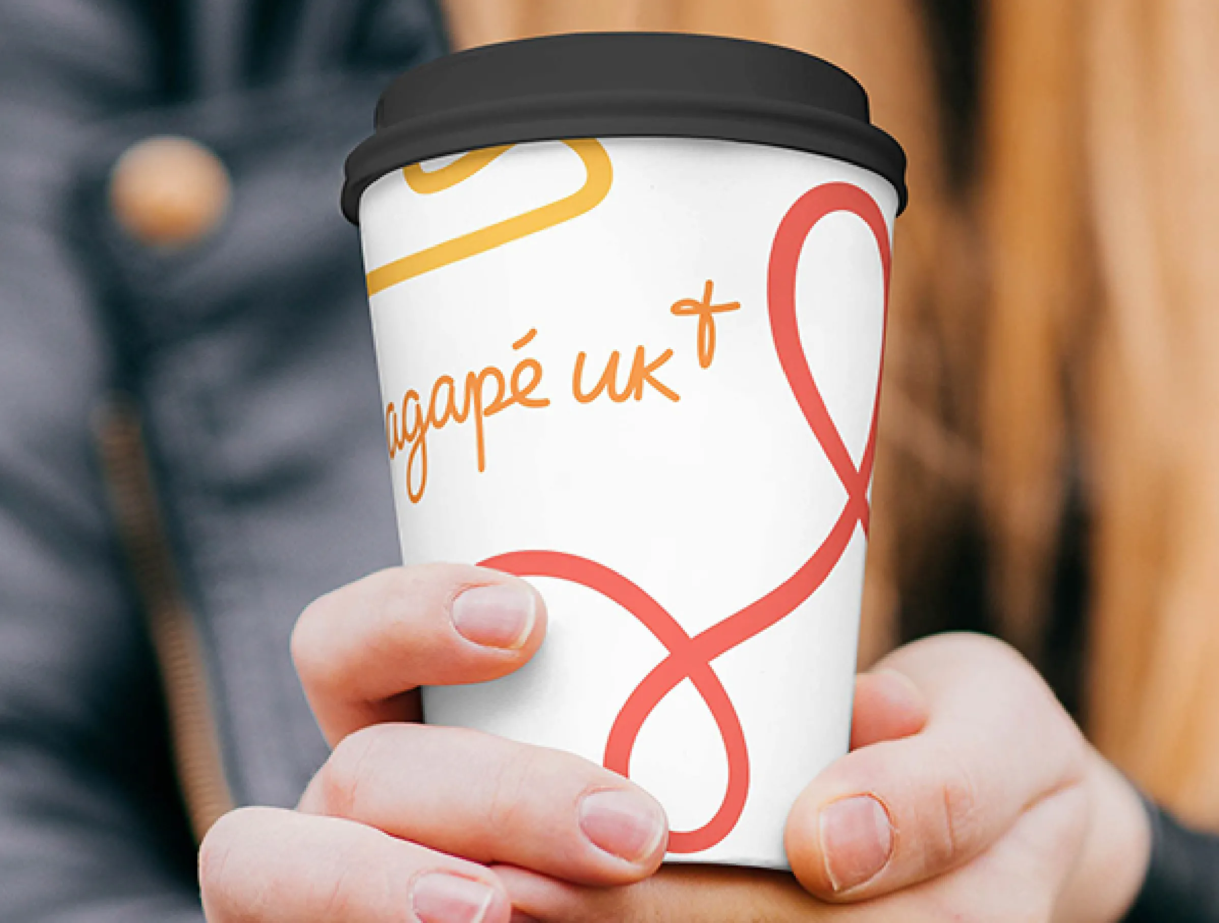
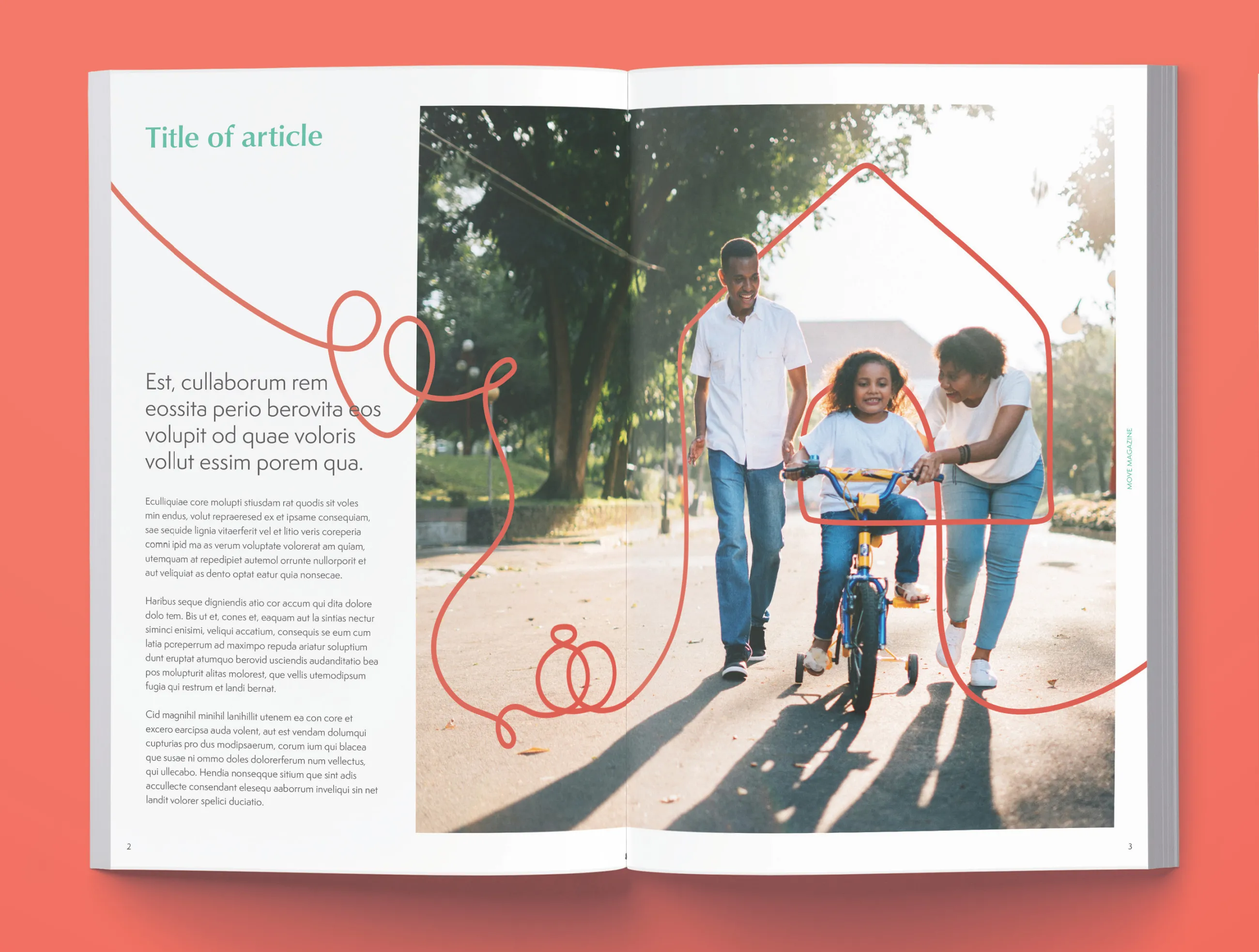
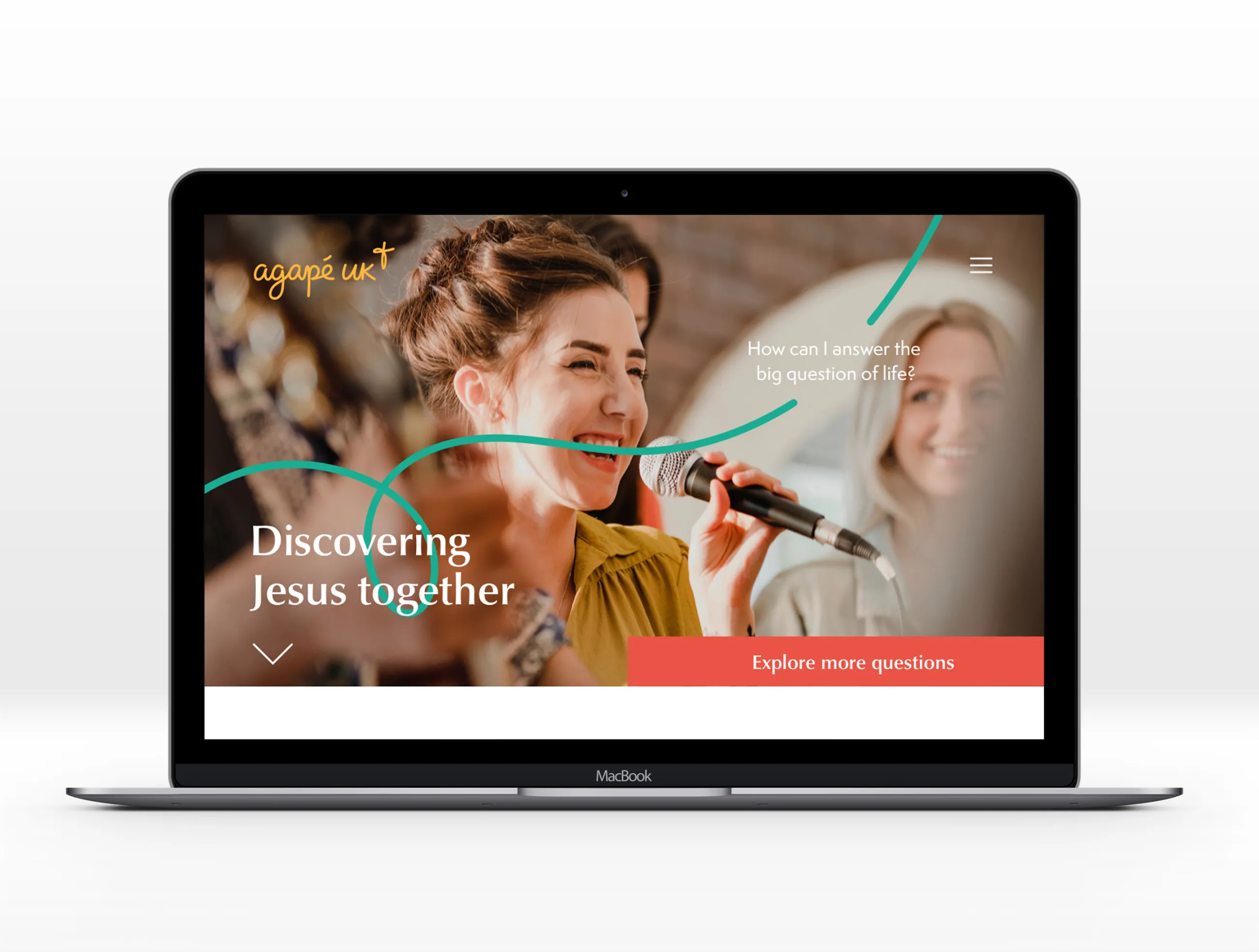
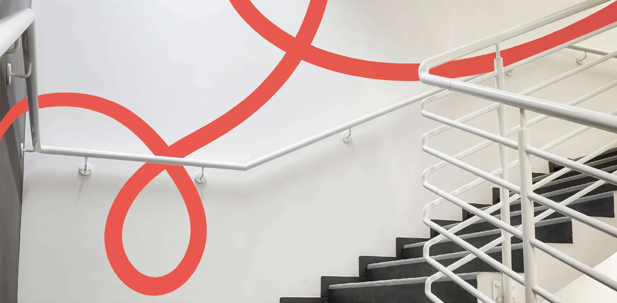
Perhaps the most recognisable feature of Agapé UK new visual identity is a continuous, unbreakable line, symbolising the continuity of God’s unconditional love. It flows above, below and through everything Agapé UK does, connecting everyone to Jesus, through every life stage. We use strong photography of real people to illustrate Agapé’s work, focusing on the experiences and emotions of the people who are helped by Agapé, and the staff and supporters who make it all happen. The line often flows through photography, interacting with people and objects.
The new logo also adopts a handwritten, flowing style, to represent Agapé UK’s approachable, caring and personable nature. This is finished off with a superscript of a stylised, handwritten cross to represent Agapé UK's Christian heritage. The old logo featured both a cross and a heart symbol, so a heart is among the suite of illustrations we created using the continuous line. This represents both Jesus’ love and the love and relationships in people’s lives. Both the logo and the unbreakable line animate beautifully.
Finally, a bright, vibrant colour palette communicates Agapé UK’s passion and enthusiasm, bringing joy to all their communications.
The new brand sees the charity begin a new chapter in its history. They've come together as a single organisation, with everyone proud to say they work for Agapé UK.
Image
Image
Support
Website, magazine and key collateral
With the new visual identity agreed, IE Brand supplied a full suite of print and digital assets for Agapé UK, along with detailed brand guidelines to protect and police the new brand.
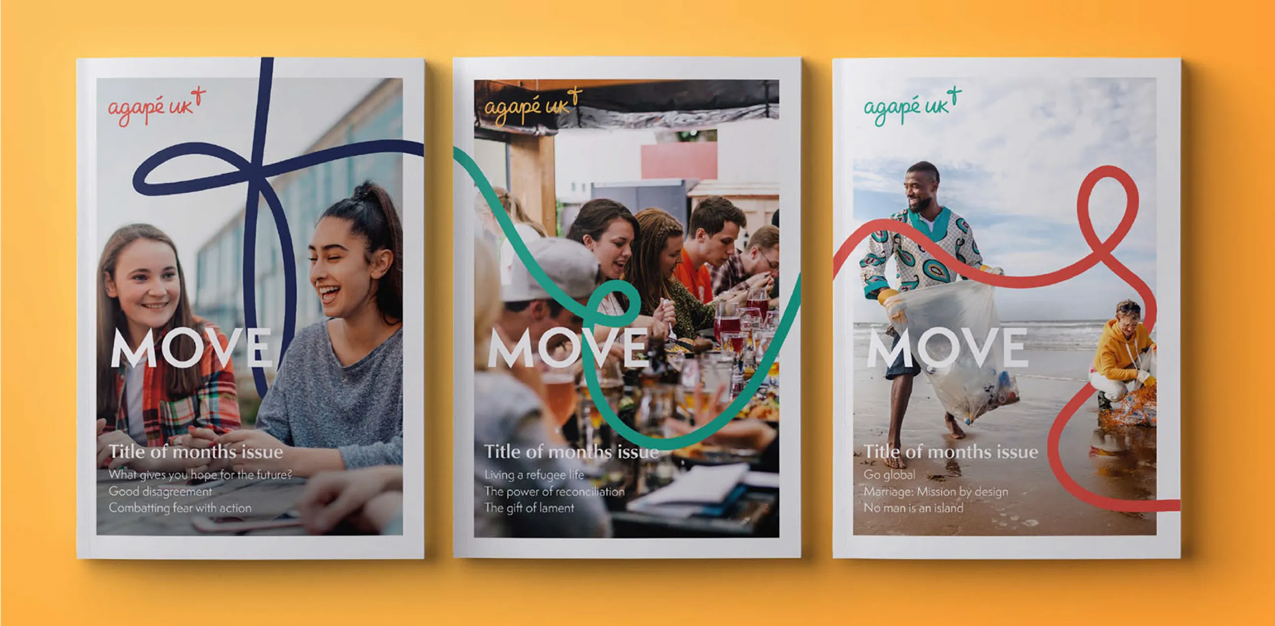
We provided templates for key stationery, flyers and brochures, plus exemplar cover designs and editorial spreads for Agapé UK’s magazine, MOVE.
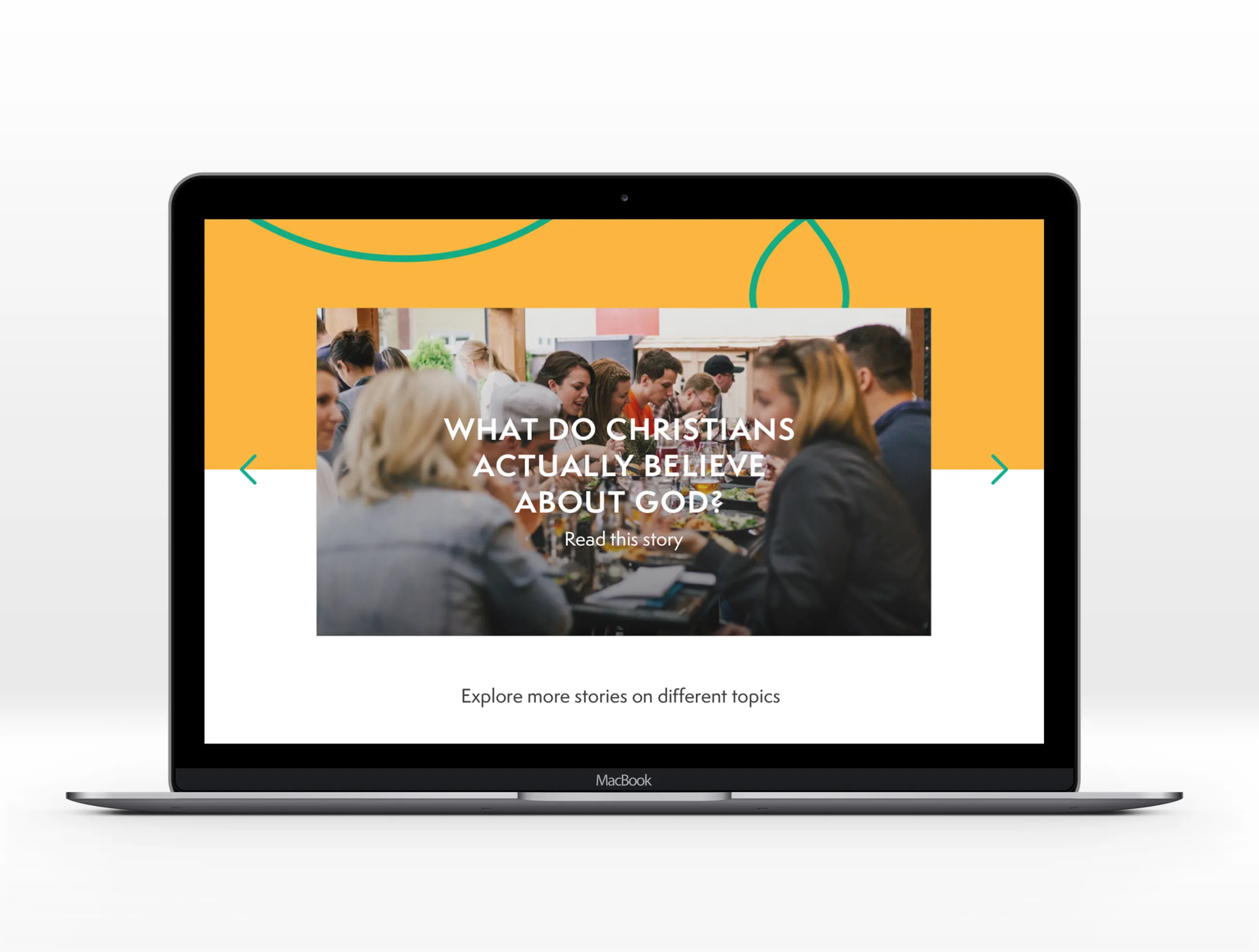
Hot on the heels of the rebranding project, IE Digital revamped Agapé UK's website – their most important communications tool. The user experience for the site was designed to support the needs of its key Christian audience. Built in WordPress, it signposts Agapé UK’s practical support, while welcoming people at any stage in their own journey of faith.
Image
190+ countries with an active Agapé presence, with Agapé UK just one arm of the international charity
50+ years active on university campuses across the UK