CHIPS
Image
Client
CHIPS
Services
Visual identity & logo design
Messaging and Tone of Voice
Stakeholder engagement
Brand guidelines
Charity Marketing
Industry
Charity
Christian charities
International Charities
Charity CHIPS (Christian International Peace Service) asked IE Brand to help them re-articulate their story and craft a new brand to take them forward.
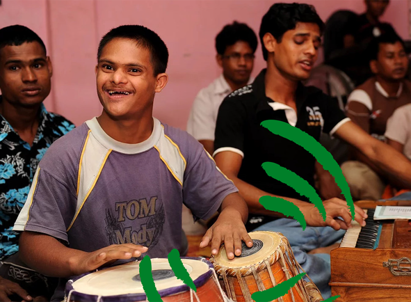
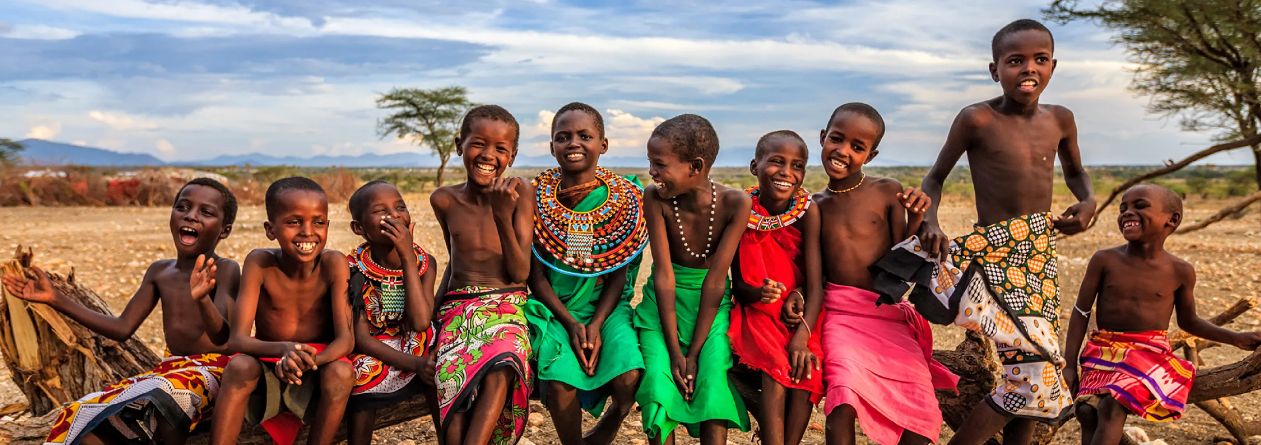
CHIPS joins with communities from both sides of a conflict – from Brixton to Ghana – to help build sustainable futures free from violence and division. With ambitious growth plans, CHIPS realised they needed to reach out to a broader supporter base, and be braver about asking for financial assistance.
The confident new CHIPS brand narrative and visual identity are an investment in the charity's future and will enable them to bring their unique peacemaking abilities to more divided communities around the world.
Image
Image
Listen
Finding the brand personality
Exciting changes were afoot at CHIPS.
They’d identified an urgent need to drive up fundraising to meet their ambitious strategic objectives for 2020. That meant deepening engagement with existing, loyal audiences, and recruiting new, multi-generational, supporters.
However, the CHIPS brand had become neglected, while the overall charity landscape has become much more sophisticated. Realising the importance of a strong brand to enable them to engage with their audiences, CHIPS sought the support of a major donor, and asked IE Brand to help them re-articulate their story.
Through research and engagement with CHIPS’ stakeholders, both in the UK and at their project in Ghana, IE unearthed the charity’s personality. This was largely inspired by the charity’s late founder, Roy Calvocoressi – a man described as insightful, fearless, independent, inspirational, Christ-like, creative, open to ideas and all beliefs, personable, patient, empathetic and visionary.
Roy’s personality lives on through CHIPS, but this wasn’t the personality that was coming through on their old website and comms.
Image
Image
Our brand and identity are the key to communicating our personality, and if truth be told, were in dire need of a spruce-up. We chose IE Brand for their branding expertise and thorough, considered approach to the process. They were excellent at guiding our team, and challenging us where needed. We felt in very safe hands and thoroughly enjoyed working with their team and seeing the new brand and design emerge.
IE Brand's wise, high-quality work to rebrand CHIPS will lead to a step-change for the charity. We’ll now be able to shout louder with less effort. It’s a great investment in the future. Awesome work!
IE Brand's wise, high-quality work to rebrand CHIPS will lead to a step-change for the charity. We’ll now be able to shout louder with less effort. It’s a great investment in the future. Awesome work!
Paul Maxwell-Rose, Director, CHIPS
A really strong rebrand. I applaud the fact that the charity’s core aims are at the centre of the identity. Nice identity, and a strong endline. The new logo and brand is bold, clear and works in a variety of situations. Overall, a really solid rebrand, one that touches all aspects of the organisation, and with great results on a comparatively small budget.
Third Sector Awards
Image
Advise
Identifying core beliefs
CHIPS is a charity that dives into the centre of a conflict to build lasting relationships between two sides of a divide.
Through our co-creation messaging workshop with CHIPS stakeholders, IE identified four key beliefs at the centre of the charity:
- We only go where we are invited. We believe that CHIPS should only go where people want us. Peace cannot be imposed upon communities in conflict.
- We live in the heart of the conflict. We believe that we must live amongst communities in the heart of the conflict in order to understand their challenges.
- We take sides. Both sides. We believe in taking sides. Both sides. We seek to understand everyone’s perspective, and to build relationships.
- We’re here to stay We believe that a long-term commitment to sustainable development projects is the only way to achieve lasting results.
From this, IE crafted a compelling brand narrative. A detailed messaging matrix will help CHIPS to create consistent messaging for its key audience groups – from their close inner circle and regular church goers, to young Christians and the wider world (including the media).
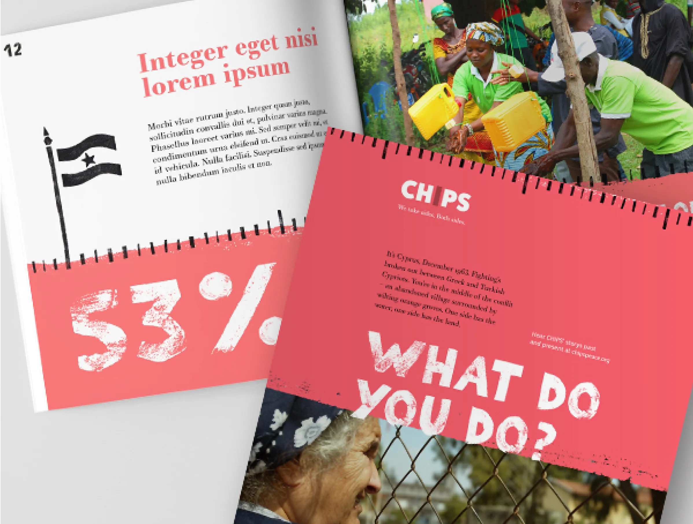
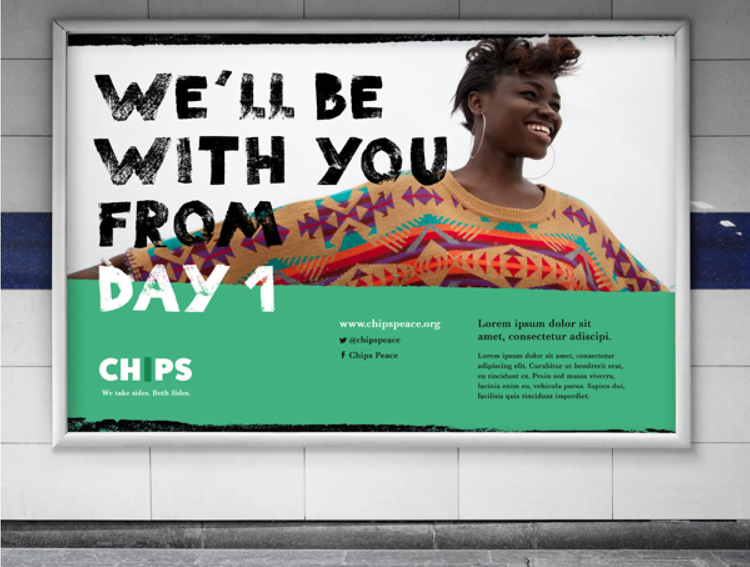
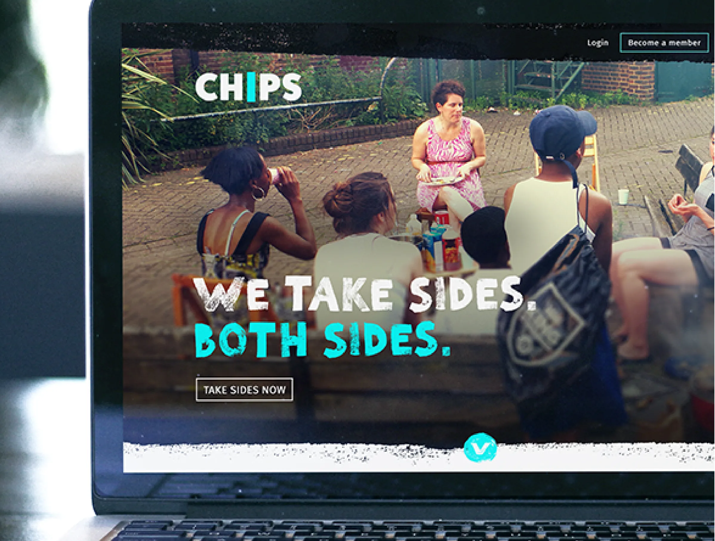
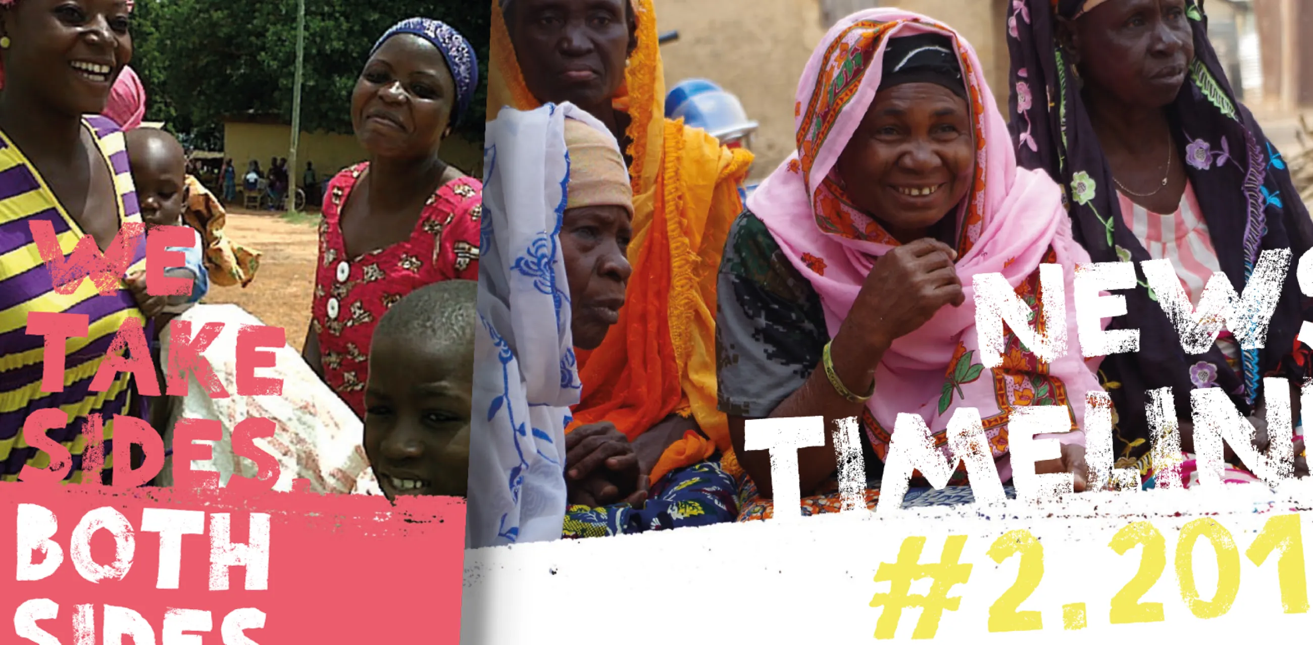
The slogan 'We take sides. Both sides.' was taken from some existing CHIPS campaign materials. It perfectly summed up what CHIPS do, who they are and how they behave in a uniquely attitudinal, human way. So we made it the charity's overall strapline.
Image
Deliver
Telling the brand's story
CHIPS has 50+ years of stories from the charity’s beginnings in Cyprus in the 1960s to the present day in London’s Brixton.
We put these stories front-and-centre in the new CHIPS brand narrative to share how their work has made a difference to lasting peace and celebrate the inspirational work of staff and volunteers.
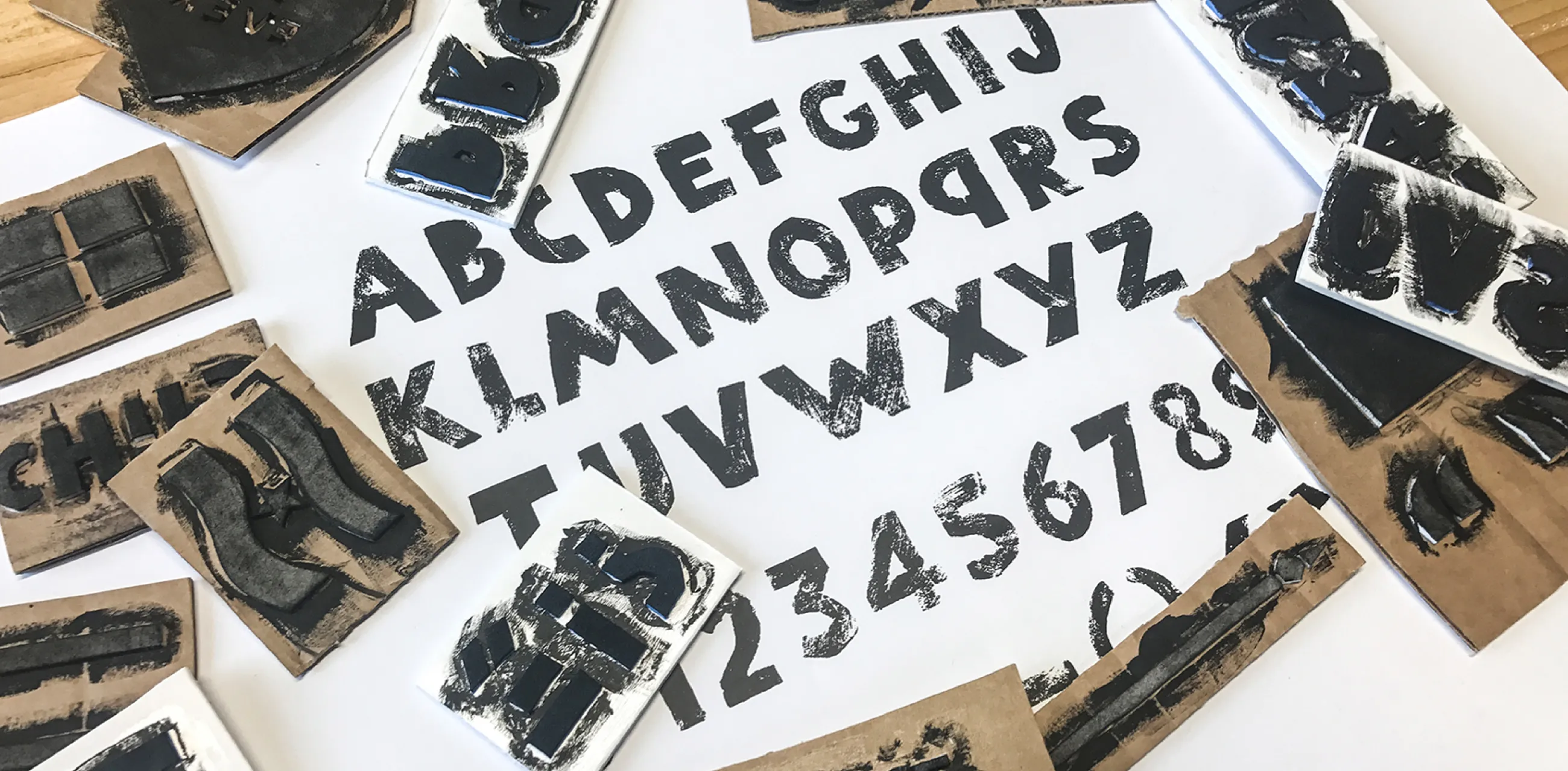
IE’s design team created an exclusive hand-cut font – CHIPS Press – which adds a strong personality and grit to the charity’s comms. Complimentary illustrations are based on repeat patterns, to convey the community and group work inherent to the charity’s work.
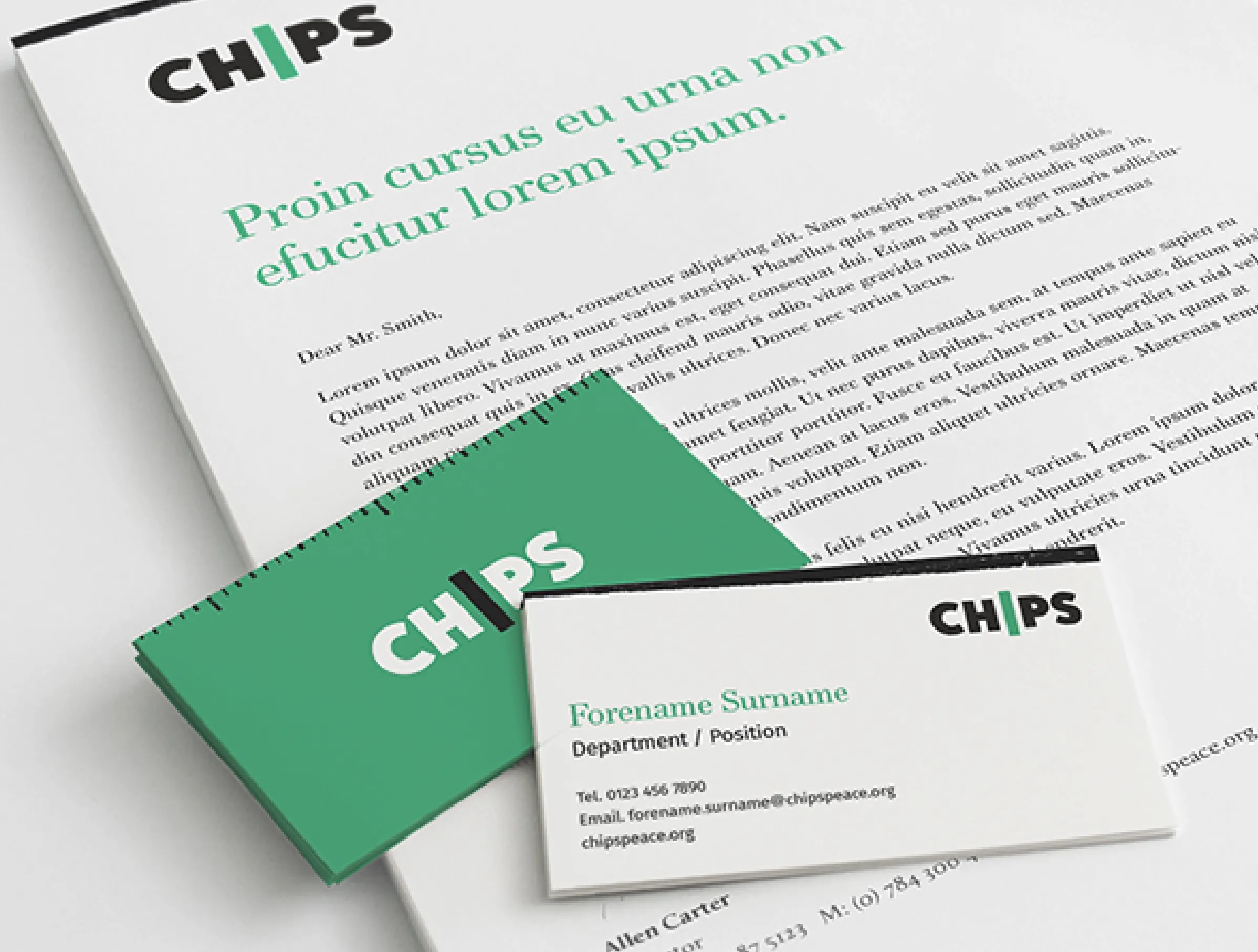
The new, simplified, logo reflects the CHIPS approach of taking both sides in a conflict – with the “I” symbolising the divide they always straddle in their peacemaking.
Authentic and versatile visual identity
We also drew from CHIPS’ extensive library of archive photographs from projects spanning half a century, adding to the authenticity of the brand.
The resulting visual identity is versatile enough to accommodate a diverse range of potential CHIPS’ projects – it can look youthful and urban for inner city projects like Brixton, or more humanitarian and traditional when supporting rural communities in Ghana.
When all of the brand elements are put together, they portray a more confident CHIPS’, supporting their renewed ambition. They’ll be unashamed in asking more of their supporters when they need funding to grow their inspirational work, as well as help through volunteering and prayer.
This in turn will enable CHIPS to bring reconciliation to more divided communities at home and abroad, and improve life for people living in extremely challenging environments.
Support
Messaging and comms plan
To support the new brand narrative, IE equipped CHIPS with a bank of stories to engage their audiences:
"It’s Cyprus, December 1963. Fighting’s broken out between Greek and Turkish Cypriots. You’re in the middle of the conflict – an abandoned village surrounded by wilting citrus groves. One side has the water, one side has the land. WHAT WOULD YOU DO? Find out how the story ends at chipspeace.org"
We also created a set of brand guidelines and packaged template files. These record best practice and provide clear guidance on how best to create on-brand comms collateral, protecting CHIPS investment in their new brand.
Finally, we created a high-level fundraising and communications plan to kick-start the new phase of CHIPS' development and growth.
Stakeholders consulted from Brixton to Ghana
50+ years of inspiring stories brought to the fore
1 bespoke, hand cut font