PVRI
Pulmonary Vascular Research Institute (PVRI) wanted to raise its profile and attract new members. They chose IE Brand to refresh the brand and visual identity, which had been in place since 2006.
PVRI is a global membership charity that brings together experts, researchers, and industry leaders to combat pulmonary vascular diseases (PVD). Through innovation, education, research and advocacy, PVRI is helping healthcare professionals to better understand PVD, and improve diagnosis, treatment and care.
IE's brand designers created a beautiful new visual identity reflecting a sense of collaboration and a global community. The more modern brand helps PVRI to move forward with confidence. Members described the distinctive new logo as vibrant, warm, and memorable.

Pulmonary Vascular Research Institute (PVRI) wanted a refreshed brand to help them stand out from similar membership organisations in the professional healthcare sector.
Modernising to appeal to new members
PVRI felt that the old branding, in place since 2006, no longer reflected their work. The old logo and visual identity looked dated, and the brand typeface didn’t meet modern accessibility standards.
They wanted to raise their profile and attract more people to engage with the organisation – and collaborate with each other. Plus, they wanted to grow the membership and bring more people to their events. To appeal to new members, particularly younger specialists, they needed to evolve the brand to something slicker and more modern.
Immersion
IE Brand facilitated a workshop with internal stakeholders, to capture internal perceptions of the old brand.
We looked at PVRI’s key audiences, their needs and behaviours. Audiences included:
- Specialists in pulmonary hypertension (PH) or pulmonary vascular disease (PVD)
- Pharmaceutical companies
- Drug regulators
- Funders
- GPs and Nurses
- Patients and families
- Partner organisations
- General public
We also talked about the brand’s personality, using our metaphor of ‘brand as a person’, and looked at their various sub-brands.
IE Brand took a messaging-light approach to PVRI’s rebrand. We defined the new brand proposition, personality, and strapline ‘Together to beat pulmonary vascular diseases’.
We brought out PVRI’s brand personality: capable, sincere and driven.
- Capable because they work with the world’s leading PV specialists.
- Sincere because they are always transparent and honest with the PV community.
- Driven to transform the lives of millions of people affected by PVD.
The brand’s new tone of voice is confident, clear, thought provoking, respectful, warm, enthusiastic and engaging. Based on this work, PVRI’s in house team crafted messaging for each of its key audiences.
Defining a successful visual identity
We briefed our brand designers to create a visual identity to embody the brand’s new personality and tone of voice. The new visual identity needed to stand out from similar organisations, creating a platform to celebrate the charity’s impact and allowing PVRI to move forward with confidence.
PVRI needed their visual identity to bring their work to life, explaining what they do and why people should care. It needed to balance clinical excellence, competency and authority with sincerity, excitement, and warmth.
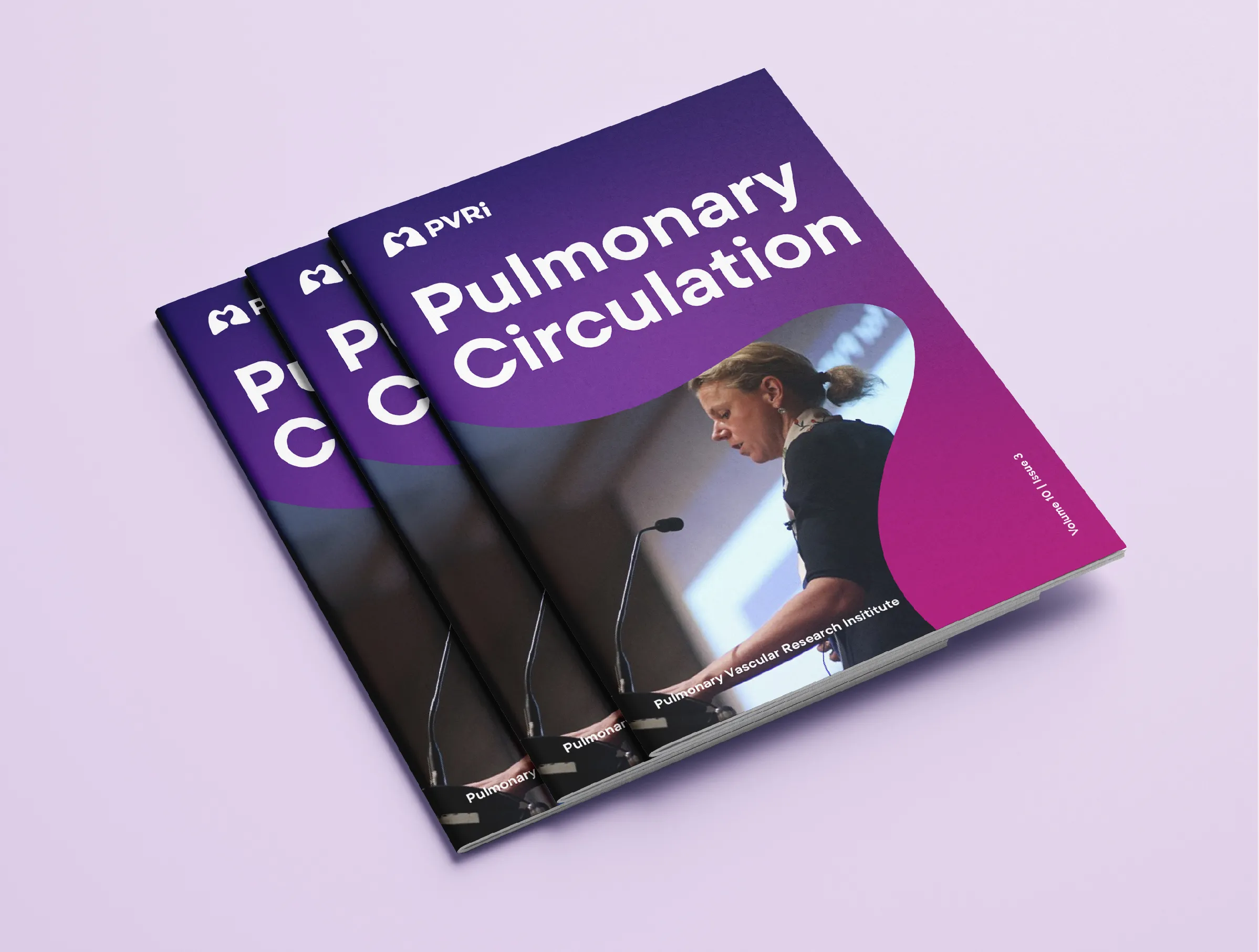
It also needed to adapt to in-person and virtual events, publications including the Pulmonary Circulation Journal, and different task forces and symposia.
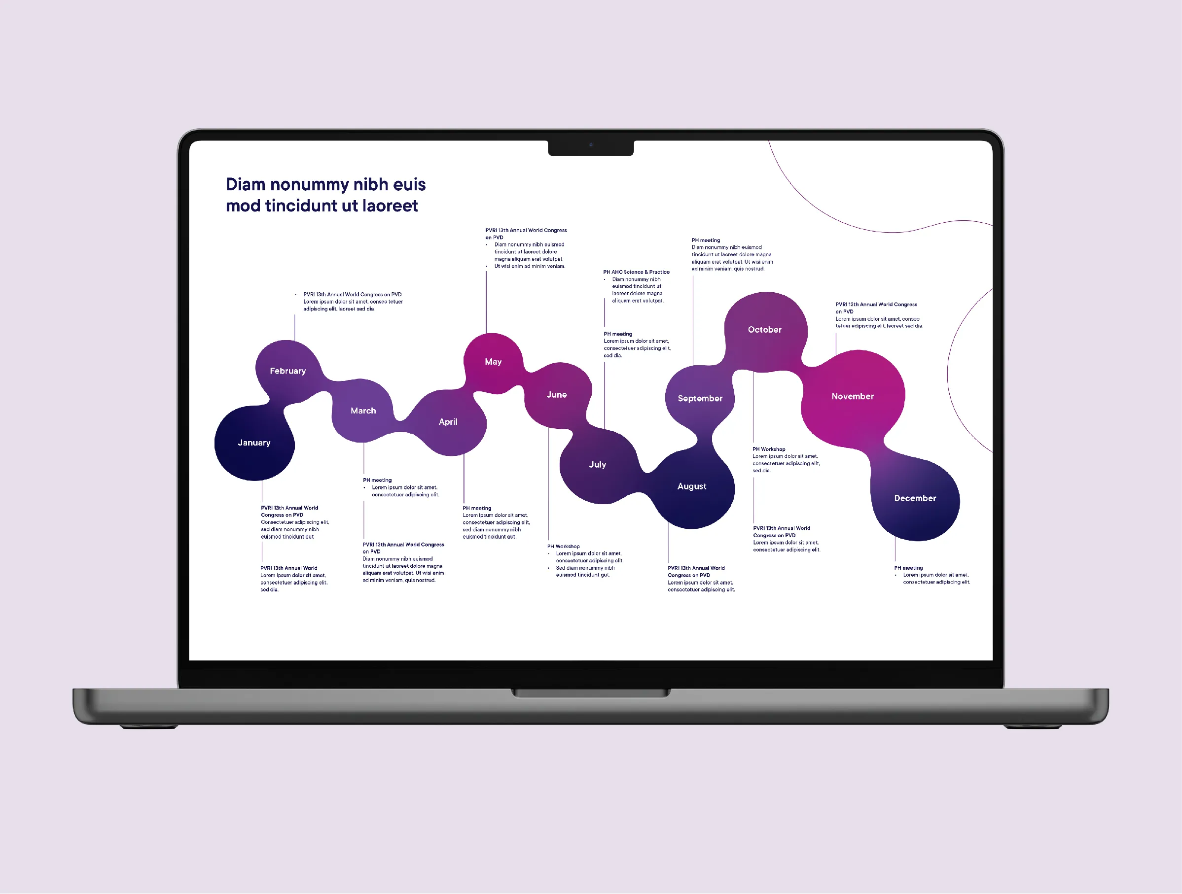
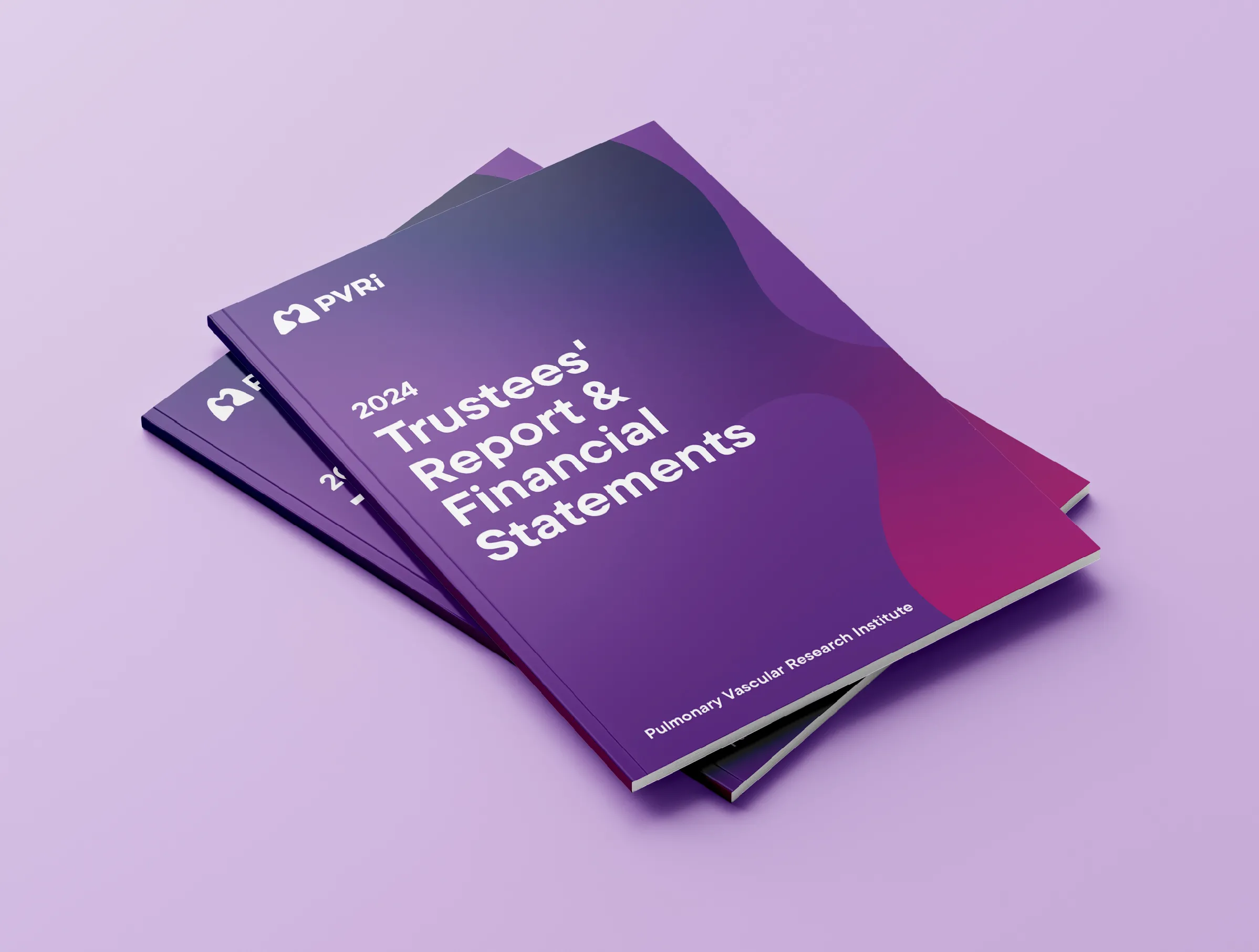
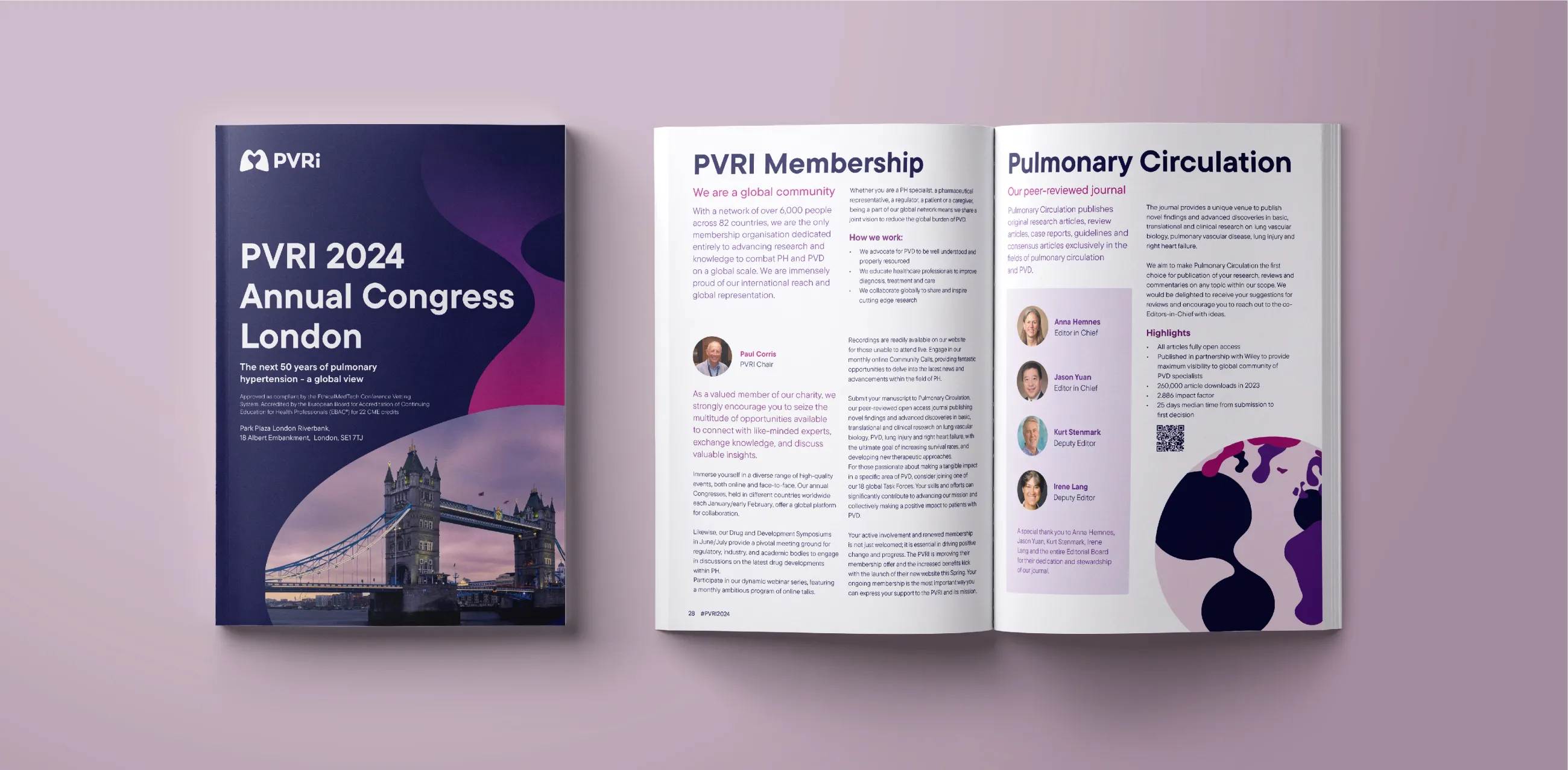
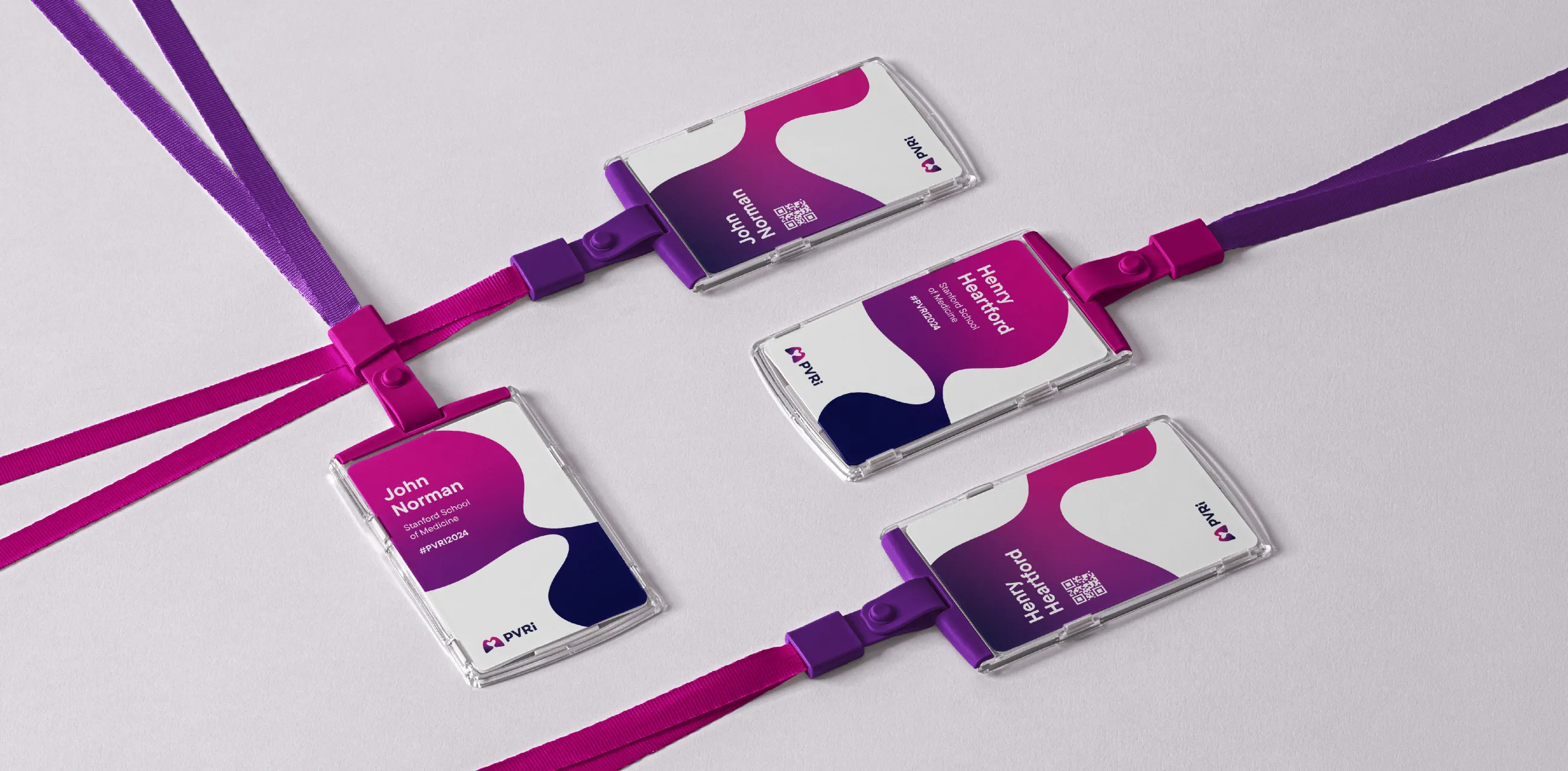
IE Brand’s designers created a flexible and bold visual identity, reflecting a sense of collaboration and a global community.
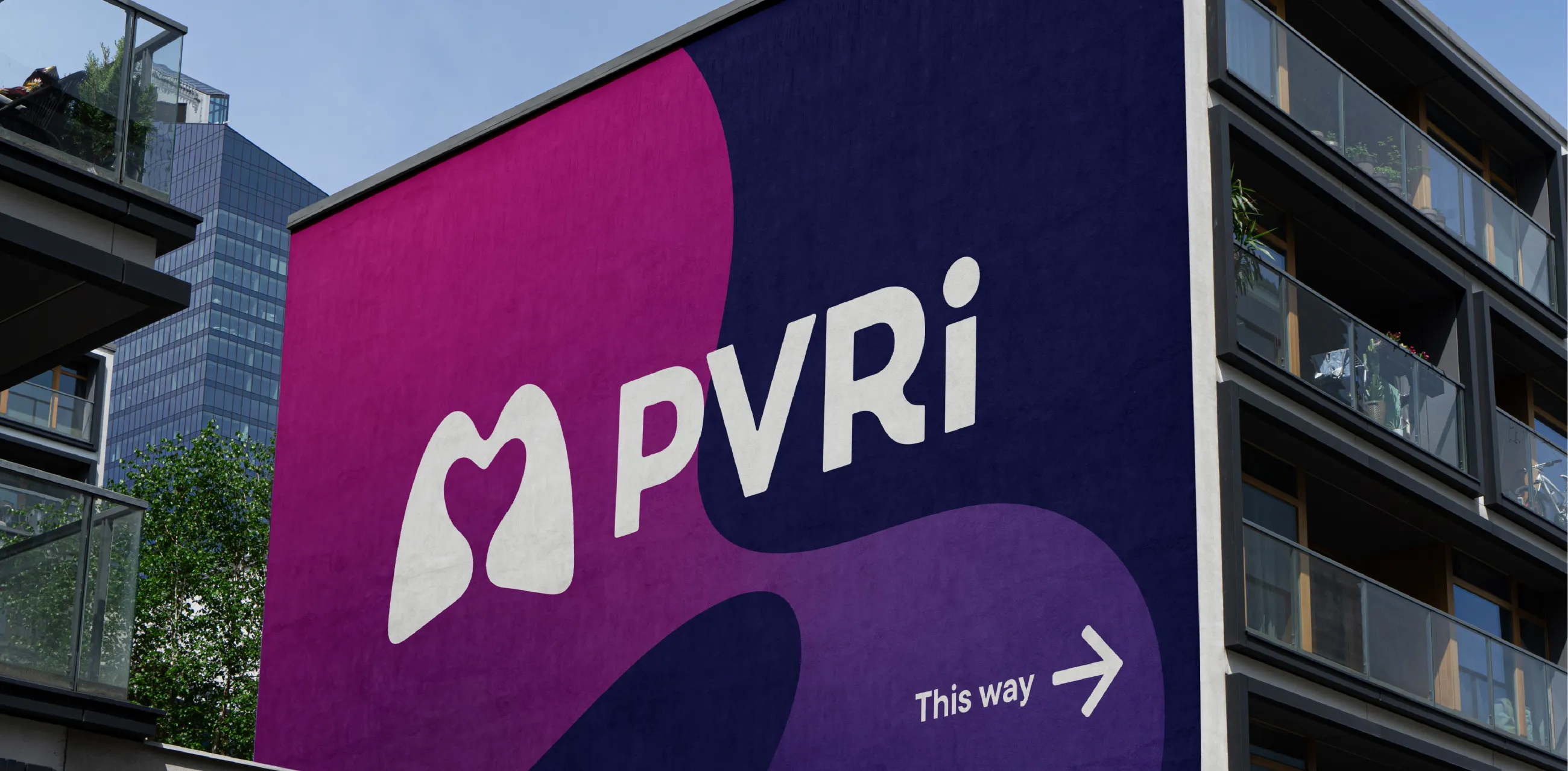
The new logo features an abstract icon of a pair of lungs, forming the shape of a heart in the central negative space. This is complemented by a clear, modern wordmark.
Since Pulmonary Vascular Research (PVR) is a well-recognised term, we emphasised PVR in upper case, with a lower case i. This makes the logo distinctive, while demoting the word ‘institute’ in the full name.
Vibrant and warm – the new logo
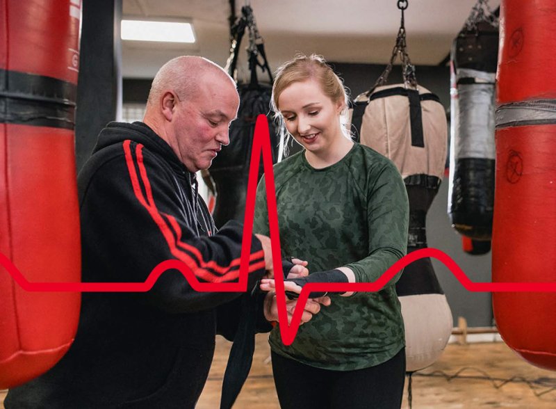
The ‘lungs’ icon is flooded with a colourful gradient in the brand’s new colour palette: deep pink, plum, purple, and indigo. Purple is commonly associated with Pulmonary Vascular Research, putting PVRI at the heart of this specialist scientific community. It’s also a clear evolution from the blue and red of the old PVRI logo.
We also created an animated version of the logo, where the heart beats. Members described the new logo as vibrant, warm, and memorable.
Harmony and energy – the new visual identity
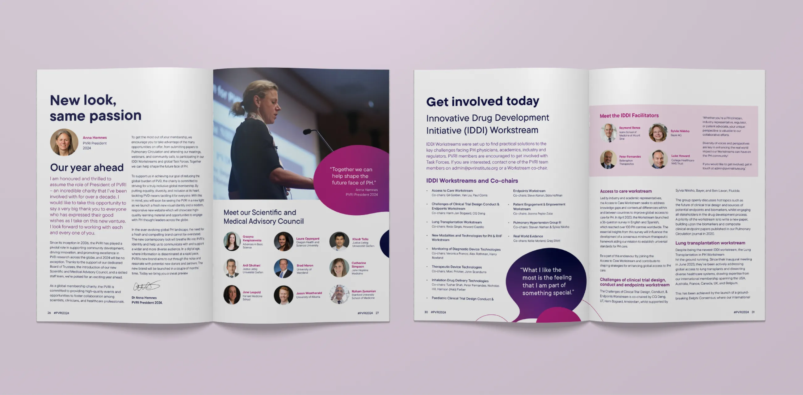
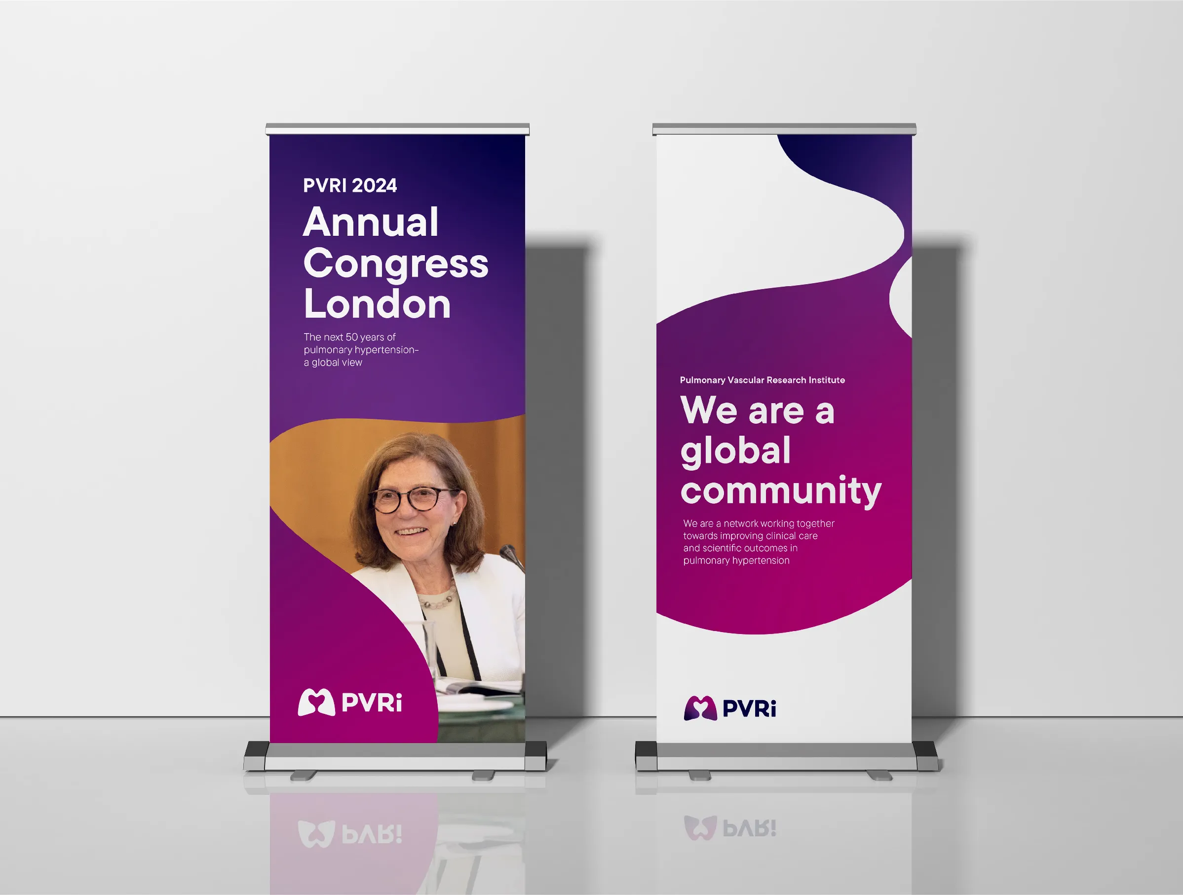
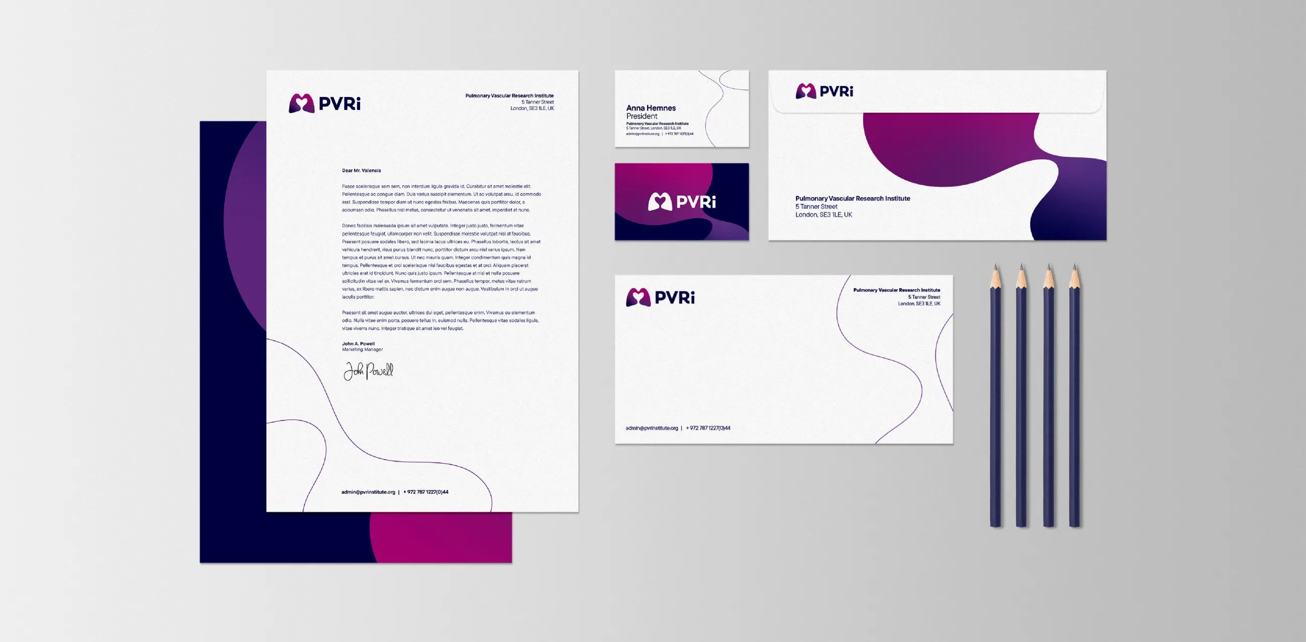
The rest of the visual identity takes inspiration from the icon to create a suite of fluid shapes. They add a sense of harmony and energy to the visual identity, helping to communicate PVRI’s community coming together to share ideas and research. The shapes can be used in outline only or flooded with the colourful gradient. They can also be used to frame authentic photography of PVRI’s members and events.
Like the logo, the fluid shapes animate beautifully, giving an almost hypnotic effect like a lava lamp.
All these elements combine with bold typography to create interesting and impactful design compositions.
Since we began in 2006, there have been significant strides in research and medicine, but there is more to be done to achieve the vision of a world without Pulmonary Vascular Disease (PVD). Our new modern logo signifies a rejuvenated energy to achieve this vision.

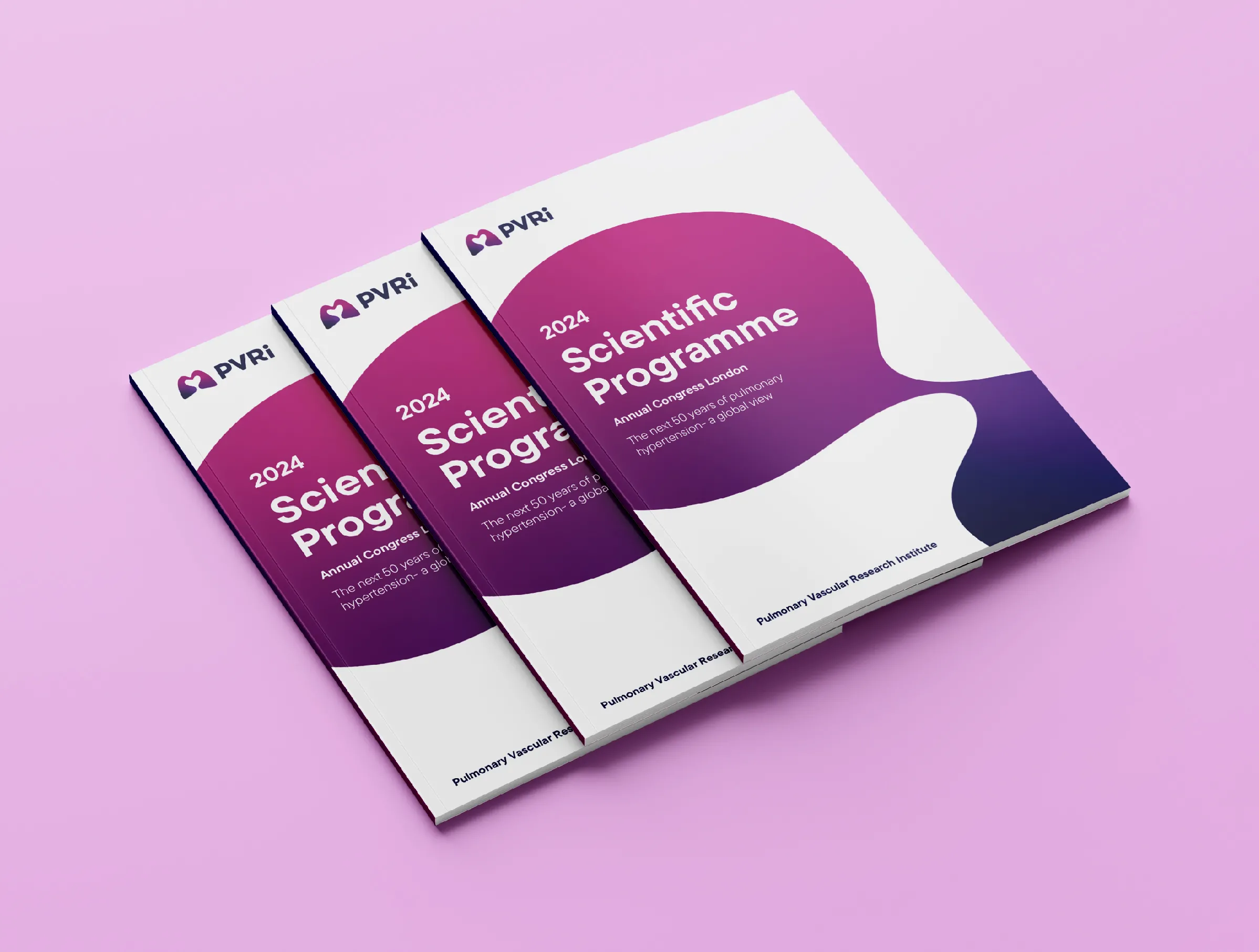
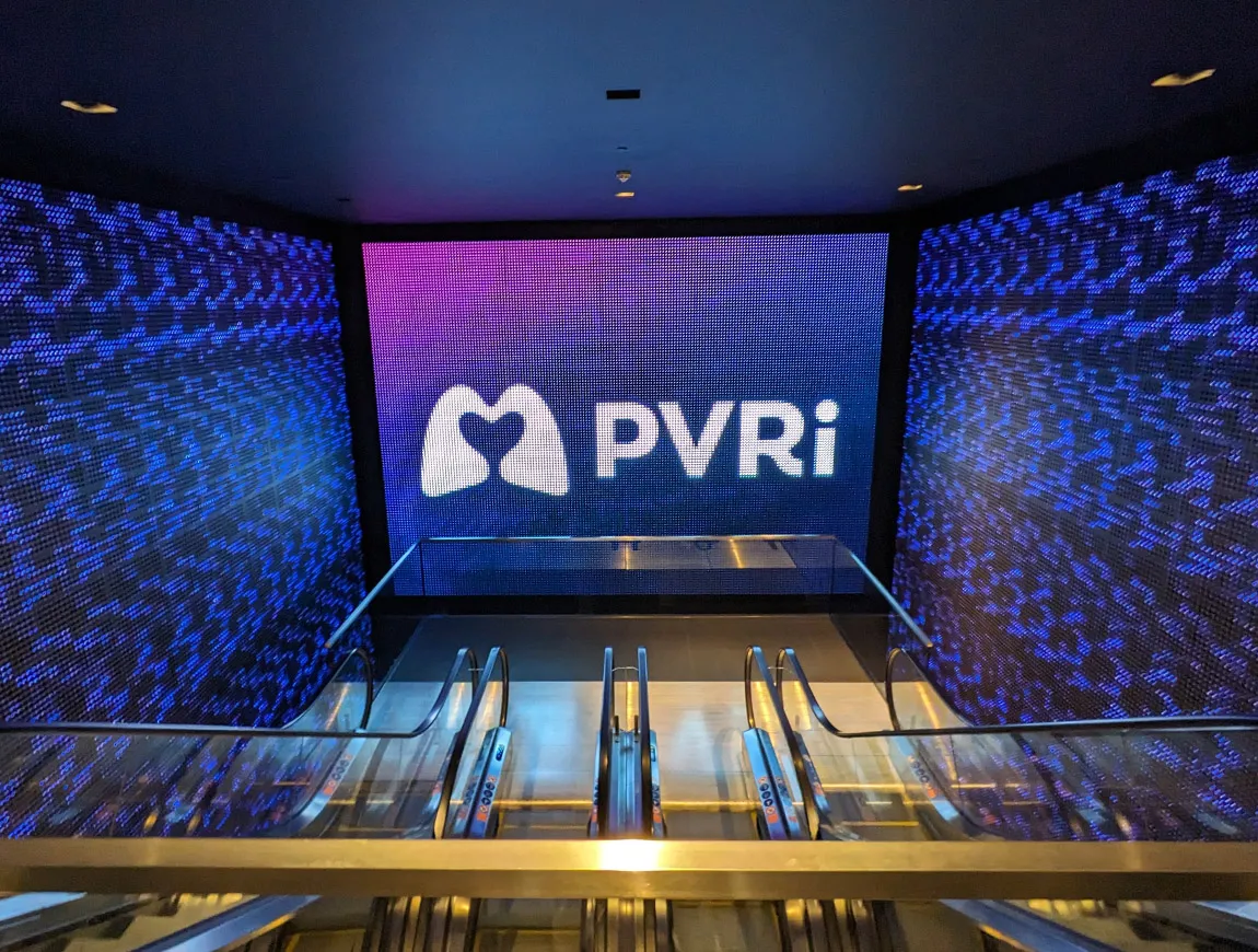
The new brand was unveiled in February 2024 at PVRI’s Annual Congress held in London. The new logo captured the hearts and minds of over 500 pulmonary hypertension experts, researchers, industry representatives, charity partners, drug regulators, and patients from over 31 countries.
To get them ready for launch, IE designed key collateral for the event including:
Annual Congress brochure
Awards programme and certificates
Banner stands
Name badges
Social media banners
PowerPoint templates
